Pen, Ink & Watercolour Wash
Mar 29, 2019 12:58:16 #

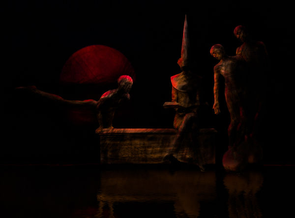
Well, the title is the look I'm attempting here. The composition is one I've posted previously so those with longer memories may remember it as somewhat brighter. I've also used some of the elements in other composites. Anyway, I wanted a pen, ink and wash look. What do you think of it please, and do you have any thoughts for improvement?
Mar 29, 2019 13:27:49 #

I had to increase brightness quite a bit just to see it, but it's gorgeous, Dave! Really cool figures + the colors and light are mesmerizing.
Mar 29, 2019 13:36:02 #
kenievans
Loc: Dallas
I very much like where you are going with this. It is really dramatic and riveting. I want to just sit and study it but I think it is a little bit too dark. The reflection is difficult to make out. I believe this would be considered Chiaroscuro. https://en.wikipedia.org/wiki/Chiaroscuro
I think I remember you doing an image with the person in the tall hat sitting on a bench in a park? Loved that image. Wasn't it inverted?
I think I remember you doing an image with the person in the tall hat sitting on a bench in a park? Loved that image. Wasn't it inverted?
Mar 29, 2019 16:27:10 #
Linda From Maine wrote:
I had to increase brightness quite a bit just to see it, but it's gorgeous, Dave! Really cool figures + the colors and light are mesmerizing.
You’re not supposed to increase the brightness! All that work making it dark, thrown out in the whizz of a slider!!! Woe is me! But glad you had a look and like it Linda. Expect you remember the first edition? It included a man doing a one-hand-stand on on horses head - but nobody liked that bit.
Mar 29, 2019 16:34:15 #
kenievans wrote:
I very much like where you are going with this. It is really dramatic and riveting. I want to just sit and study it but I think it is a little bit too dark. The reflection is difficult to make out. I believe this would be considered Chiaroscuro. https://en.wikipedia.org/wiki/Chiaroscuro
I think I remember you doing an image with the person in the tall hat sitting on a bench in a park? Loved that image. Wasn't it inverted?
I think I remember you doing an image with the person in the tall hat sitting on a bench in a park? Loved that image. Wasn't it inverted?
Yes, chiaroscuro, one of my favourite effects/methods - but I ain’t no Rembrandt!
Your memory serves you well Keni, I did a b&w using the nun character and her bench set in a wooded avenue. She is a sculpture in a private collection (unfortunately not mine). The acrobats are in the same collection. Many thanks for your comments - I do need to address the dark reflection.
Mar 29, 2019 17:37:10 #
magnetoman wrote:
Just enough to see it! I'm sure the problem is I sit next to a bright window 😇 You’re not supposed to increase the brightness!
magnetoman wrote:
I can't remember what I had for breakfast, so the fact I can't recall a one-hand stand on a horse should not be taken as criticism of your talent 🤔Expect you remember the first edition? It included a man doing a one-hand-stand on on horses head - but nobody liked that bit.
Mar 30, 2019 05:07:48 #
Linda From Maine wrote:
I can't remember what I had for breakfast, so the fact I can't recall a one-hand stand on a horse should not be taken as criticism of your talent 🤔
I’ve fitted a black-out blind to my study window - helps enormously with my dark compos.
Whether or not you remember my man, you probably have a better memory than most of us ‘seniors’ round here. I’ve often said to the Other Linda I don’t know how you do it, when you’ve recalled somebody’s earlier post. Even so, I would have thought a stand-out combo like that was etched into the mind! ☺️
Mar 30, 2019 09:11:10 #

I don’t remember your previous post, but I looked me the idea and composition. But for my old eyes it seems a bit dark. If this were mine I would lighten it up some.
Mar 30, 2019 11:19:10 #

This is thoroughly enjoyable in concept and execution. As for the technique, I think it more unique than wash and pen--the textures, save for under the table, are too geometric and regular. The textures cause a not-unpleasant questioning as to meaning for me.
Mar 30, 2019 14:18:33 #
NJFrank wrote:
I don’t remember your previous post, but I looked me the idea and composition. But for my old eyes it seems a bit dark. If this were mine I would lighten it up some.
I think I’ve come round to the idea of lightening it a little Frank, especially after I printed it. Thanks for your thoughts on it.
Mar 30, 2019 14:24:25 #
artBob wrote:
This is thoroughly enjoyable in concept and execution. As for the technique, I think it more unique than wash and pen--the textures, save for under the table, are too geometric and regular. The textures cause a not-unpleasant questioning as to meaning for me.
Knew I could rely on you to consider the question I posed Bob. It’s probanly quite difficult to get the free movement of pen strokes without actually resorting to a pen. I’ll have to have a go. As for texture, it’s either in the original or the brush I used to darken areas - there are no added textures as such. Thanks for the critique, its much appreciated.
Mar 30, 2019 16:23:17 #

I really like this! Could see it fine on my computer screen. I wonder if a print would come out as vibrant.
Mar 30, 2019 17:47:43 #
ediesaul wrote:
I really like this! Could see it fine on my computer screen. I wonder if a print would come out as vibrant.
Hi Edie, good to see you! I was quite pleased with the way it printed on lustre paper, but felt I could brighten it up just a tad. Printing, for me, is an important criteria and it’s where I find out whether my efforts have been successful. Many thanks for chipping-in, it’s much appreciated.
Mar 30, 2019 21:06:50 #
magnetoman wrote:
Well, the title is the look I'm attempting here. The composition is one I've posted previously so those with longer memories may remember it as somewhat brighter. I've also used some of the elements in other composites. Anyway, I wanted a pen, ink and wash look. What do you think of it please, and do you have any thoughts for improvement?
WOW!! I think you got just what you were looking for. It does look more like a painting than a photograph and, since that is what you set out to do, I'd say it is a success.
Erich
Mar 31, 2019 03:58:03 #
ebrunner wrote:
WOW!! I think you got just what you were looking for. It does look more like a painting than a photograph and, since that is what you set out to do, I'd say it is a success.
Erich
Erich
Thanks Erich. I too think it goes some way toward the aim but, as Bob intimates, it’s not quite free-flowing enough. Still, it’s a start in the right direction. Many thanks for your comments.
If you want to reply, then register here. Registration is free and your account is created instantly, so you can post right away.