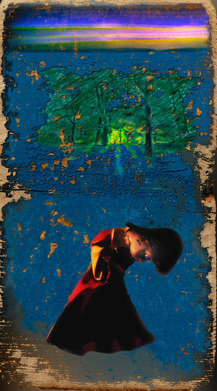
Combination of Photos & Art--An Angel with "Heaven's Question"
Mar 21, 2019 16:29:02 #

PP here involved:
-The original inspiration, a Christmas yard decoration angel, partially melted from storage near a furnace--altered to get the colors and tones to be rich but not overpowering.
-a photo of an old, blue painted swing seat--stretched and altered at the border of paint/wood
-a photo of a sketch (the forest with the light) with computer color added later, and a watercolor sunset I'd painted.
Overall dodging, burning, saturating, and desaturating to bring the various elements together.
Mar 21, 2019 16:57:16 #

Mar 22, 2019 07:15:41 #

Mar 22, 2019 08:27:13 #

Only an artist would have the mindset to come up with this combination.  Nicely done.
Nicely done.Mar 22, 2019 12:15:50 #

IMO the top half of the image has visual interest and has been put together skilfully. However, the angel seems incongruous and for me doesn't evoke any story-telling. Perhaps a figure seen from behind and looking in the direction of the trees and the illuminated path might have worked better for me.
Where story-telling is concerned, a certain amount of obscurity can work well but if it's overdone you'll just lose the viewer altogether. It can very quickly get the the point where the only people that are going to "get it" are telepaths and psychics. If that's your targeted audience then fine, but where the wider viewing public are concerned, obscurity needs to be used with restraint. Even with clear pointers, a message can be easily lost on an uninformed audience.
Where story-telling is concerned, a certain amount of obscurity can work well but if it's overdone you'll just lose the viewer altogether. It can very quickly get the the point where the only people that are going to "get it" are telepaths and psychics. If that's your targeted audience then fine, but where the wider viewing public are concerned, obscurity needs to be used with restraint. Even with clear pointers, a message can be easily lost on an uninformed audience.
Mar 22, 2019 16:23:06 #
Thanks to everyone.
R.G., your response is a bit obscure to me. While I certainly agree, and know from experience that your general principle, "a certain amount of obscurity can work well but if it's overdone you'll just lose the viewer altogether." However, "certain amount," "overdone," and "the viewer" are way too vague, again on general principle and years of experience. Add to that, that narrative or story is not the only goal of photography. Also considered goals are pure emotion and idea. It is those two that this work is placed. Considering emotion or idea, again your basic principle is true: "a certain amount of obscurity can work well but if it's overdone you'll just lose the viewer altogether." Alas!
R.G., your response is a bit obscure to me. While I certainly agree, and know from experience that your general principle, "a certain amount of obscurity can work well but if it's overdone you'll just lose the viewer altogether." However, "certain amount," "overdone," and "the viewer" are way too vague, again on general principle and years of experience. Add to that, that narrative or story is not the only goal of photography. Also considered goals are pure emotion and idea. It is those two that this work is placed. Considering emotion or idea, again your basic principle is true: "a certain amount of obscurity can work well but if it's overdone you'll just lose the viewer altogether." Alas!
Mar 22, 2019 20:00:43 #

I want a half-melted doll Bob! I like the whole thing - as a whole and as individual elements. You’ve brought them together wonderfully. And the colours are super. The only change I’d make is to reduce the contrast of Miss Melt, or perhaps just reduce her shadows a little.
Mar 22, 2019 22:57:29 #
magnetoman wrote:
I want a half-melted doll Bob! I like the whole thing - as a whole and as individual elements. You’ve brought them together wonderfully. And the colours are super. The only change I’d make is to reduce the contrast of Miss Melt, or perhaps just reduce her shadows a little.
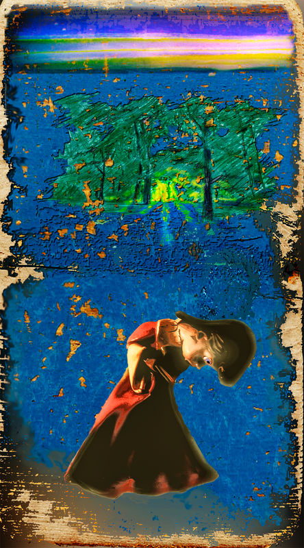
Okay, help me work this out. Your idea made enough sense that I certainly wanted to try it out. So I did (attached) in several tries, use Camera Raw and Curves. Here's the rub, by bringing the angel into harmony, the piece seemed unsettled, the angel neither a part of the overall, nor distant and "above" it as in the original.
What do you think? Play with the original or the revision if you want.
Thank you, by the way, for the good look and the suggestion.
Mar 23, 2019 16:47:41 #
Hi Bob, I did try to respond very early today but the iPad locked up for some reason. Three days of visitors precludes any time to myself! I’m wondering if just reducing the contrast, or saturation, on the face would help? Have you tried a juxtaposition of the angel and the scene? I know it changes your concept but it might work.
Mar 23, 2019 17:00:49 #
Might help bring the angel into the scene more, but I now know I like her above it all, looking down as it were.
If you want to reply, then register here. Registration is free and your account is created instantly, so you can post right away.