Color or b&w? Consider the subject...
Mar 19, 2019 12:48:32 #

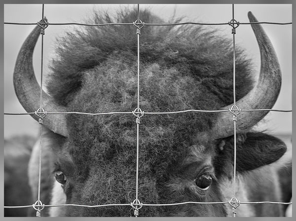
I am posting these for peer review because I think, given the powerful subject and his incarceration, that each iteration has its strong points and its drawbacks. I would welcome any and all constructive comments, on the issue of color v. b&w, the subject of the images, particular treatments, etc. I want to learn and I take all comments under careful advisement. Thanks for weighing in (if you choose to do so!) 

Mar 19, 2019 12:52:48 #

Mar 19, 2019 12:56:33 #
tommystrat wrote:
I am posting these for peer review because I think, given the powerful subject and his incarceration, that each iteration has its strong points and its drawbacks. I would welcome any and all constructive comments, on the issue of color v. b&w, the subject of the images, particular treatments, etc. I want to learn and I take all comments under careful advisement. Thanks for weighing in (if you choose to do so!)
Sorry, but to me, the most powerful subject in this image is the fence!
Mar 19, 2019 13:25:53 #

Tho I am a fan of b&w, I think the color version is better in this case. IMHO, the photo would be greatly improved by widening the composition to show a larger view of the captive buffalo. The little swath is just too narrow, esp. given the domineering presence of the fence.
Mar 19, 2019 14:13:45 #
speters wrote:
Sorry, but to me, the most powerful subject in this image is the fence!
Yes! I was trying to get the fence to be as important, if not more so, than the buffalo. The sense of captivity, restriction, separation, power, etc. all come from the dominant fence restricting and containing the power of the buffalo. Hope that came through!
Mar 19, 2019 14:34:07 #

tommystrat wrote:
I reacted like the others who feel the fence is a drawback. After reading your opening, I now understand what you were going for. I don't have any suggestion at the moment as to how you could better convey the sentiment, maybe I'll come back after a nap ... The sense of captivity, restriction, separation, power, etc. all come from the dominant fence restricting and containing the power of the buffalo. Hope that came through!

I think the discussion of b&w vs. color is very instructive and I'm always happy when it's a topic here. I really like the description of b&w photography by Ben Long on lynda.com: "In a black-and-white image, the world is reduced purely to tone, to light and shadow, brightness and darkness...As a black-and-white photographer, your visual vocabulary simplifies to form shape, texture, volume, highlight, and shadow. "
I also like a viewpoint I think I first read on UHH: What does color add to the story? We usually approach the discussion from the other direction.
IMO color does not add anything to this composition. We don't need it to separate tones or shapes, and I'm pretty sure most of us know what a bison looks like in color. The b&w is more graphical, just forms, textures and lines (thanks to your excellent pp bringing out all the tones and details), and I think tells your story best of the two.
Mar 20, 2019 07:12:19 #
Szalajj
Loc: Salem, NH
Normally, I would prefer color over black & white because there is generally more detail in color shots.
The rule of thumb is usually to shoot in color and get the sharpest shot available, then convert to B&W to keep the details.
But in this case, there's no doubt that the B&W shot is noticeably sharper, especially when you look at the bison's forehead, and the details on the fence itself. That sharpness makes the B&W shot a standout, it almost pops off the page at you.
Mar 20, 2019 08:00:33 #

B&W version for sure! It was the bison's eyes that drew me - that, plus the fence, make a powerful statement.
Mar 20, 2019 08:12:32 #

I do like the idea of the black and white. My thinking is that, just as with all wildlife photos, the buffalos eyes should have been the sharpest focus rather than the fence. The shallow DOF you got from F5.6 left all the buffalo less than sharply focused. A less than sharp fence would convey the incarceration just as well. It appears that you applied a great deal of global sharpening in an attempt to retrieve details that were not there in the buffalo, and then went back with a blur brush to mitigate those effects within some of the fencing grids.
Mar 20, 2019 08:23:44 #

Black and white. To me, the fence does not distract in b&w, but in the color version it becomes the subject.
Mar 20, 2019 08:38:47 #
bbrown5154
Loc: Baltimore, MD
tommystrat wrote:
I am posting these for peer review because I think, given the powerful subject and his incarceration, that each iteration has its strong points and its drawbacks. I would welcome any and all constructive comments, on the issue of color v. b&w, the subject of the images, particular treatments, etc. I want to learn and I take all comments under careful advisement. Thanks for weighing in (if you choose to do so!)
I like the B&W the best but the focus on the fence and frankly the fence itself is completely distracting.
Maybe if you would have focused on the "eye" and let the fence be out of focus might have helped.
But the fence, to me, is ruining your photo.
Mar 20, 2019 08:41:37 #
Mar 20, 2019 09:08:07 #
tommystrat wrote:
I am posting these for peer review because I think, given the powerful subject and his incarceration, that each iteration has its strong points and its drawbacks. I would welcome any and all constructive comments, on the issue of color v. b&w, the subject of the images, particular treatments, etc. I want to learn and I take all comments under careful advisement. Thanks for weighing in (if you choose to do so!)
The B&W has the eyes bringing a strong interest point forward. Thus, it is the stronger presentation.
Mar 20, 2019 11:10:51 #

rjaywallace wrote:
Tho I am a fan of b&w, I think the color version is better in this case. IMHO, the photo would be greatly improved by widening the composition to show a larger view of the captive buffalo. The little swath is just too narrow, esp. given the domineering presence of the fence.
I have to agree.
Mar 20, 2019 12:14:21 #
suntouched wrote:
I have to agree.
I find the color image has more impact. The B&W harks back
to the early 20th century. To me the B&W is time gone by. The color
impact says this is happening today. This buffalo is real. The situation
is real today. Don't fence me in! I am a prisoner, just because I am real
today, and have not been eliminated by human actions. So sad.
If you want to reply, then register here. Registration is free and your account is created instantly, so you can post right away.