Reflections
Mar 18, 2019 23:23:32 #
Mar 19, 2019 07:05:01 #

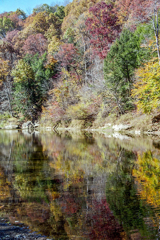
A nice little ripple on the water sets this apart from a long exposure reflection (slight blur) and mill pond calm (mirror like). Little bit of rock in the left corner lets us know it's a small pond or inlet of a river.
I like it, well done.
I like it, well done.
Mar 19, 2019 08:06:59 #

The bright sunshine washes out the colors, which for me makes the reflection the more appealing part of the image. Very nice!
You don't need the upper part of the composition to make a strong statement IMO, just depends on your personal preference. Given the harsh light, with the composition as-is I'd go more painterly or Simplified (Topaz)
You don't need the upper part of the composition to make a strong statement IMO, just depends on your personal preference. Given the harsh light, with the composition as-is I'd go more painterly or Simplified (Topaz)
Mar 19, 2019 08:40:29 #

Linda From Maine wrote:
The bright sunshine washes out the colors, which for me makes the reflection the more appealing part of the image. Very nice!
You don't need the upper part of the composition to make a strong statement IMO, just depends on your personal preference. Given the harsh light, with the composition as-is I'd go more painterly or Simplified (Topaz)
You don't need the upper part of the composition to make a strong statement IMO, just depends on your personal preference. Given the harsh light, with the composition as-is I'd go more painterly or Simplified (Topaz)
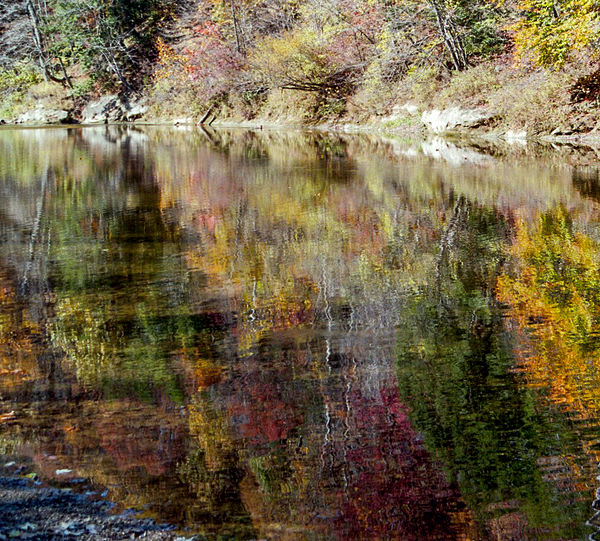
Agreeing with Linda in principle, I think another option would be to crop out all but the shore and reflection, which could have its tonal range boosted a bit, for a mysterious but beautiful shot.
Mar 19, 2019 11:59:12 #

Mar 19, 2019 12:10:07 #

Mar 19, 2019 12:58:15 #
Curmudgeon wrote:
Too busy?
I think I'm with Linda. I might try to crop so that not much above the shoreline is visible. We would get the suggestion of trees above; but not really see them. That would make the reflection the star of the show.
Erich
Mar 19, 2019 14:32:04 #
How about this? I adjusted the hue and saturation a little. Not sure I like the almost square format but don't want to give up any more pixels.
Mar 19, 2019 14:39:19 #
Curmudgeon wrote:
I thought you liked working with that up-sizer ... don't want to give up any more pixels.
 Without the upper portion, now the rocks stand out as too bright IMO. An easy fix, but if you are not fond of the aspect, then you should work towards another solution - assuming you want to pursue.
btw, have you tried flipping this vertically?
Mar 19, 2019 15:36:21 #
Curmudgeon wrote:
Too busy?
This is a very nice landscape scene. As it was described to me once, "this image has solid bones." I love water reflections and I don't think it's too busy, but IMO it's slightly overexposed and a little sharp. Also, the sky doesn't add to the image. Since you asked for input, I took the liberty of doing some small edits to this image in LR, hope you don't mind. A picture is worth a thousand words.
Global
1. Cropped out the sky.
2. Reduced the exposure by about 1 stop. This also increased color contrast.
3. Reduced clarity (-35) to give the image a softer more painterly feel.
Locally
1. Applied dehaze to the water (+15) to add a little saturated contrast
2. Using the brush filter, burned and increased warmth in the reflection highlights using WB sliders.
3. D&B in the top half (trees) to selectively increase color and luminous contrast.
The image still has a slight warm colorcast, but I like it in this image. Just adding a little blue would remove the color cast and give a little more color pop. Generally, I like a soft vignette in landscape scenes, but I liked it better without in this image.
Hope this gives you some ideas for your final image.
Mike
Mar 19, 2019 15:47:23 #

Curmudgeon wrote:
Too busy?
Attractive scene, I like the rocks in the foreground.
Mar 19, 2019 18:28:40 #

Much too busy for me--the main problem is that there is no strong element to ground the eye.
Mar 19, 2019 19:31:01 #
kymarto wrote:
Much too busy for me--the main problem is that there is no strong element to ground the eye.
Thank you all. This has been interesting to say the least. So many skills I don't have yet. I am burned out with this photo right now. I may revisit it later.
In the meantime just to satisfy and myself andkymarto I am going to post this final revision.
Mar 19, 2019 20:08:30 #
Curmudgeon wrote:
Well, there you go!Thank you all. This has been interesting to say th... (show quote)

If you want to reply, then register here. Registration is free and your account is created instantly, so you can post right away.