Garden of the Gods - part 2
Mar 3, 2019 12:21:22 #

I initially posted my first image to the UHH forum and everyone was very positive and offered many helpful/useful comments . . . I appreciate that tremendously as I regain my confidence after such a long absence . .
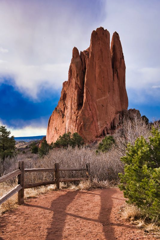
I have started playing with Luminar3, and went through some additional images from the Garden of the Gods shoot earlier in February, and found this image as the morning golden hour was fading and the storm clouds were moving in . . seemed like a striking image of the rock formation in the early morning light . .
Nikon D810 / ISO 100 / 24-70 lens / 1/125 @ f5.6 handheld . .
Some slight adjustments with the sky filter, but overall just some minor moves.
Thanks for looking and any comments welcome
Sam
Mar 3, 2019 12:22:36 #
Mar 3, 2019 12:23:21 #


Mar 3, 2019 12:37:59 #
This is a powerful image of the vertical rock against the deep blue sky. But (in my opinion only) the pathway is too much of an eye snag. It almost becomes the "hero" of the photo. You might consider cropping up from the bottom to the nearest fencepost. That minimizes the path but doesn't eliminate it.
Mar 3, 2019 12:49:09 #

photogeneralist wrote:
This is a powerful image of the vertical rock against the deep blue sky. But (in my opinion only) the pathway is too much of an eye snag. It almost becomes the "hero" of the photo. You might consider cropping up from the bottom to the nearest fencepost. That minimizes the path but doesn't eliminate it.
The problem I have with the pathway has to do with scale. Since we only see the part of the path near the viewer (and not the path as it winds further into the landscape) it fails to provide scale to the picture. It actually seems to make the rock seem small.
Mar 3, 2019 18:20:32 #

Mar 3, 2019 18:23:48 #
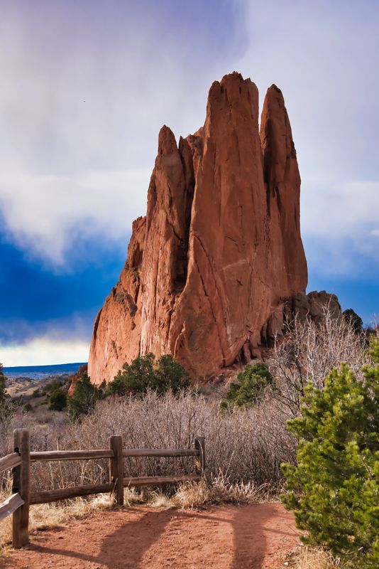
Thanks for your comments and suggestions . . After looking at the image for a while, I agree that the "rock" should be the prominent feature, but I still don't want to lose the foreground completely . . so I cropped a little from the bottom (about 1/3) and re-framed a little . . How about this . . (could be a little more but don't want to "float the post" without an anchor . .)
Sam
Sam
Mar 3, 2019 19:24:15 #
IR Jim wrote:
Nice capture, I just flew home from there yesterday.
Thanks, don't get down there from Denver often enough.
Mar 3, 2019 19:25:17 #
photogeneralist wrote:
This is a powerful image of the vertical rock against the deep blue sky. But (in my opinion only) the pathway is too much of an eye snag. It almost becomes the "hero" of the photo. You might consider cropping up from the bottom to the nearest fencepost. That minimizes the path but doesn't eliminate it.
Liked your suggestion . . cropped some off the bottom 1/3 but could be a "smite" more . .
Thanks for your comment
Mar 3, 2019 19:26:57 #
dsmeltz wrote:
The problem I have with the pathway has to do with scale. Since we only see the part of the path near the viewer (and not the path as it winds further into the landscape) it fails to provide scale to the picture. It actually seems to make the rock seem small.
Understand your view . . sometimes "the now" catches up and you don't have much time to plan . . did some cropping on your suggestion and re-posted the crop - take a look
Thanks for your comment and suggestion.
Mar 4, 2019 05:41:01 #

SafetySam wrote:
Thanks for your comments and suggestions . . After looking at the image for a while, I agree that the "rock" should be the prominent feature, but I still don't want to lose the foreground completely . . so I cropped a little from the bottom (about 1/3) and re-framed a little . . How about this . . (could be a little more but don't want to "float the post" without an anchor . .)
Sam
Sam
Better. In the original, it was the longer shadow on the path that distracted me. I agree that we want to keep the path to draw the viewer in, but this smaller path image seems a huge improvement to me.
Mar 4, 2019 07:46:54 #

Mar 4, 2019 07:47:34 #
Mar 4, 2019 07:54:57 #
Definitely like the cropped version better. The rock is much more prominent while intensifying the mood.
Mar 4, 2019 08:02:55 #

If you want to reply, then register here. Registration is free and your account is created instantly, so you can post right away.