Actual feedback. Good, bad or indifferent.
Mar 1, 2019 10:02:43 #

Take a look. Then leave a comment. Nobody gets better without some instruction.
Mar 1, 2019 10:05:48 #

E4Mafia wrote:
Take a look. Then leave a comment. Nobody gets better without some instruction.
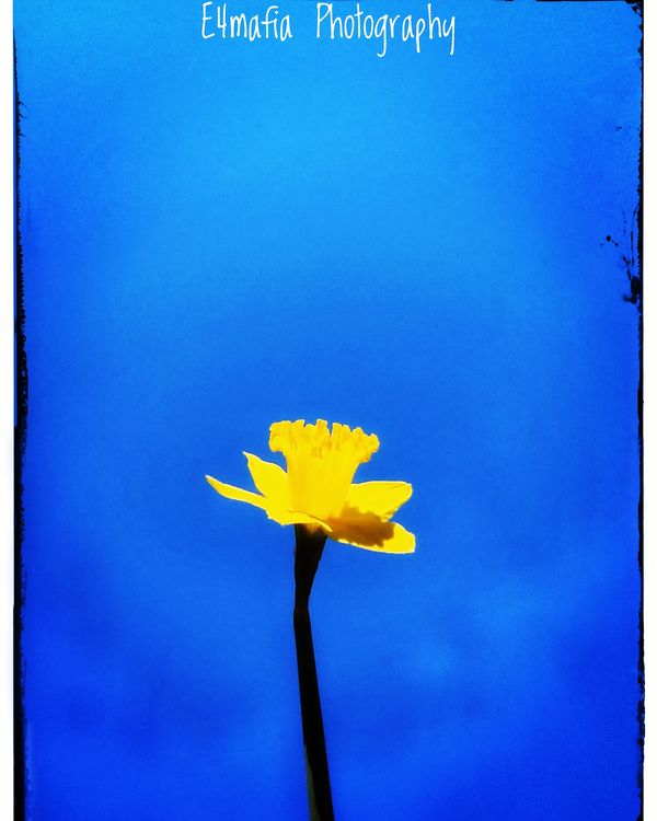
You have photographed a flower shading itself. The shadow is misplaced maybe?
Mar 1, 2019 10:07:31 #
Yeah the shadow on the petal throws me. Thanks for commenting. Always appreciated.
Mar 1, 2019 10:08:32 #
E4Mafia wrote:
Take a look. Then leave a comment. Nobody gets better without some instruction.
The composition is not bad, but the yellow is a bit blown out, try lowering the yellow just a bit. It also looks like you either cropped too much, or you cut the flower out and moved it to a different background, as the edges of the flower are not sharp. Good start.
Mar 1, 2019 10:11:36 #
orrie smith wrote:
The composition is not bad, but the yellow is a bit blown out, try lowering the yellow just a bit. It also looks like you either cropped too much, or you cut the flower out and moved it to a different background, as the edges of the flower are not sharp. Good start.
Its actually all in camera (cropping). Minus the tonel change in post edit. But your right. The sharpness is lost at the edges. Thanks for the feedback. Much appreciated and will incorporate your feedback on my next pic.
Mar 1, 2019 10:14:47 #

E4Mafia wrote:
Take a look. Then leave a comment. Nobody gets better without some instruction.
Nice image! The flower could use more detail. Perhaps a touch less exposure or some clarity in post processing. I'm not too partial to the rough frames (?) on the left and right. Good complimentary colors, you might crop some of the sky. I would also have different versions varying the sky's hue and saturation using Photoshop's tool of the same name. Cheers. Ed
Mar 1, 2019 10:35:05 #
elee950021 wrote:
Nice image! The flower could use more detail. Perhaps a touch less exposure or some clarity in post processing. I'm not too partial to the rough frames (?) on the left and right. Good complimentary colors, you might crop some of the sky. I would also have different versions varying the sky's hue and saturation using Photoshop's tool of the same name. Cheers. Ed
Ok I can see what your saying. Too much empty space up top. Could you elaborate on the suggestion of "more detail" for the flower though? Thanks in advance.
Mar 2, 2019 09:36:06 #
Maxwell12
Loc: Florida
I’m not sure what you wish to present. Are you aiming for an impressionistic
rendering, a still life, or a mixture of both. I think you should pick on or the other
and go for it. The blown out colors (over processed and/or over exposed) and painted(?)
side frames look very much like an impressionist painting but the actual flower looks
like you might have been trying for a real flower.
The colors are appealing but what you are trying do is confusing.
I'm not trying to be a jerk here, the image is interesting and am interested in what
the vision is.
Mar 2, 2019 10:10:55 #
mizzee
Loc: Boston,Ma
You’ve got some distractions at the left and too much sky, so cropping will help. Next time in a similar situation, try using exposure compensation to tone down the yellow. By the way, I’ve found that both yellow and white flowers are very tough to get right in full sun. Keep an eye out for odd shadows.
Mar 2, 2019 10:37:07 #

It depends on what you are trying to express. I THINK you are doing a semi-abstract of a flower because of the hyped-up color (very saturated flower and background) and strange tones (bright flower, dark stem). In that case, if I were jurying, I would probably put it in the "maybe" stack for a while instead of the "in" stack, because the artsy edges of the frame distract, as does the watermark. Some cropping would likely help, just a little if you want a feeling of isolation or aloneness, tight if you want to "blast" the color. I like your idea, and like your willingness to learn. I expect you will be very good as you push forward with composition and concept.
Mar 2, 2019 10:37:19 #
Overexposure means there is no detail in the flower highlight. The shadow made me think, "What's the light source?? While negative space can add impact, a little goes a long way. For me, there is too much here. I like the idea, though!
Mar 2, 2019 11:25:45 #
xt2
Loc: British Columbia, Canada
Sharpness? Watermark is dominant and distracting in its current position.
Mar 2, 2019 14:12:47 #
I'm slightly bothered by the foliage sticking into the frame top right. This is a good opportunity to use the visual weight of the negative space effectively to counterbalance a less centered subject. The bright contrast of the yellow blossom has so much visual weight that I find myself wishing it were not so large in the photo. Just my opinion, others mileage may vary.
If you want to reply, then register here. Registration is free and your account is created instantly, so you can post right away.