First Photo Shoot With An animal!
Oct 13, 2011 06:46:26 #

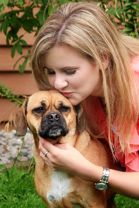
This is the first time I have a pet in the picture, it was a little challenging! The pooch was more interested in everthing around her and did not want to sit still. How is the compostion of this picture, is it not acceptable because the hand and paws are cut off?

Oct 13, 2011 08:38:00 #

Oct 13, 2011 08:43:52 #
"Cutting off" parts of bodies, buildings, mountains, etc is pretty much an accepted practice. I believe the key is to simply not leave the viewer wondering about the missing parts. If the missing are to substantial, not important to the "story", then no sweat!
In this case I think you are fine. What I would have tried to do a bit different would be to try to get the two faces more connected. Either by shortening the distance or having the faces recognize the presence of each other. pet pics are usually a slam dunk if you can get some action between the person and the pet - not easy I know... One trick is to simply wait, wait and be ready for that moment when the faces do connect, perhaps with only a slight furtive glance at one another saying, "isn't this person ever going to take the picture?"
In this case I think you are fine. What I would have tried to do a bit different would be to try to get the two faces more connected. Either by shortening the distance or having the faces recognize the presence of each other. pet pics are usually a slam dunk if you can get some action between the person and the pet - not easy I know... One trick is to simply wait, wait and be ready for that moment when the faces do connect, perhaps with only a slight furtive glance at one another saying, "isn't this person ever going to take the picture?"
Oct 13, 2011 09:23:32 #
Thanks for the input! Another question! My biggest problem is always getting the right colors. I know photos look different on different monitors, but which photo seems to be the better as far as color goes?


Oct 13, 2011 09:28:50 #

sdoyon wrote:
Thanks for the input! Another question! My biggest problem is always getting the right colors. I know photos look different on different monitors, but which photo seems to be the better as far as color goes?
I think the top one with the brighter peach colored top is better, in this case. But I don't think it's always the case, especially with portraits... just happens to be my personal taste, this time. :)
And I agree with the composition suggestion of waiting for the person and pet to interact with each other... much more interesting!
Not bad at all... these are something to be proud of!
Oct 13, 2011 09:37:14 #
Oct 13, 2011 09:48:25 #
sdoyon wrote:
To me, the top picture seems to have a green tint to the skin tones.
I don't know if it's a difference in monitors or just my eye, but I don't see enough of a problem, myself. Yes, it's a little darker than the bottom one... and yes, her skin is more pale in the bottom one, but I still think the top one looks more natural.
See, that's a consideration, too... not everyone prefers a natural look!
It's all-good, to me.
Maybe wait until the pros check it out and can offer better critique. ;) They'll likely think I'm talking out of my butt LOL
Oct 13, 2011 09:54:05 #
Oct 13, 2011 10:03:48 #
sdoyon wrote:
Thanks for the input! Another question! My biggest problem is always getting the right colors. I know photos look different on different monitors, but which photo seems to be the better as far as color goes?
I like the top one better but I'm certanly not a pro
Oct 13, 2011 10:11:06 #

The top photo displays better color saturation and brightness levels. No green color caste on either photo.
Oct 13, 2011 10:14:01 #

Oct 13, 2011 10:21:51 #
sdoyon wrote:
Thanks for the input! Another question! My biggest problem is always getting the right colors. I know photos look different on different monitors, but which photo seems to be the better as far as color goes?
I like the top one better also and the hand is leading to the paws so it doesn't look like an amputee. I like the lightness in the dogs face in the bottom one you can see more detail. So maybe a little selective post process. But good shot, animals are tough.
Oct 13, 2011 20:51:18 #
These were the closest I could get as far as interaction between the two! Any suggestions for next time?


Oct 13, 2011 20:58:53 #
Don't believe for a second that tilde "~" is anything but a pro at critiquing. She's got one of the best eyes for perfection you'll find in this forum. If she says it's good, I'd go with it. If she says it needs help, it probably does. If all else fails, ask Gessman; he'll feed you a line a mile long and have you rolling on the floor.
tilde531 wrote:
quote=sdoyon To me, the top picture seems to have... (show quote)
Oct 13, 2011 21:07:39 #
I detect a slight yellow color caste in this portrait and made a subtle correction.
-
-
Enhanced
If you want to reply, then register here. Registration is free and your account is created instantly, so you can post right away.