Which White Balance?
Feb 21, 2019 07:35:37 #

Feb 21, 2019 08:46:49 #

Feb 21, 2019 08:58:51 #
Feb 21, 2019 09:13:40 #
aflundi
Loc: Albuquerque, NM
Count me for the 1st too.
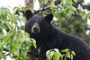
What caused that noisy-looking mess to the left of the lower main stock?
What caused that noisy-looking mess to the left of the lower main stock?
Feb 21, 2019 09:19:14 #

Feb 21, 2019 09:46:44 #
Feb 21, 2019 09:48:58 #

To be honest... None.
The first is too yellow, (warm) and the second one, too blue. (Cool)
I would think somewhere inbetween... (At least that's how it looks on MY computer screen..)
Which is a COMPLETLY other discussion..
The first is too yellow, (warm) and the second one, too blue. (Cool)
I would think somewhere inbetween... (At least that's how it looks on MY computer screen..)
Which is a COMPLETLY other discussion..
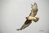
Bmac wrote:
Which white balance do you prefer in these photos? ISO 400 - 105mm - f/5.6 - 1/400 sec.
Further critique, comments and suggestions welcomed. Thanks.
Select download for additional resolution.
Further critique, comments and suggestions welcomed. Thanks.
Select download for additional resolution.
Feb 21, 2019 10:13:52 #
StevenG
Loc: Long Island, NY
Bmac wrote:
Which white balance do you prefer in these photos? ISO 400 - 105mm - f/5.6 - 1/400 sec.
Further critique, comments and suggestions welcomed. Thanks.
Select download for additional resolution.
Further critique, comments and suggestions welcomed. Thanks.
Select download for additional resolution.
1st
Feb 21, 2019 10:45:10 #
The first is much more natural. But the second has more impact. Depends what you're going after. "American Flower" magazine would like the first. "Environmental Quarterly" might prefer the second.
Oh, LWW & Dirtpusher: Fascism is not a strand of radical Socialism. It is the basis of Conservatism. Read the link and see if you notice any similarities to a person who is in the WH at this very moment:
https://www.britannica.com/topic/fascism
Oh, LWW & Dirtpusher: Fascism is not a strand of radical Socialism. It is the basis of Conservatism. Read the link and see if you notice any similarities to a person who is in the WH at this very moment:
https://www.britannica.com/topic/fascism
Feb 21, 2019 11:05:45 #

Feb 21, 2019 13:17:42 #
Feb 21, 2019 17:23:55 #

pquiggle wrote:
The 1st looks more natural to me.
Kmgw9v wrote:
1st.
LWW wrote:
Tritto.
PAR4DCR wrote:
First image.
Don
Don
MichaelEBM wrote:
I tend to add "warmth" to my photographs as a rule, and so I am partial to the 1st photo which is "warmer" than the 2nd one. The reds and yellows are deeper and richer IMO.
Thanks for commenting folks..........five for the first.
Feb 21, 2019 17:25:40 #
Photobum wrote:
I'd have to go with the first one, tho they're both nice.
Thanks Photobum, glad you liked them. Six for the first, Zero for number two.
Feb 21, 2019 17:56:39 #

Feb 21, 2019 19:39:05 #
I agree with the unanimous preference but have to ask- is this really about white balance, which I think is set prior to taking the exposure or is it about post processing?
If you want to reply, then register here. Registration is free and your account is created instantly, so you can post right away.