Three to share
Feb 16, 2019 01:28:37 #

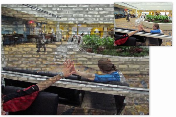
1. Airport Good-byes. Added brick wall overlay to express the separation of the glass
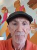
2. The Mannequin. Embellished with textures and overlays, changed background.
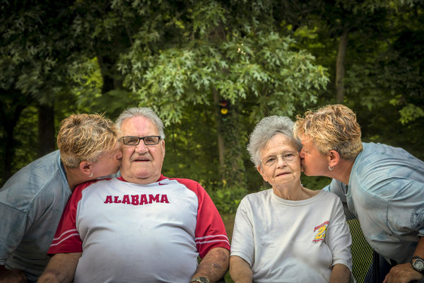
3. Kiss Composite. I did this one for my Sister in Law. She cherishes it now because Mom has recently passed.
2. The Mannequin. Embellished with textures and overlays, changed background.
3. Kiss Composite. I did this one for my Sister in Law. She cherishes it now because Mom has recently passed.
Feb 16, 2019 15:18:09 #
kenievans
Loc: Dallas
I like what you did with the wall in the first one. I think it does help tell the story.
Feb 16, 2019 18:44:08 #

Strong story with #1. Very pleasing colors and texture in #2. Sweet, sweet #3!
Feb 16, 2019 20:33:44 #
kenievans wrote:
I like what you did with the wall in the first one. I think it does help tell the story.
thank you kenievans

Feb 16, 2019 20:35:22 #
Linda From Maine wrote:
Strong story with #1. Very pleasing colors and texture in #2. Sweet, sweet #3!
Thanks Linda. You have been a huge help with the UHH learning curve, much appreciated.
Feb 17, 2019 09:52:36 #
Feb 17, 2019 10:01:10 #
emmons267 wrote:
Great creative thought process on #1. Good job.
Much thanks, Emmons
Feb 17, 2019 10:43:00 #

I like no 1, but I would have put the filter so it sat in between the white bits on the window base. With the girl's arm, hand and the lower part of the wall on this side as it is in the inset picture would have to me given a more definite separation. Your inset picture is different... I like the other two...
Feb 17, 2019 11:05:59 #
nanaval wrote:
I like no 1, but I would have put the filter so it sat in between the white bits on the window base. With the girl's arm, hand and the lower part of the wall on this side as it is in the inset picture would have to me given a more definite separation. Your inset picture is different... I like the other two...
Good points. I think at least masking the white trim piece would have likely been an improvement but this was pre masking skills I think. On the inset, I wanted anonymity in the pp image so I went with the head turned but I could not find the image so I went with the similar one for pre edit example. Thanks for your input, well taken advice on improvements that could be made.
If you want to reply, then register here. Registration is free and your account is created instantly, so you can post right away.