Images in Black and White
Feb 15, 2019 11:59:15 #

Sorry about some of the sizes, it has been awhile since I visited UHH and forgotten I should have resize, I shall endeavor to remember that in the future.
Feb 15, 2019 12:04:48 #

tad1937 wrote:
Sorry about some of the sizes, it has been awhile since I visited UHH and forgotten I should have resize, I shall endeavor to remember that in the future.
I like your first image Tad.
Feb 15, 2019 12:05:48 #

Feb 15, 2019 12:09:35 #
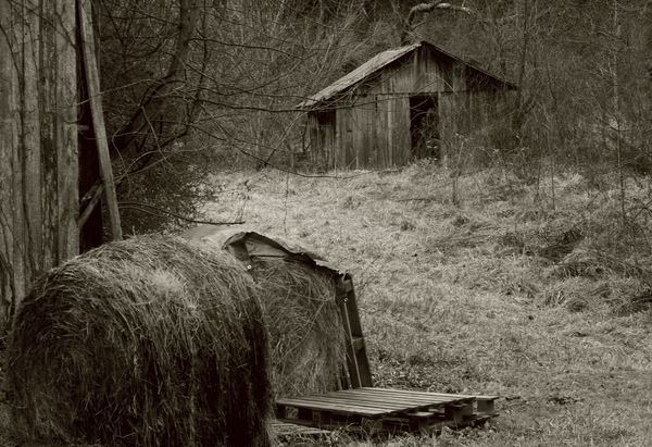
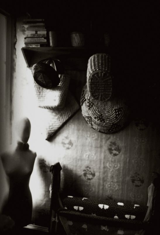
I like them all. Shots 2 & 3 color remind me of printing on Agfa Papers, Portriga Rapid I think.
Feb 15, 2019 12:14:17 #

Feb 15, 2019 12:32:38 #
Feb 15, 2019 12:36:59 #

Feb 15, 2019 13:07:30 #

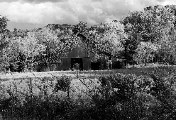
...they *are* nice, especially composition. But all of them need to be straightened. In the first you are dealing with a sloping geography, but the building is built plumb and square (at least that's how this 40 year carpenter learned it) and if you run a true vertical line through the pic you'll see the structure is not in plumb, nor, to a lesser degree, level. In the second the phenomenon is less evident but to my eye that doorway needs a little scootch to the right. In the third I think it'd look better with the wall paper plumbed...and maybe a bit sharper focus. JMHO, but I'm a bug on lines doncha know. ;0)
Feb 15, 2019 13:15:59 #
Feb 15, 2019 13:16:55 #
mcmama wrote:
Good set, especially the second image.
Thank you very much, I like that one also
Feb 15, 2019 13:18:09 #
ORpilot wrote:
I like them all. Shots 2 & 3 color remind me of printing on Agfa Papers, Portriga Rapid I think.
Thank you, I like those warm tones
Feb 15, 2019 13:19:40 #
Feb 15, 2019 13:21:17 #
Curmudgeon wrote:
Nice series. 
Thank you, and I strongly suspect the term Curmudgeon is a misnomer
Feb 15, 2019 13:21:50 #
Feb 15, 2019 13:27:21 #
chasgroh wrote:
...they *are* nice, especially composition. But a... (show quote)
Will play closer attention to that Charlie, but a lot of these barns etc in Tennessee may have started out plumb but as the years go by they may no longer be so or the foundations were simply a pile of rocks. But you are correct about the need to be straight.
If you want to reply, then register here. Registration is free and your account is created instantly, so you can post right away.