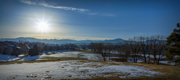
Winter afternoon sun.
Feb 12, 2019 11:05:14 #
I had a hard time deciding whether to post this photo in this section, or in the Landscape section. It is a landscape, but I figured that the technical aspects of the end product might be a bit more interesting than the landscape scene, itself.
I wanted to do something a little different -- different, for me, that is. It is not unusual, at all, for me to shoot in the general direction of the sun. I try to photograph wildlife, and, with wildlife, you play the hand you're dealt. When I shoot landscapes, it is more often an opportunity that presents itself when I'm out and about, rather than an effort to be in a certain spot, at a certain time of day, to get the perfect shot.
The unusual aspect of this shot, for me, is that I wanted to include the sun, itself, in the shot. I rarely do that, but it has happened. The purpose of this shot, and its subject, is the sun, itself. It was a late afternoon, winter sun.
When one includes the great ball of fire in the shot, the brightness of the sun tends to overwhelm everything else, which means everything else tends to be underexposed. Expose for the rest of the scene, and the bright sun blows the sky out. My solution to this is to use HDR. I bracketed the scene, using +/- 1EV. The three shots were taken hand held.
I wanted the sun to appear as a star, rather than a white ball. I don't have a star filter, nor have I ever used one. To get the sun to appear as a star, I simply used a smaller aperture. In this case, I used f/16.
To blend the three, raw photos, I used Lightroom's HDR capability. When I use HDR, I am only interested in a final product that has all, or most, parts of the final product in good exposure. I want it to appear natural, rather than being an obvious product of HDR. To that end, Lightroom's capability is just fine.
Lightroom allowed me to produce something that I liked, but I wanted to see if I could fine tune it any better, in Photoshop. Above all, I wanted the sun to appear star-like, but I did not want it to have any of the usual artifacts of over enhancing the sky. Put too much of that in the mix, and you end up with a very obvious border defining the region of the sun, and the region of the rest of the sky. After that, some slight color grading, a bit of a boxed vignette, and a slight matte finish, and I was finished.
Usually, the download version of any shot that is posted is better than the smaller version that appears on the base page. This is one time that, to my eyes, the difference between the smaller version and the download version is a bit more significant.
Feb 12, 2019 11:35:24 #

Appreciate your in-depth discussion of how you achieved the result, Jim. It appears your careful analysis and workflow were very successful.
Many thanks for your time!
Many thanks for your time!
Feb 12, 2019 13:17:49 #

You've succeeded in achieving an interesting wintery look. I'm glad you didn't take all of the blue out of the snow.
Feb 13, 2019 07:55:28 #
This is beautiful. Thanks for sharing the steps you took to achieve this. Very nice and very helpful.
Feb 13, 2019 08:56:44 #

You have done a very nice job here. I like how I have to squint looking at the sun and how nicely the brightness falls off to the right. I am not real comfortable with the star effect of the sun but so what. Two white spots appear in the middle of the shot and I would remove them. What do you mean by color grading?
I have a similar shot taken on a balmy spring day that is the warm version of your shot. If you want, I will post it.
I have a similar shot taken on a balmy spring day that is the warm version of your shot. If you want, I will post it.
Feb 13, 2019 09:12:49 #
Linda From Maine wrote:
Appreciate your in-depth discussion of how you achieved the result, Jim. It appears your careful analysis and workflow were very successful.
Many thanks for your time!
Many thanks for your time!
Thanks! I was happy that the day gave me an opportunity. Early in that morning, about sunrise, it was cold, and there was a rather thick fog. This created a cool blanket of frost on everything. We had to go somewhere, though, so I missed that opportunity. I'm pretty sure those conditions will be repeated before spring.
Feb 13, 2019 09:14:01 #
R.G. wrote:
You've succeeded in achieving an interesting wintery look. I'm glad you didn't take all of the blue out of the snow.
Thanks! I did, indeed, leave some blue in the snow. I experimented with several white balance settings, and found that, if I removed all the blue in the snow, it just didn't look cold enough.
Feb 13, 2019 09:14:34 #
Red Sky At Night wrote:
This is beautiful. Thanks for sharing the steps you took to achieve this. Very nice and very helpful.
Thank you. I'm glad this proved useful.
Feb 13, 2019 09:34:47 #
abc1234 wrote:
You have done a very nice job here. I like how I have to squint looking at the sun and how nicely the brightness falls off to the right. I am not real comfortable with the star effect of the sun but so what. Two white spots appear in the middle of the shot and I would remove them. What do you mean by color grading?
I have a similar shot taken on a balmy spring day that is the warm version of your shot. If you want, I will post it.
I have a similar shot taken on a balmy spring day that is the warm version of your shot. If you want, I will post it.
Thanks!
Feel free to post.
It is funny how one can spend a fair amount of time editing a photo, and not notice a flare spot. Once you mentioned it, the one spot in the trees became so obvious that I can't miss it, even in the small version. Thanks for pointing that out.
Color grading is, basically, adding a varying tint to the photo. In Lightroom, you could do this either with the Split Toning feature, or with the Profile feature. To me, the Split Toning feature is a bit on the brute force side, and not particularly flexible. The Profile feature illustrates, a bit better, what color grading can do, but you don't really know what is going on, under the covers. I do color grading in Photoshop. For me, it is easier to do, and you know what is going on. It is also easier to experiment with color grading, in Photoshop.
If you feel like learning more about color grading, get on youtube, and search "Blake Rudis color grading". Blake has a lot of information about this, and color theory, in general.
Feb 13, 2019 09:55:11 #
Anvil wrote:
Thanks! br br Feel free to post. br br It is f... (show quote)
I will check out the color grading. https://www.youtube.com/watch?v=ST_22PuNdUk I might be doing a similar thing with adding clarity, medium contrast tone control and ColorChecker profiles. I shoot my raw's with the natural profile which takes all the life out of the picture. I then bring it back to get the snap I like.
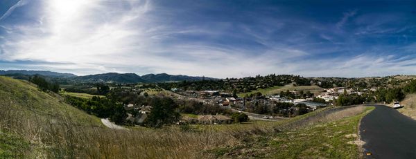
This was a panorama shot overlooking Solvang, California.
Feb 13, 2019 09:58:27 #
I overlooked Anvil's use of the term "color grading" in the opening, so I appreciate abc1234 bringing it up. Here is an article in addition to the You-Tube links:
https://contrastly.com/how-to-color-grade-your-photographs/
Many thanks to you both!
https://contrastly.com/how-to-color-grade-your-photographs/
Many thanks to you both!
Feb 13, 2019 11:29:07 #

I think you achieved your goals on this shot. There is not a whole lot I would change about it. In fact there is nothing I would change on this image.
Feb 13, 2019 12:30:52 #
NJFrank wrote:
I think you achieved your goals on this shot. There is not a whole lot I would change about it. In fact there is nothing I would change on this image.
Thank you!
If you want to reply, then register here. Registration is free and your account is created instantly, so you can post right away.