Trying to get to where I want to go
Feb 9, 2019 17:48:44 #

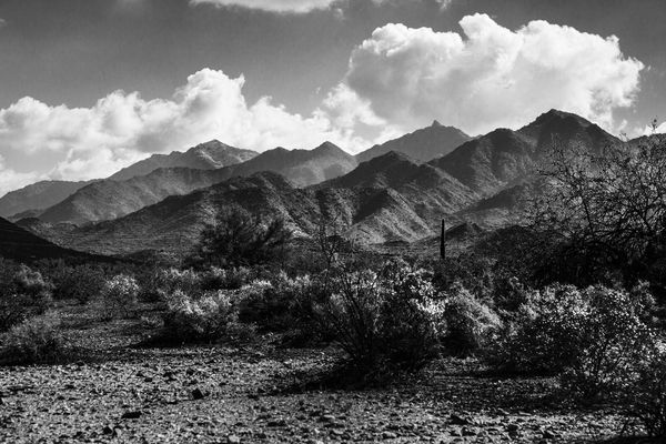
Some time back, I posted a B&W in the landscape section. I got a reworked version of that image from Rich1939 that was really nice. So I asked him how to do it. He had used layers in PS, and unfortunately they just don't seem to work for me. (Maybe it's broken in my PS 
 ?) Anyway, I decided to try NIK. It did pretty well, but the printed version was pretty dark. So I went back into PS and dodged a bit.
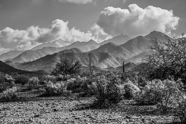
I'm posting Rich's version (with his permission) and my final (to date) version. I'd like to know if y'all think mine is still too dark, first, and what other work might perhaps need to be done.
I'm not too good at PP work, so anything I can learn is appreciated.
?) Anyway, I decided to try NIK. It did pretty well, but the printed version was pretty dark. So I went back into PS and dodged a bit.I'm posting Rich's version (with his permission) and my final (to date) version. I'd like to know if y'all think mine is still too dark, first, and what other work might perhaps need to be done.
I'm not too good at PP work, so anything I can learn is appreciated.
Feb 9, 2019 18:02:42 #

Was some of your dodging done on the bushes? The white highlights break up the dark areas really nicely. You also retained or worked on keeping detail in the clouds. You could make the sky darker if you wished (the red filter in Nik and other tweaks), but for me the mountains are the primary point of interest and more sky drama would compete. I really like how the mountains become less sharp - indicating distance and atmosphere (literal and figurative).
If you haven't tried the color filters in Silver Efex, start with the default conversion (the first one at top left). Scroll to right side controls and go down to the colored circles - filters. Click red and note how that darkens the sky (and other blues). Click through the other colors for ideas, and then scroll further down to the color sliders. Depending on how you want your image (any b&w, not just this one), saturating a specific color while it's still in color can be helpful.
If you haven't tried the color filters in Silver Efex, start with the default conversion (the first one at top left). Scroll to right side controls and go down to the colored circles - filters. Click red and note how that darkens the sky (and other blues). Click through the other colors for ideas, and then scroll further down to the color sliders. Depending on how you want your image (any b&w, not just this one), saturating a specific color while it's still in color can be helpful.
Feb 9, 2019 18:34:34 #
Linda From Maine wrote:
Was some of your dodging done on the bushes? The w... (show quote)
I did do a lot of dodging on the bushes. And I'm thinking I might do more. They still seem a bit dark to me. I also dodged out some of the mountain tops because they were going totally black and I wanted them a bit lighter than that.
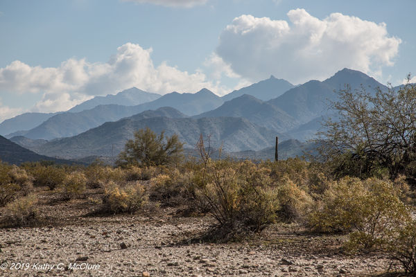
I didn't know there were colour filters in the Silver Efex! I'll look for them. Actually, I had to start all over because I decided I did want the sky a bit darker, and had to go back to the actual colour version to do that. I'll try that. But I do agree with you that I don't want the sky and clouds to overpower the mountain. Thanks!
Feb 9, 2019 19:30:49 #
I like the way you're going with this. I truly don't get those who "edit it and forget it". Your ideas are spot on.
Andy
Andy
Feb 9, 2019 19:41:48 #
Cany143
Loc: SE Utah
B&W tends to be pretty --or almost entirely-- subjective. What works for you doesn't work for someone else, and vice versa. At a glance, there are aspects of Rich's version that are *better*, and aspects of yours that are *better*, but neither quite 'does' it for me. Globally speaking, I find myself 'preferring' some version between your collective two, and I'd want to incorporate aspects, or portions, of both into a third, and presumably more *preferred* version, and to do so, I might start by opening Rich's, then opening yours, then 'select all' of yours and pasting that on top of Rich's as a second layer. Then I'd adjust transparency levels and/or blending options of yours and seek to find the *version* I prefer. (Its doubtful that anything in Photoshop is 'broken' --you just haven't quite found the way/ways to utilize its capabilities. That's not the end of life as we know it. If anything, its a beginning of life as we *can* come to know it.)
Fact is, rather than the above, I'd find it preferable to simply start from the beginning. Whether a raw file or a .jpg, it is what it is, and I'd identify what particular areas need 'more' of something or 'less' of something else, and go from there. Tonal values, local contrasts, this color abuts that color, sharper here or less sharp/diffused there; any or all of those can be had before you touch a slider or investigate what options might be available in some plug-in. If you can see it (in your mind), there's a way --or half a dozen ways-- to actualize it on your computer screen or in a print.
Fact is, rather than the above, I'd find it preferable to simply start from the beginning. Whether a raw file or a .jpg, it is what it is, and I'd identify what particular areas need 'more' of something or 'less' of something else, and go from there. Tonal values, local contrasts, this color abuts that color, sharper here or less sharp/diffused there; any or all of those can be had before you touch a slider or investigate what options might be available in some plug-in. If you can see it (in your mind), there's a way --or half a dozen ways-- to actualize it on your computer screen or in a print.
Feb 9, 2019 20:15:23 #
AndyH wrote:
I like the way you're going with this. I truly don't get those who "edit it and forget it". Your ideas are spot on.
Andy
Andy
Thanks, Andy. That's encouraging.
Feb 9, 2019 20:20:00 #
Cany143 wrote:
B&W tends to be pretty --or almost entirely-- ... (show quote)
Usually, I do my basic development of raw images and stop. Rich opened my eyes to what could be. So I'm trying to figure out ways to get there. Thanks. Actually, having pulled more from the BW, I'm considering doing similar work on the colour image.
Feb 10, 2019 03:14:05 #

You don't mention specifics, but it looks like one of your priorities was to reduce the haze. One of the main influences on haze is the Highlights slider which, along with Contrast and Clarity, are your main dehaze tools*. In your edit the darks have gone too dark, but lifting the Shadows will aggravate the haze. To lighten the darks you need to leave the Shadows slider and use the Blacks. That way you can alleviate the too-dark shadows without re-introducing the haze. Lifting the Blacks will cause a loss of contrast which you can reverse using the Contrast slider, but that will reverse the improvement to the too-dark shadows, so you're looking to find the optimum balance between Contrast and Blacks. Upping the contrast may also make the brights too bright, in which case you can reverse that using the Highlights and Whites sliders.
* Any editor that uses ACR will have a Dehaze slider. It will be informative to deliberately push the Dehaze setting slightly beyond what looks OK and then use the levels sliders in the Basic section to mitigate the unwanted effects of too much Dehaze. The main effect of too much Dehaze is an over-darkening of the darks, which you can mitigate using Blacks and to a lesser extent Shadows (as I said before, lifting the Shadows will aggravate the haze).
* Any editor that uses ACR will have a Dehaze slider. It will be informative to deliberately push the Dehaze setting slightly beyond what looks OK and then use the levels sliders in the Basic section to mitigate the unwanted effects of too much Dehaze. The main effect of too much Dehaze is an over-darkening of the darks, which you can mitigate using Blacks and to a lesser extent Shadows (as I said before, lifting the Shadows will aggravate the haze).
Feb 10, 2019 09:32:16 #
R.G. wrote:
You don't mention specifics, but it looks like one... (show quote)
I think my PS is too old to have the dehaze tool. But I'll look for it. It wasn't the haze in the picture that I was working on deliberately, but it was indirectly. I liked how Rich was able to put separation between the layers of the mountain and sort of "light" the haze that was in the pockets. I usually push my blacks a bit. I'll see where they are and look at that. Thanks, so much, R.G., for the detailed suggestion.
Feb 10, 2019 12:39:08 #

I would say something in between the two would work for me. Both are nice. I'm no expert at black and white. I just know what looks good to me.
Feb 10, 2019 17:51:01 #
kpmac wrote:
I would say something in between the two would work for me. Both are nice. I'm no expert at black and white. I just know what looks good to me.
Thanks, kpmac, for looking in. Can you expand a bit. Is it the contrast? The density? The highlights?
Jul 13, 2019 09:51:19 #
Jul 13, 2019 11:52:47 #

From my experience as Art Appreciation instructor and exhibition juror, your shot is fine, as is Rich's. BTW, it is not just a matter of taste. It IS a matter of the technique and composition all expressing a coherent, unique view of the photographer/artist. Simplifying: Rich's view expresses airiness and distance; yours expresses massiveness and textural presence. Fine work!
Jul 13, 2019 13:39:40 #
Jul 13, 2019 13:40:07 #
artBob wrote:
From my experience as Art Appreciation instructor and exhibition juror, your shot is fine, as is Rich's. BTW, it is not just a matter of taste. It IS a matter of the technique and composition all expressing a coherent, unique view of the photographer/artist. Simplifying: Rich's view expresses airiness and distance; yours expresses massiveness and textural presence. Fine work!
Thanks, Bob. I truly appreciate your comment.
If you want to reply, then register here. Registration is free and your account is created instantly, so you can post right away.