February 7-9 2019-Using Visual Balance for better Photography
Feb 7, 2019 16:25:18 #
judy juul
Loc: Cheshire, Ct.
Rolk wrote:
I've never been good at "book learnin'" stuff, but here's
one I created which I feel has good visual balance enhanced
by color, size and orientation. (Two different orientations
are show.)
Let me know, JJ.
Tim
one I created which I feel has good visual balance enhanced
by color, size and orientation. (Two different orientations
are show.)
Let me know, JJ.
Tim
Look good to me,Tim...Glad you joined us!

Feb 7, 2019 17:02:55 #
judy juul
Loc: Cheshire, Ct.
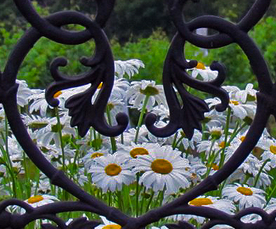
#6 Quantity
Quote- few small objects can balance out a single large object.
Quote- few small objects can balance out a single large object.
Shasta daisies versus wrought Iron
Feb 7, 2019 17:07:23 #
Feb 7, 2019 17:07:30 #

judy juul wrote:
#6 Quantity
Quote- few small objects can balance out a single large object.
Quote- few small objects can balance out a single large object.
Fine example, Judy.
Feb 7, 2019 17:18:28 #
judy juul
Loc: Cheshire, Ct.
Kaskazi wrote:
I dunno - this is all too deep for me!
Nope, not too deep for you! Especially the Isolation! Love it..right on in my book!
Feb 7, 2019 17:27:00 #
judy juul
Loc: Cheshire, Ct.
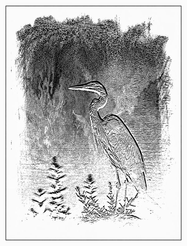
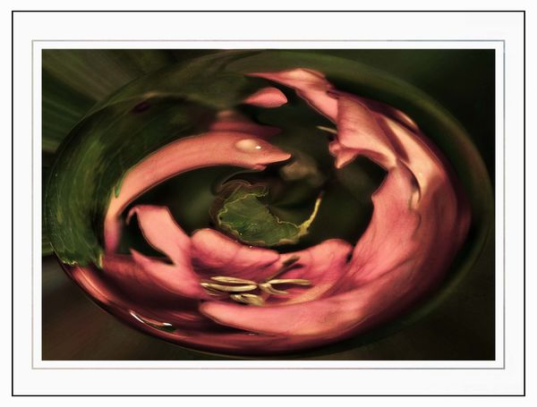
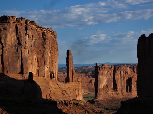
#7 – Orientation
Quote-Vertical objects appear heavier than horizontal objects. A diagonal orientation carries more visual weight than a horizontal or vertical one. Lines can be very powerful in your composition. Pay close attention to them.
#7-Orientation-Eva-polak.
Remember, you don’t have to balance colour with colour, or light with dark – you can mix and match your visual weights. For example, a counterweight to a large, bright area might be a small red object. Experiment with different kinds of balance and play around with visual weight. See what works best for your images and the story you want to tell.
As you go out exploring with your camera on your next photo shoot, keep balance in mind and the seven factors of visual weight. Look closely and try to determine which elements are commanding the most visual weight when you compose your photographs, and see how they affect balance in your images.
Feb 7, 2019 17:28:01 #
judy juul
Loc: Cheshire, Ct.
Roadrunner wrote:
Fine example, Judy.
Thank you , Jim.
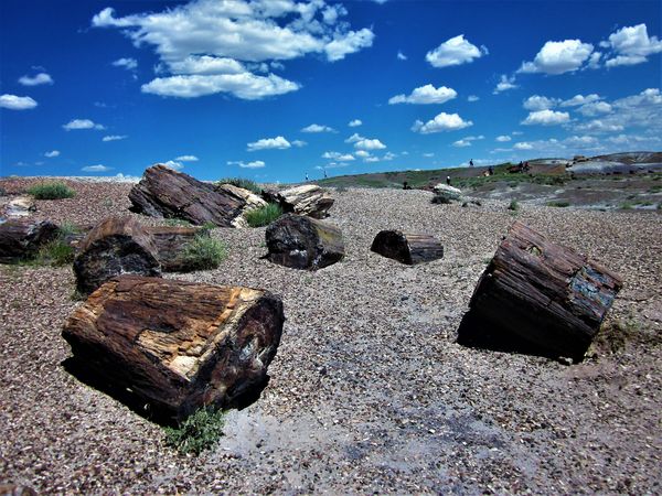
I like those deer in the meadow for orientation!2nd photo pg.4
Feb 7, 2019 17:53:55 #

Using Visual Balance for better Photography
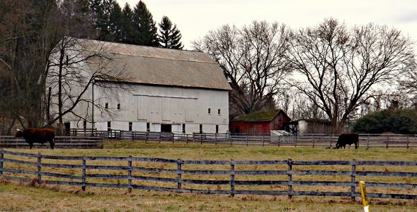
This challenge is probably my most difficult to achieve. Somehow, I guess I just don't get it. So as I'm trying to better understand, I've created this photo. I think it fits on several points.
#2. Size
Large elements appear heavier than small ones. Size is an evident visual weight factor because, in the physical world, an object that’s bigger than another will naturally be heavier, and will take up more physical space. Large elements command more attention. We naturally see them first, or spend more time looking.
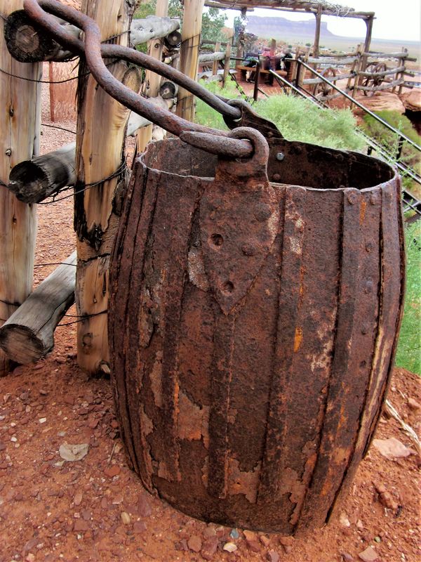
4 – Texture
Texture adds visual weight to items in photographs. Texture is just more interesting and our eyes are drawn to it. Smooth areas will feel lighter than those with a lot of heavy texture.
6 – Quantity
A few small objects can balance out a single large object.
7 – Orientation
Vertical objects appear heavier than horizontal objects. A diagonal orientation carries more visual weight than a horizontal or vertical one.
If, I missed the concept, please feel free to say so. I'm really struggling with this.
This challenge is probably my most difficult to achieve. Somehow, I guess I just don't get it. So as I'm trying to better understand, I've created this photo. I think it fits on several points.
#2. Size
Large elements appear heavier than small ones. Size is an evident visual weight factor because, in the physical world, an object that’s bigger than another will naturally be heavier, and will take up more physical space. Large elements command more attention. We naturally see them first, or spend more time looking.
4 – Texture
Texture adds visual weight to items in photographs. Texture is just more interesting and our eyes are drawn to it. Smooth areas will feel lighter than those with a lot of heavy texture.
6 – Quantity
A few small objects can balance out a single large object.
7 – Orientation
Vertical objects appear heavier than horizontal objects. A diagonal orientation carries more visual weight than a horizontal or vertical one.
If, I missed the concept, please feel free to say so. I'm really struggling with this.
Feb 7, 2019 18:31:50 #

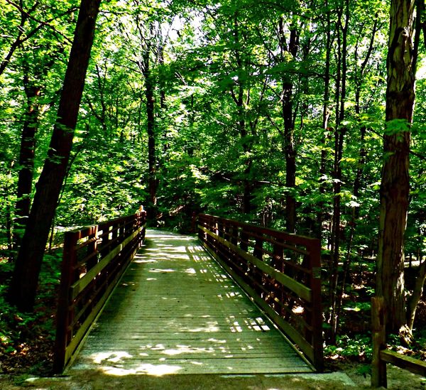
danersmiff wrote:
your 2nd bridge, the 2 trees, and the 2 cats...
Thanks danersmiff!
Feb 7, 2019 18:42:44 #
Feb 7, 2019 19:08:04 #
Using Visual Balance for better Photography
1 – Color
Color has many properties that can affect an object’s visual weight relative to others in the photograph, such as saturation, brightness, darkness, and hue. Warm colors advance into the foreground and tend to weigh more than cool colors, which recede into the background. Red attracts attention better than any other color, and thus has the highest visual weight as opposed to yellow, which has the least visual weight. Also bright colors attract more attention than subdued colors.
Feb 7, 2019 19:14:02 #
Kaskazi
Loc: Ontario, Canada
judy juul wrote:
Nope, not too deep for you! Especially the Isolation! Love it..right on in my book!
Well thank you Judy! But I'm struggling actually to figure out why I like some of my shots much more than others - perhaps it has partly to do with an unconscious application of balance principles. Hhmmm, application or sheer luck?
Feb 7, 2019 19:30:05 #

Feb 7, 2019 19:51:12 #

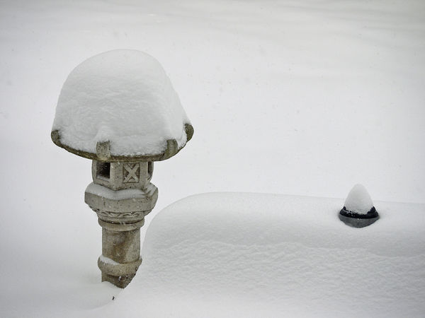
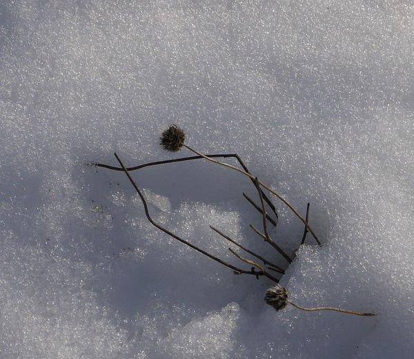
Yes and yes. Size, and big vs little, isolated in the snow, ditto for the 2nd, isolation,
Kaskazi wrote:
I dunno - this is all too deep for me!
Feb 7, 2019 19:59:19 #
Visual Balance for better photography.....
Balance
(Download)
Isolation & texture
(Download)
Color & orientation
(Download)
Value - Shadow & Light
(Download)
If you want to reply, then register here. Registration is free and your account is created instantly, so you can post right away.