What is flat B&W?
Feb 3, 2019 14:01:06 #

melueth wrote:
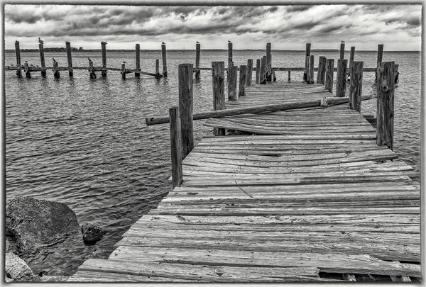
When i first went colorblind, (  ) i posted a B&W here and was told that it seemed flat . . . i'm tweaking things much more now, and i think i get the definition, but i'm still a little unsteady about it. Is there a good definition of flat as it applies to B&W photography, or is it more intuitive - you either 'get it' or you don't? Here's another that i recently drained the color out of. Thoughts?
Marylea
) i posted a B&W here and was told that it seemed flat . . . i'm tweaking things much more now, and i think i get the definition, but i'm still a little unsteady about it. Is there a good definition of flat as it applies to B&W photography, or is it more intuitive - you either 'get it' or you don't? Here's another that i recently drained the color out of. Thoughts?Marylea
I would simply say that a flat b&w photo is lacking in contrast, having a narrow tonal range.
Feb 3, 2019 15:52:17 #

fergmark wrote:
Just a comment following Paul's excellent advice. With b/w its often necessary to clip the lights and darks to make it happen, and doing so, with this really nice shot, does the trick.
Thanks fergmark! About to post a re-dux, trying to take into account tips given here.
ML
Feb 3, 2019 15:53:01 #
DWU2 wrote:
I would simply say that a flat b&w photo is lacking in contrast, having a narrow tonal range.
Thank you! My thoughts as well, as i continue to learn this genre.
ML
Feb 3, 2019 16:50:10 #
srt101fan wrote:
Great shot, Marylea. Don't know who said, and in what context, that one of your B&W images seemed "flat". Current photographers (and audiences) generally seem to prefer bold, super-saturated, "in your face" colors. Subtlety and muted colors are out. So it's reasonable to expect them to also prefer strong visual impact in B&W?
Well srt101fan - this seems to be an area of post-processing that brings out a great deal of opinions on the presentation. It's a tad confusing as i attempt to plow forward, so i think that i'll attempt the suggestions given here, but still rely on what my currently inexperienced eye prefers! Thank you for you kind comments!
Marylea
Feb 3, 2019 16:53:54 #
R.G. wrote:
Instead of the word "flat", my preferenc... (show quote)
R.G. - lots to consider here, and i thank you for the time you've taken to help me in this quest. I truly enjoy working in the subtleties of B&W, and you are a true encouragement. I need to study this genre more. (Clearly!
 )
)ML
Feb 3, 2019 16:54:54 #
Linda From Maine wrote:
Marylea, I think your composition is wonderful. I'... (show quote)
Thank you so much Linda - your comments introduce other ideas that i'd not considered.
ML
Feb 3, 2019 17:09:33 #
OK, so here's new rendition . . . i did not adjust the clouds as well as Paul had suggested, but i realized that the original image had very dark shadows in the clouds to begin with, and i wanted to bring that out. I managed to bring out the wood grain more in this one, and got rid of the little distraction to the right. Maybe too overcooked . . . ??? Sorry if i'm belaboring this one! Just trying to learn . . .
Marylea
Marylea
Feb 3, 2019 17:16:39 #

Looking good, although I agree it crosses now toward overdone. You might still look at brightening the entire frame by adjusting the exposure. Depending on your tool, you might also see how it looks by cutting the black adjustment by 50% in terms of the overcooked aspect. Or maybe, just lowering the contrast slider as it's the fine details that really jump out in this version.
Feb 3, 2019 17:21:19 #

melueth wrote:
This thread is one of the best reasons to have a PP Forum in my not-so-objective opinion ... Sorry if i'm belaboring this one! Just trying to learn . . . Marylea
Some parts of this I like better than the original for sure, but it's really all about your own satisfaction. Keep inspiring us with your energy and desire to learn!
Feb 3, 2019 18:02:36 #

melueth wrote:
When i first went colorblind, ( ) i posted a B&W here and was told that it seemed flat . . . i'm tweaking things much more now, and i think i get the definition, but i'm still a little unsteady about it. Is there a good definition of flat as it applies to B&W photography, or is it more intuitive - you either 'get it' or you don't? Here's another that i recently drained the color out of. Thoughts?
Marylea
) i posted a B&W here and was told that it seemed flat . . . i'm tweaking things much more now, and i think i get the definition, but i'm still a little unsteady about it. Is there a good definition of flat as it applies to B&W photography, or is it more intuitive - you either 'get it' or you don't? Here's another that i recently drained the color out of. Thoughts?Marylea
There really isn't much wrong with the original image that can be significantly tweaked in post processing without taking it too far.
The real issue is that it was taken on a cloudy-bright day (almost no shadows) and that's why the scene seems to lack mid-tone contrast.
I'm sure you could return to this location on a sunnier day and get a snappier image. The clouds might even be better with some blue sky around them. That will make the B&W conversion more rewarding as you suppress some of the blue light.
Feb 3, 2019 19:05:54 #
CHG_CANON wrote:
Looking good, although I agree it crosses now toward overdone. You might still look at brightening the entire frame by adjusting the exposure. Depending on your tool, you might also see how it looks by cutting the black adjustment by 50% in terms of the overcooked aspect. Or maybe, just lowering the contrast slider as it's the fine details that really jump out in this version.
Paul - i worked with those sliders in a big way . . . but nothing seemed to lighten those clouds. The only way i think i could affect that change would be to work in layers, which i really didn't have time to do today (squeezed a 6 mile hike into the mix, and now it's Superbowl time!). BUT . . . i agree - the sky in particular looks a tad overcooked. Thank you for your helpful thoughts and comments - i really appreciate it. Even if i don't come up with a perfect mix on this one, i've learned a lot. Thanks again!
Marylea
Feb 3, 2019 19:08:10 #
selmslie wrote:
There really isn't much wrong with the original im... (show quote)
Selmslie - you are exactly right - the blue tone on that cloudy day predominated this shot. I literally lowered the blue saturation before i even took it into Silver Efex, but it only translated into darker clouds with the contrast. Hopefully we'll get back there soon. It's only a couple of hours away. Thank you so much for commenting!
Marylea
Feb 3, 2019 19:09:16 #
Linda From Maine wrote:
This thread is one of the best reasons to have a PP Forum in my not-so-objective opinion
Agreed! I needed this, and maybe it helped some others!
ML
Feb 4, 2019 07:22:18 #

There has been some excellent advice given so far to tweaking the image. So I will just comment on the composition. I, very much like it. I feel that I am standing there taking in the view. The clouds and birds are a definite plus.
Feb 4, 2019 07:26:42 #
NJFrank wrote:
There has been some excellent advice given so far to tweaking the image. So I will just comment on the composition. I, very much like it. I feel that I am standing there taking in the view. The clouds and birds are a definite plus.
Thanks very much, NJFrank!
If you want to reply, then register here. Registration is free and your account is created instantly, so you can post right away.