A Tree of Paper
Feb 2, 2019 20:01:35 #
wdross
Loc: Castle Rock, Colorado
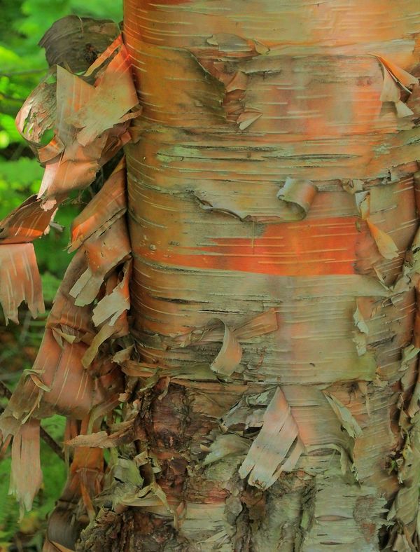
I was looking through some older photos and would like opinions on this one.
Feb 2, 2019 20:51:50 #

I like the subject and the close framing. There's a lot of interest in all the shapes and textures.
The contrast of oranges and greens is engaging, also. I'd like to see the image tweaked a little bit for sharpness and perhaps curves or levels to separate mid-tones from lighter (whites).
The contrast of oranges and greens is engaging, also. I'd like to see the image tweaked a little bit for sharpness and perhaps curves or levels to separate mid-tones from lighter (whites).
Feb 2, 2019 22:42:22 #
wdross
Loc: Castle Rock, Colorado
Linda From Maine wrote:
I like the subject and the close framing. There's a lot of interest in all the shapes and textures.
The contrast of oranges and greens is engaging, also. I'd like to see the image tweaked a little bit for sharpness and perhaps curves or levels to separate mid-tones from lighter (whites).
The contrast of oranges and greens is engaging, also. I'd like to see the image tweaked a little bit for sharpness and perhaps curves or levels to separate mid-tones from lighter (whites).
Thank you Linda. I can always count on you for a good eye and helpful suggestions.
Feb 3, 2019 03:56:18 #
wdross
Loc: Castle Rock, Colorado
Linda From Maine wrote:
I like the subject and the close framing. There's a lot of interest in all the shapes and textures.
The contrast of oranges and greens is engaging, also. I'd like to see the image tweaked a little bit for sharpness and perhaps curves or levels to separate mid-tones from lighter (whites).
The contrast of oranges and greens is engaging, also. I'd like to see the image tweaked a little bit for sharpness and perhaps curves or levels to separate mid-tones from lighter (whites).
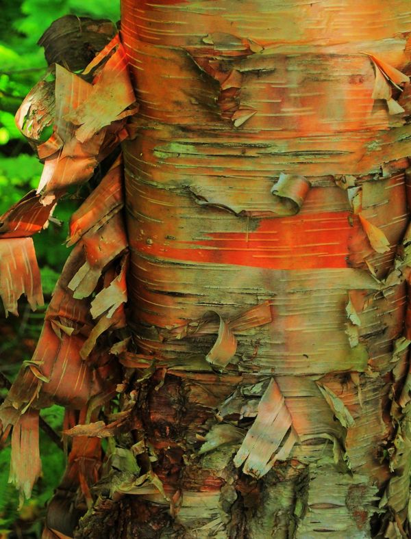
Like this one a little better?
Feb 3, 2019 07:36:21 #
wdross wrote:
The orange might be going into the fanciful realm a bit now, but it's your opinion that counts. Do you like the clarity better or prefer original?Like this one a little better?
Feb 3, 2019 07:50:33 #

This type of shot more than most depends on visual impact for its effectiveness. I haven't tried adjusting it but I get the impression that it could do with more contrast and Clarity. I suspect that if you give it more contrast you'll have to watch out for two things - the extremes becoming too dark/bright and the colours becoming too garish. I would say the colours are already right at the saturation limit and any more boosting will put them beyond the point where they're starting to look garish (which is what more contrast will do). And some extra sharpening may help the shapes and textures to stand out.
EDIT - I've just seen your update and the colours are too strong. Plus it might benefit from a little lightening.
EDIT - I've just seen your update and the colours are too strong. Plus it might benefit from a little lightening.
Feb 3, 2019 09:50:15 #

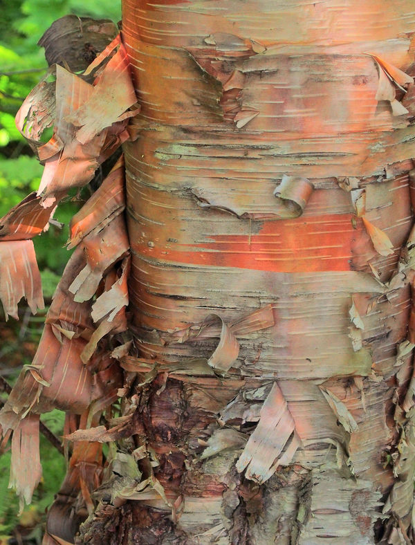
It looks over saturated, and to my eye there is a green cast. I love the bark on these trees. I tried to give the bark a little more dimension, contrast and sharpness, while toning down the slightly garish ( R.G.) appearance and maintain some softness.
Feb 3, 2019 09:59:19 #

Feb 3, 2019 12:58:43 #

It (first one) seems closer to celebrating the richness without over saturating if the green, yellow, and red are desaturated to the point of naturalness or just a bit above, then sharpening. It's a beautiful discovery then, fulfilling the artistic ideal of seeing the ordinary in a new way.
As you've done it is fine of course, if you wanted a powerful semi-abstract.
As you've done it is fine of course, if you wanted a powerful semi-abstract.
Feb 3, 2019 16:56:43 #

First, let me say most people with or without a camera would walk right by it and not give it a second thought. The color saturation in my opinion is completely subjective. Of course to a point. No need to go overboard. I like the orginal but as you have shown a little tweaking is not changing the image. but bring it up notch or two . For me that is a good thing.
Feb 3, 2019 17:07:36 #
wdross
Loc: Castle Rock, Colorado
Rab-Eye wrote:
I’m afraid I don’t find this image compelling.
Thank you for at least giving it a look. This is not a shot that is going to be liked by everyone. This is more of what my former camera club members and pro photographer teacher would call a "judge's shot". They talked about how people entering a photo contest or competition would try and find out who the judge(s) were going to be. If the judge liked barns, then they would enter barn shots. If the judge liked cars, then they would enter car shots. If the judge liked travel, then they would enter travel shots. Of course, that is a "double edged sword". If he was really good at the photo subject, the judge could end up being super critical of the pictures. Sometimes having a technically good shot of an interesting subject was a better pick and had a better chance to place in the competition. This shot was just a "what do you think" and not everyone is going to think about it.
If you want to reply, then register here. Registration is free and your account is created instantly, so you can post right away.