PP Before and After redone !
Jan 31, 2019 13:06:25 #
Greg Huntsinger
Loc: Battle Ground WA.
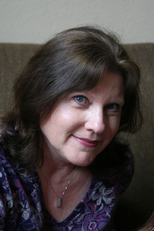
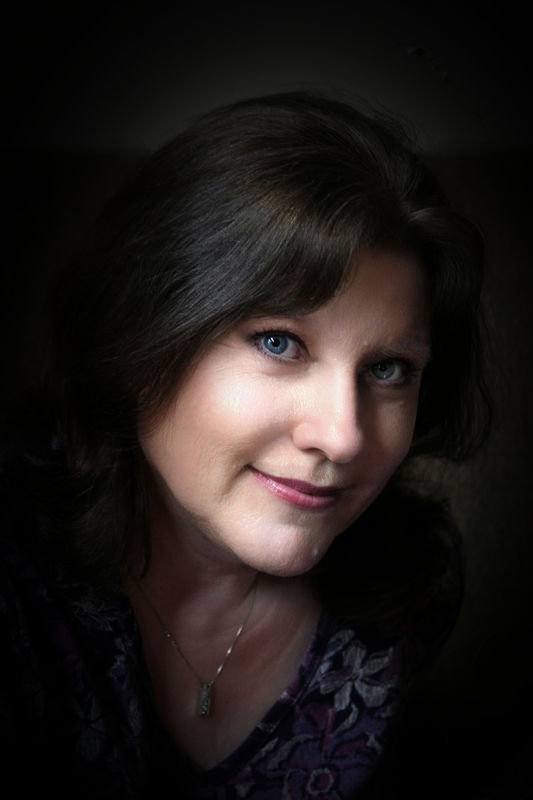
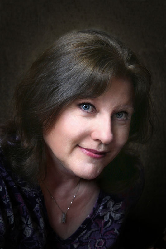
I did not like the line going through the head on the background. Added more light to the subject's left side, lightened the hair, and toned down the highlights on cheek and nose. Thanks for the previous comments. Here is a before and after 1,2,3
Jan 31, 2019 13:10:33 #

Very interesting to compare #2 and #3. Her hair is beautiful, as of course are her eyes. I still like #2 for a bit of mystery and drama. Thanks for the follow-up!
Jan 31, 2019 14:19:21 #

Jan 31, 2019 15:00:39 #

Jan 31, 2019 16:38:56 #

I really like the results! The only thought I had yesterday, and again to day, is to have less open space above her head. You can scroll your browser over the image and use the top of the window to "see" a crop where that top space is divided into 1/3rds and you keep just 1/3 of the open space.
Feb 1, 2019 06:53:02 #

Feb 1, 2019 07:54:51 #
Linda From Maine wrote:
Very interesting to compare #2 and #3. Her hair is beautiful, as of course are her eyes. I still like #2 for a bit of mystery and drama. Thanks for the follow-up!
Of course, Linda is right... #2 is the winner.
Feb 1, 2019 08:25:17 #

I too like ALL three, beautiful work and model.
However, I really do not care for the small "white" spot on her left side of her chin.
To me, the spot really stands out in all three photos, however,
I think the white spot is greater in #2 than #1 & #3.
Excellent post processing though!!!
Dave
However, I really do not care for the small "white" spot on her left side of her chin.
To me, the spot really stands out in all three photos, however,
I think the white spot is greater in #2 than #1 & #3.
Excellent post processing though!!!
Dave
Feb 1, 2019 09:07:24 #

Greg Huntsinger wrote:
I did not like the line going through the head on the background. Added more light to the subject's left side, lightened the hair, and toned down the highlights on cheek and nose. Thanks for the previous comments. Here is a before and after 1,2,3
I prefer no. 3 as having all the right highlights and shadows. Very well done and balanced!
Feb 1, 2019 09:38:24 #
Beautiful work and results are worth the time and effort. IMO, #2 and #3 - choice between would be personal and the "feeling" you wish to convey as well as portrait purpose. One to be used for a professional business portrait? If so, #2 would be my choice - especially for an "actress", "singer" publicity photo because it is different and would be remembered. Personal use? For family? #3 would get my vote. The skin bump left chin - unless that is a characteristic mark of the subject, I would remove it.
Feb 1, 2019 18:17:42 #

Its now difficult to choose between #1 and 2, as others seem to have found. Both are very nice and I think I’d try for #2 generally, with the lightened area around the right hand hair of #3 blended-in. Agree with the comment of the chin imperfection - but if the model would be upset by its removal, simply tone it down a little. Beautiful portrait.
Feb 1, 2019 18:18:49 #

I'm pleased to see a kind of workshop environment in this section. Folks offering various opinions and trying various approaches to the same image is a good way of creating beneficial learning experiences. Besides retouching of portraits there's also an opportunity to tweak composition, color or tonal balance, de-emphasize or remove distractions and or add any number of textures or special effects of required.
For me, portrait retouching goes back a long- very long way and it's funny in that I am not a retoucher per se. Traditionally, busy high end portrait studios had resident retouchers in that most photograhers did not have time to do all their retouching and darkroom work. There were also many freelance retouchers who did work for individual portraitists.
The freelance retouchers or operators running a outsourced retouch service would receive negatives and prints and, of course, they had to work with whatever the received as to contrast, density, head size and even film and paper types and surfaces. Sometimes they would encounter difficulty in that some negatives presented various issues that made retouching problematic. The resident retouchers or photographers who did or do their own retouching were/are working at an advantage in that the coud coordinate their shooting techniques to facilitate more efficient and effective retouching results.
This is why I encourage anyone who is interested in portraiture AND post processing retouching to attempt to do as much what I like to call "pre-retouching" or "optica retouching", that is applying aesthetically pleasing lighting, posing, camera angles, perhaps diffusion or soft focus in certain cases so that post processing retouching is minimized.
It's important to talk to the subject well before the session to determine their expectations as to aesthetics and retouching. Some undesirable features can be dealt with by clothing stylizing and "camouflaging". Heavy makeup is not usually necessary but lightly and expertly applied, it can solve many problems. Some issues such as "multiple chins", asymmetrical facial structures, lazy, deep set or different size eyes, sagging skin, broken nose lines and more are best addressed at the camera simply because many of theses things are murder to retouch and natural results are difficult to achieve.
It may see very "old school" but I always show paper proofs. I can project them in my opaque projector to show various sizes. This is especially important because we can go over retouching details with the subject (client). This way there is no ambiguity as to removal of moles, birth marks etc. I will usually remove blemishes or anything that is a the result of illness, injury or a dermatological condition assuming that these will hopefully be healed, treated, corrected etc.
Feb 1, 2019 18:25:05 #
E.L.. Shapiro wrote:
Your time and experience are much appreciated, Ed!I'm pleased to see a kind of workshop environment in this section. Folks offering various opinions and trying various approaches to the same image is a good way of creating beneficial learning experiences.
Feb 1, 2019 19:52:44 #

Greg Huntsinger wrote:
I did not like the line going through the head on the background. Added more light to the subject's left side, lightened the hair, and toned down the highlights on cheek and nose. Thanks for the previous comments. Here is a before and after 1,2,3
#2 for me. I love the skin tone, the way the light hits just the right places to highlight the face and the mysterious look of the photo as a whole. Well done. A very pretty subject and I know she must love it.
Feb 2, 2019 15:35:31 #
TBerwick
Loc: Houston, Texas
I like the highlight in the hair of #3 as her head doesn't disappear into the background. I agree with the crop comment above in that just a little less space above the head enhances the appearance.
If you want to reply, then register here. Registration is free and your account is created instantly, so you can post right away.