Crop questions
Jan 15, 2019 09:02:07 #

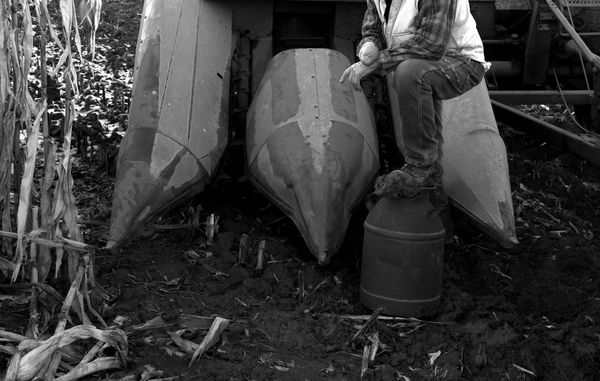
I recently posted this image in the photo gallery, but would like to offer it here for a more in-depth analysis. Does this crop work? I am considering entering it in a "farming/agriculture" category of a local contest. It is sized for an 8x10, which the required entry print size. My purpose for the unusual crop is to convey the often harsh reality and danger of farming. Also, I could not get my father-in-law to not smile in the full version, which did not fit the mood I was going for (although it does show his overall optimism) I am limited by the rules of the contest as to adjustments I am allowed to make. Converting to B/W, cropping, contrast is about it for allowable edits. I appreciate your feedback.
Jan 15, 2019 09:08:24 #

Will most people who view the photo know what the equipment is? I had no clue, so I spent some time trying to figure it out. That may be good, or not; I don't know.
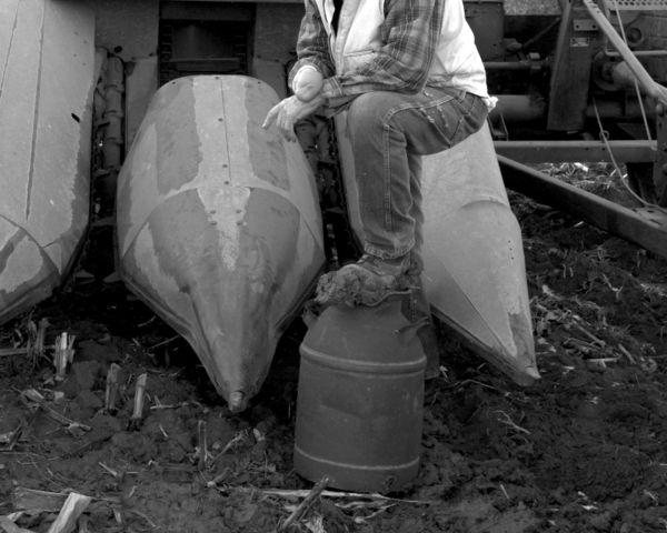
It also took some time to notice that your father-in-law is missing his hand. Here is an 8x10 that better emphasizes the "danger" part of the story IMO.
It also took some time to notice that your father-in-law is missing his hand. Here is an 8x10 that better emphasizes the "danger" part of the story IMO.
Jan 15, 2019 10:14:13 #
I appreciate you pointing out that what is obvious to me from "being in the business" may not be understood by others. Perhaps I should try it in color with a different crop. Thank you! 
Jan 15, 2019 17:09:11 #

Haymaker wrote:
I recently posted this image in the photo gallery,... (show quote)
I agree that a tighter cropping focuses on what you want to convey, as does more contrast. Subtly powerful pic. I left in a bit of the crop roughage because I think that reinforces the idea of the power of machines.
Jan 15, 2019 17:59:21 #

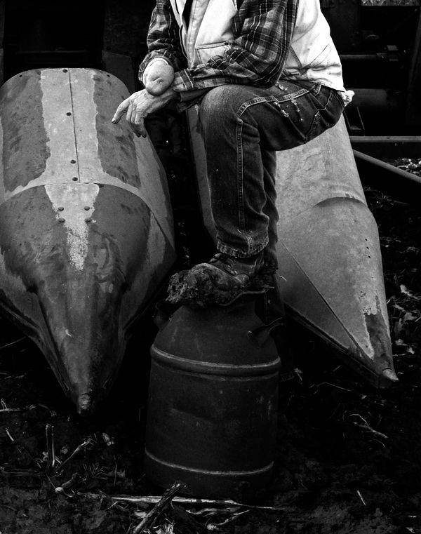
I understand and appreciate what you are trying to convey. However, the cropped out head simply looks like a mistake to me. 
Jan 16, 2019 06:14:32 #

It feels rather awkward to me. The missing head is too much of a ‘miss’ and sort of makes a connection with the missing hand - as if there’s some attempt at making a point with the image, if you see what I mean. Otherwise, ArtBob’s adjustments look good, but may be a tighter crop than you wish. Whatever you go for, there’s a danger of the hand becoming the point of focus as it’s so central.
Jan 16, 2019 09:08:18 #
magnetoman wrote:
It feels rather awkward to me. The missing head is too much of a ‘miss’ and sort of makes a connection with the missing hand - as if there’s some attempt at making a point with the image, if you see what I mean. Otherwise, ArtBob’s adjustments look good, but may be a tighter crop than you wish. Whatever you go for, there’s a danger of the hand becoming the point of focus as it’s so central.
You have explained exactly what I was trying to convey! The hand, or lack thereof, is meant to be the "subject" with the machinery indicating the source of his missing limb. His head being not in the image was to add to the jarring effect. I am just not certain people will "get it"
Jan 16, 2019 09:09:08 #
Bmac wrote:
I understand and appreciate what you are trying to convey. However, the cropped out head simply looks like a mistake to me.
That was what I was afraid of. It jars my eye, too.
Jan 16, 2019 09:13:15 #
artBob wrote:
I agree that a tighter cropping focuses on what you want to convey, as does more contrast. Subtly powerful pic. I left in a bit of the crop roughage because I think that reinforces the idea of the power of machines.
I like what you have done here, thank you! It goes against the composition "rules" though, by not showing the third cone. Then again, I did crop out his head, so rules are already being broken
Jan 16, 2019 09:34:28 #
Haymaker wrote:
You have explained exactly what I was trying to convey! The hand, or lack thereof, is meant to be the "subject" with the machinery indicating the source of his missing limb. His head being not in the image was to add to the jarring effect. I am just not certain people will "get it"
Success then! I just didn’t realise I was getting the intent, but I’m not sure that matters if it had exactly the right affect upon me.
If you want to reply, then register here. Registration is free and your account is created instantly, so you can post right away.