Reworked
Jan 12, 2019 10:42:07 #

CLF wrote:
Kathy, it is a subtle change but I like it for that reason. You preserved the overall beauty of the photo. I know it is my $.02, so take it for what it is worth. 
Greg
Greg
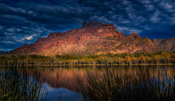
Thanks, Greg. The effect on the clouds didn't look subtle to me! But the changes in the reed portion was - and was nice. I appreciate your $.02!
Jan 12, 2019 11:01:36 #

I liked the first version, and the second as well. Have you thought to blend the two?
Jan 12, 2019 11:18:24 #
GreyOwl40
Loc: Quebec City
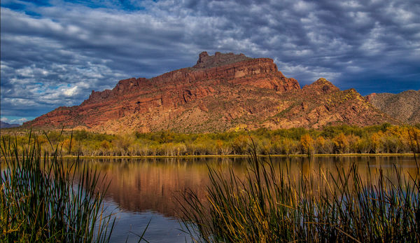
Kathy, I actually like the original version better. To me the top of the mountain now looks washed out. The dark reeds in the original added contrast and gave the photo a certain richness that, while not absent in the reworked version, has not been enhanced. I thought that the original was an excellent photo. Just my opinion.
Jan 12, 2019 11:43:52 #
fergmark wrote:
I liked the first version, and the second as well. Have you thought to blend the two?
Actually, since I have no clue how to do that, no it hadn't occurred to me. And thanks for being interested in my image! I really do appreciate it.
Jan 12, 2019 11:47:10 #
GreyOwl40 wrote:
Kathy, I actually like the original version better. To me the top of the mountain now looks washed out. The dark reeds in the original added contrast and gave the photo a certain richness that, while not absent in the reworked version, has not been enhanced. I thought that the original was an excellent photo. Just my opinion.
Thanks, GreyOwl40. Honestly, I think I agree with you - especially about the top of the mountain. The darkness of it didn't bother me, but it did several others whose opinions I value. And they thought it was "fixable." That's what prompted me to start working on it more. I actually do think there has been an improvement in the reeds.
Jan 12, 2019 11:57:11 #
AzPicLady wrote:
Actually, since I have no clue how to do that, no it hadn't occurred to me. And thanks for being interested in my image! I really do appreciate it.
Assuming using PS, and no cropping differences between the two, or size difference, open them both up and drag one onto the other. Align, should snap into the corner, and use the fill slider in the layers panel to adjust the percentage of one image to the other. then flatten the layers in the layers dropdown at the top. Give it a whirl.
Jan 12, 2019 12:06:17 #
fergmark wrote:
Assuming using PS, and no cropping differences between the two, or size difference, open them both up and drag one onto the other. Align, should snap into the corner, and use the fill slider in the layers panel to adjust the percentage of one image to the other. then flatten the layers in the layers dropdown at the top. Give it a whirl.
I'll try that. Thanks!
Jan 12, 2019 15:54:43 #
AzPicLady wrote:
A few days back, I posted two pictures of Red Moun... (show quote)
Here I go---way out on a limb.
I sorta like the way to did your re-edit. First I added a whole lot of sharpness across the red rocks. But the more I looked at it I thought a crop might help so I cropped some sky, some reeds from the bottom and a bit off the right. I thought this made the mountain a bit more dominate. The I got to thinking I generally under expose my images to bring out more color and add some punch without changing vibrance which I think looks phony. When I did that, I the noticed that the red rock seemed to glow. So... using the radial filter in light room i added a oblong mask diagonally across the red rocks, added a bit of yellow and ---- you have the second image.
You can now forget i ever suggested any of this.
Jan 12, 2019 16:53:46 #
treadwl wrote:
Here I go---way out on a limb. br I sorta like ... (show quote)
You certainly made a striking and one I would never have even thought about. Thank you. I'll have to play with that idea. I really aporeciate your work on my image!
Jan 12, 2019 18:33:13 #

Looks nice to me. The only suggestion I would make is to select the sky and do some noise reduction there. Nice job.
Jan 12, 2019 19:39:00 #
yssirk123 wrote:
Looks nice to me. The only suggestion I would make is to select the sky and do some noise reduction there. Nice job.
I hadn't paid attention to that. Thanks for pointing it out.
Jan 12, 2019 20:04:01 #
Jan 12, 2019 20:15:43 #
bertloomis wrote:
It looks great.
Thanks so much, Bert. I appreciate your comment.
Jan 12, 2019 22:46:41 #
Jan 13, 2019 07:40:29 #
Vince68 wrote:
Not over the top at all. It looks fine to me.
Thank you, Vince. So good to hear from you and read your good comment.
If you want to reply, then register here. Registration is free and your account is created instantly, so you can post right away.