Square, Plumb & Level - Need Not Apply
Jan 6, 2019 16:22:57 #

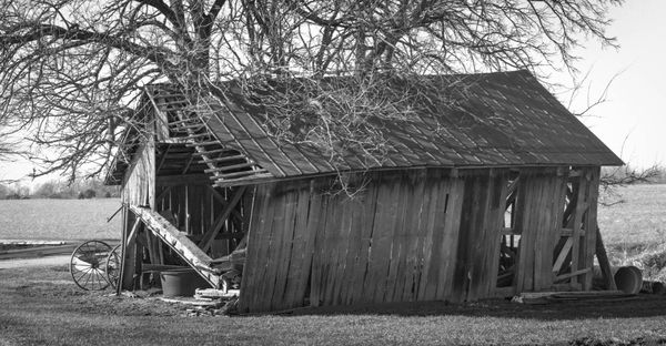
I was out shooting lighthouses, but keeping my eyes open for interesting stuff while driving. This barn grabbed my attention as it was clearly losing its struggle with the tree. Shot with an Intrepid 4x5 with a Nikon 150/5.6 lens. HP5+ developed in HC110 (B). Interested in yall’s input.
Jan 6, 2019 16:44:45 #
Old Timer
Loc: Greenfield, In.
Old dilapidated are always a good subject for photographers and artist. It seems that nostalgia from days past are intriguing.
Jan 6, 2019 17:15:17 #

Jan 6, 2019 19:04:31 #
Cany143
Loc: SE Utah
A criticism I have with images like this is that they tend to center the subject (barn, shed, house, what-have-you) in the frame and all but eliminate foreground, side-ground, background and/or sky. The inclusion of one or more of those non-barn elements often provides a context --the thing in its setting-- that strengthens the overall composition, not to mention the image's overall impact. This is, of course, just my opinion, but its an opinion shared by many. With regard to your image as presented, seems like its contrast could be bumped up a bit, or the blacks made deeper and the whites made stronger while detail was retained in each. Defined tree shadows on the roof indicate there was direct sunlight, and those, along with the shadowed side of the structure, seem weaker than might've been seen in actuality, no?
Again, these are little more than my opinions, and how you --or anyone-- choose to shoot/process an image should be entirely up to them, not me. But I take it on faith that those who shoot (or have shot with) large format b&w are often more exacting.
Again, these are little more than my opinions, and how you --or anyone-- choose to shoot/process an image should be entirely up to them, not me. But I take it on faith that those who shoot (or have shot with) large format b&w are often more exacting.
Jan 6, 2019 19:48:16 #
Cany143 wrote:
A criticism I have with images like this is that t... (show quote)
Well that is a limitation with using 4x5 film. With digital, you've got a lot more options for cropping and framing.
Jan 6, 2019 20:05:18 #
Cany143
Loc: SE Utah
rgrenaderphoto wrote:
Well that is a limitation with using 4x5 film. With digital, you've got a lot more options for cropping and framing.
I disagree, rg. Large format shooters can take 20 steps forward or backward, right or left, or use a wider or a shorter lens, the same as a digital shooter can do. The only difference is that once the neg has been (wet) processed, it has to be scanned, and any (or no) further processing/cropping can be done as one chooses.
Jan 6, 2019 20:42:46 #

Shutterbug57 wrote:
I was out shooting lighthouses, but keeping my eyes open for interesting stuff while driving. This barn grabbed my attention as it was clearly losing its struggle with the tree. Shot with an Intrepid 4x5 with a Nikon 150/5.6 lens. HP5+ developed in HC110 (B). Interested in yall’s input.
Good find.
Jan 6, 2019 21:23:29 #
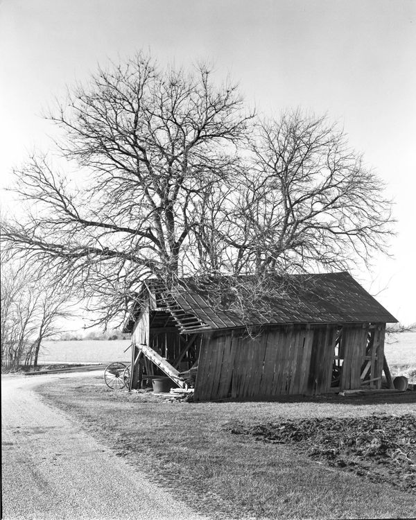
Here is the full shot. This is the same negative, just not cropped. I have jazzed up the blacks and contrast as you requested. It presents a different scene with less obvious detail on the barn and more blank sky and tree, as well as the plowed field in the foreground right. I thought the road, while eventually turning toward the barn (behind it) was leading the eye away from the barn. I prefer the more intimate look at the barn, but I also understand why some might prefer this view. I do, however, appreciate the input.
As for croppability of a 4x5 negative, there is tons of data from which to choose (depending on how it is scanned or printed). There is enough detail in the picture I originally posted to digitally print it 19" wide and have a good looking print - and that is taking up about 20% of the negative.
Thanks to all for looking and further discussion is appreciated.
ETA - I don't know what the web site software does to uploaded images, but the second shot looks much more contrasty in Lightroom, on the same monitor. On the web site, it appears to be essentially the same as in both shots.
Jan 7, 2019 06:10:58 #

Jan 7, 2019 07:34:12 #

I love those old buildings. I hate to see them falling into disrepair, but I understand why.
Jan 7, 2019 08:08:32 #
I like the 2nd one. It really captures the setting and feel of the land.
Jan 7, 2019 08:36:32 #
dvblair2003
Loc: Blountstown Fl
Plieku69 wrote:
I like the 2nd one. It really captures the setting and feel of the land.
Ditto
Jan 7, 2019 09:48:03 #
Shutterbug57 wrote:
Here is the full shot. This is the same negative,... (show quote)
Now, this uncropped 2nd image is a much more interesting photo composition. Notice how the path in the lower left corner pulls you right into the building's entrance. This is much better than "just another old building". Also the tree tends to overshadow the building, like a sentinel standing guard---as a matter of fact that could be a good name for this image---"the old oak sentinel"...... I could list another 10 or so things about how much better the composition is in the 2nd photo, but you get idea that sometimes more is better.
Jan 7, 2019 09:55:19 #
tomcat wrote:
Now, this uncropped 2nd image is a much more inter... (show quote)
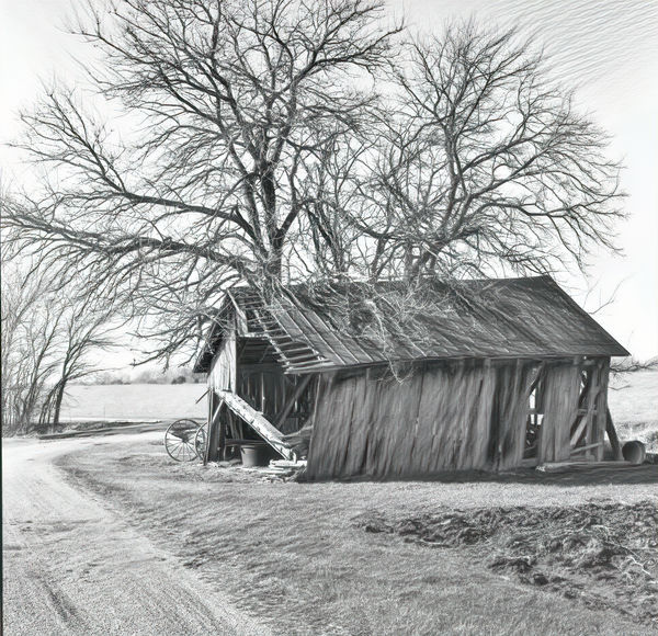
I just had to play with this in Topaz and popped on a couple of Adjustment layers. I really like your 2nd image so much better. Now this image is not "just another old building", and it has character with that path.....
Jan 7, 2019 09:56:13 #
tomcat wrote:
I just had to play with this in Topaz and popped on a couple of Adjustment layers. I really like your 2nd image so much better. Now this image is not "just another old building", and it has character with that path.....
oops. I forgot to straighten the horizon, but you can do that too
If you want to reply, then register here. Registration is free and your account is created instantly, so you can post right away.