Maine coast, color and black and white
Jan 6, 2019 11:42:18 #

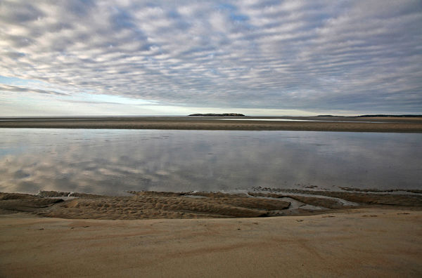
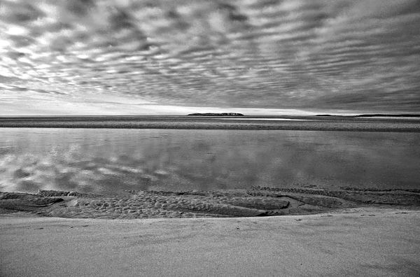
Unfortunately I did not save as raw on this trip, so it is what it is. 2008. I like this both ways and favor the b/w. I have not printed the b/w, having just made it but curious to do so. Im always interested to see what people think. I appreciate your thoughts.
Jan 6, 2019 11:49:45 #

IMO the color is surprisingly warm for that type of shot. Very appealing. The B&W is, of course, very nice.
Jan 6, 2019 12:03:38 #

The b&w is appealing to me for the lines and textures. The download reveals a bit of odd looking pp result, kind of in between sharp and soft. But from a distance, I think a print would be lovely.
Jan 6, 2019 12:05:47 #
UTMike wrote:
IMO the color is surprisingly warm for that type of shot. Very appealing. The B&W is, of course, very nice.
I never gave that much thought Mike. I didn't change the color in processing. Appreciate your thoughts!
Jan 6, 2019 12:08:34 #
Linda From Maine wrote:
The b&w is appealing to me for the lines and textures. The download reveals a bit of odd looking pp result, kind of in between sharp and soft. But from a distance, I think a print would be lovely.
Jpgs don't take kindly to a lot of processing, but I believe it would print ok. Thanks for the input! This is kind of a rough draft
Jan 6, 2019 14:57:11 #
larryepage
Loc: North Texas area
fergmark wrote:
Unfortunately I did not save as raw on this trip, so it is what it is. 2008. I like this both ways and favor the b/w. I have not printed the b/w, having just made it but curious to do so. Im always interested to see what people think. I appreciate your thoughts.
The stark bottom surface of the clouds is striking, especially in the downloaded view. Almost claustrophobic, yet not unpleasant. The effect to me is quite a bit stronger in the black & white version.
Jan 7, 2019 10:20:23 #
larryepage wrote:
The stark bottom surface of the clouds is striking, especially in the downloaded view. Almost claustrophobic, yet not unpleasant. The effect to me is quite a bit stronger in the black & white version.
I did boost the contrast for the b/w. I most frequently print in B/W, so I process with that in mind. I found that with my screen illumination at 50% or even a little less, I got a pretty accurate prediction of what I will see in the print, and I get the printed results I like by clipping the lights and darks. This is what you are seeing. Thanks for looking and commenting Larry. I had expected more responses, but I saw this got moved from new topics directly to somewhere other than the forum page. I don't know exactly how that decision is made. I see you are from the Dallas area. I lived in Arlington and Fort worth over a ten year period until the mid 80's. Good people.
Jan 7, 2019 10:33:46 #
larryepage
Loc: North Texas area
fergmark wrote:
I did boost the contrast for the b/w. I most freq... (show quote)
I found it in the Landscape Forum. Hopefully some of the folks there will pick up on it.
By the way...I had opportunity to be in the New Haven area and surroundings for a month for work several years ago. Really enjoyed my time there. Visited lots of interesting spots while there over the weekends.
Jan 7, 2019 10:44:58 #

fergmark wrote:
Unfortunately I did not save as raw on this trip, so it is what it is. 2008. I like this both ways and favor the b/w. I have not printed the b/w, having just made it but curious to do so. Im always interested to see what people think. I appreciate your thoughts.
As displayed, I rather like the color version. It has more interest with greater change going from foreground to background. The B&W does not have the same appeal for me as is. However, the B&W, if cropped to a wider aspect ratio eliminating the ground before the water, makes a more interesting B&W composition.
Jan 7, 2019 18:02:50 #
dsmeltz wrote:
As displayed, I rather like the color version. It has more interest with greater change going from foreground to background. The B&W does not have the same appeal for me as is. However, the B&W, if cropped to a wider aspect ratio eliminating the ground before the water, makes a more interesting B&W composition.
Thank you for giving me your thoughts. As I said, I only just made the b/w, and it clearly didn’t survive the processing I have become accustomed to using, but that aside I tried what you suggested. I can see what you mean. I went back to the original jpeg and produced a clean version, but which has much less impact. I’m no longer as enthusiastic with it. Just too fragile to push around much. At the time CF cards were still pretty pricey. My excuse for forgoing raw on that trip.
If you want to reply, then register here. Registration is free and your account is created instantly, so you can post right away.