Paris Woman
Aug 12, 2012 02:08:32 #
Aug 12, 2012 02:28:19 #

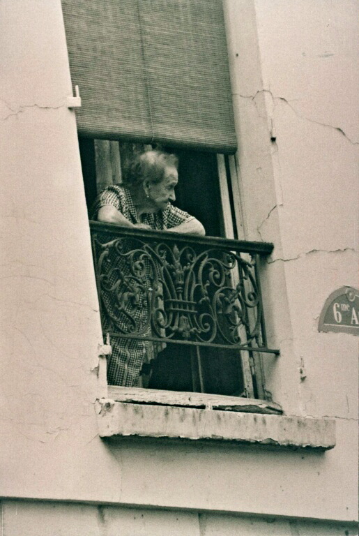
Like the subject and tones but have concerns about the composition. There is a large blank area on her left, the bottom features are a distraction and her head is too central. May I suggest that a crop of the left and bottom so that the upper thirds intersect sits right on her ear and the lower thirds line runs across the bottom of the house number. This will, I believe, give you a much better balanced pic. Hope this helps.
Peter
Peter
Aug 12, 2012 02:37:38 #
I agree with the crop at the bottom. I think I've done that on a different copy. I am liking the aging window sill tho. I tried the left crop but didn't really want to lose the building cracks on that side.. I will definitely give your suggestions a go and see how they turn out. Thanks. I took this photo a long time ago (film) and it's always been one of my favorites.
If you want to reply, then register here. Registration is free and your account is created instantly, so you can post right away.