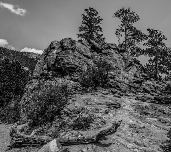
Formerly Red Rocks (Now B&W)
Jan 5, 2019 18:22:21 #
Still playing around with some B&W conversions.
Here is my most recent attempt.
Thanks for looking.
Here is my most recent attempt.
Thanks for looking.
Jan 6, 2019 03:45:20 #

It's a good choice of scene - probably what's being referred to as an intimate landscape. The B&W conversion to me looks just a little wishy-washy. The trouble is, if you just add contrast the darks are going to get even darker and it's already a bit on the dark side. I'd recommend lightening first until it looks just right exposure-wise, then add contrast etc. Overall it doesn't have much above mid-grey.
As a general rule B&Ws usually look best when the whole range of brightness is present. Typically that would mean all the way from black to white, but if the original scene didn't have any pure whites or blacks, forcing them could end up looking unnatural*. But it's a worthwhile point to consider.
* Since I've mentioned the point, some PPers use the histogram's whites and blacks warning function to set their white and black level in every edit that they do, including colour edits, believing that every image should have a black point and a white point. I don't agree with that for the reason that I stated above. If an image doesn't have white or black in it, forcing it to have them can give bad results. I prefer to see the Whites and Blacks sliders as just two more light level adjusters. I used to have the warnings for whites and blacks switched on all the time, now I never have them on. I go by what looks right. Plus I like the extra flexibility when it comes to killing glare or bright haze.
The above is probably more than you were asking for, but I thought it was an interesting point and worth mentioning. I get the impression that some people religiously set white and black points for every image when the truth is it's not always appropriate or optimum. But stretching the range of tonality is more likely to be appropriate for B&Ws, which, as a general rule, benefit from generous amounts of contrast.
Jan 6, 2019 09:15:25 #
Actually this is exactly what I'm looking for. I have not done B&W in the past because I personally don't like it. But I've decided to try and learn this new trick. I did not think that this attempt turned out very well as it looked to even. The center was a bit hot due to the angle of the sun and when converted it looked like a b right bull's eye. Try to avoid that just made everything look muddy. i appreciate your thoughts and keep working on the technique.
Thank you.
Thank you.
Jan 6, 2019 09:26:43 #
treadwl wrote:
Actually this is exactly what I'm looking for. I have not done B&W in the past because I personally don't like it. But I've decided to try and learn this new trick. I did not think that this attempt turned out very well as it looked to even. The center was a bit hot due to the angle of the sun and when converted it looked like a b right bull's eye. Try to avoid that just made everything look muddy. i appreciate your thoughts and keep working on the technique.
Thank you.
Thank you.
You're welcome. Now that you've tamed the centre and got things a bit more even across the frame, you have a good starting point for some global adjustments as described above. You might find that's all that's missing.
If you want to reply, then register here. Registration is free and your account is created instantly, so you can post right away.