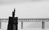
Underpass Debates
Dec 31, 2018 08:19:56 #

brucewells wrote:
I am in the throes of exploring B&W and find your capture very interesting and quite nicely done. Thank you for sharing!
Thanks Bruce! Having fun with it myself!
ML
Dec 31, 2018 08:27:07 #
abc1234 wrote:
And one more take....
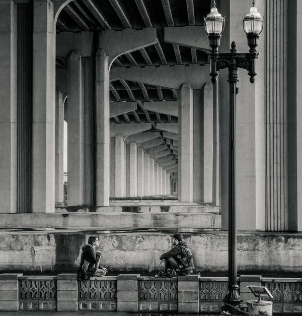
Abc1234 - i see you go the top of the lamps back in! Aren't these lines wonky? Things got too strange for my eye, so i just went with the horizontal. I understand what you meant now about my rendition being a little too flat. You may have added just a little too much contrast for my taste, as it seems to darken some detail in the wall behind the couple and other areas a little too much, but again - to each his/her own! Thanks for your interest and help!
Marylea
Dec 31, 2018 08:36:06 #
melueth wrote:
. . . I have this shot as a vertical, much like what you've each done here, but just couldn't get my eye to rest happily on the couple due to the odd angles and lines, but to each his/her own! Thanks again!
Marylea
Marylea
It's interesting, that the two figures actually upset the composition somewhat. One of the things I tried, as I was mentally playing with the scene, was just to remove the figure on the left. Somehow it seemed better, and then I remembered one of the "rules" in composition, that twos should be avoided if possible. I generally don't follow such rules rigorously, but here's a case where it works. (My take, of course.) Try it.
Dec 31, 2018 11:58:26 #

melueth wrote:
I really like your B&W rendition, Marsha. Nic... (show quote)
Thanks Marylea..glad you like it. It's amazing what brushes can do in LR for selective editing! I am torn on the whole photo that you posted...I tend to like more of a landscape-shaped photo too but in your case here, the left side is just something that takes away from the main part of the photo. Just my opinion. Thanks for sharing it and letting us work on it!
Happy New Year..Marsha
Dec 31, 2018 14:15:09 #

Most B&W conversions are going to have grey in them, but when they start to look too grey (as opposed to black and white), especially when it's the dreaded wishy washy grey, it usually means that the contrast/clarity isn't as high as it could be. The edits by Marsha, abc1234 and myself all have more contrast and as a consequence look more B&W than grey.
If there are areas where the details are getting lost because it's getting too dark, the best answer is to select those areas and give them the required adjustments to bring back the details. It's not worth compromising the contrast of the whole image just for one or two small areas. How much contrast the whole image gets is always going to be a matter of taste. My determinant is when it looks more B&W than grey, and that's usually a function of how much contrast/clarity the image as a whole has been given.
The best way to add contrast and clarity is to lead with contrast and push the adjustment a bit beyond where it's starting to look a bit harsh, then use the Highlights, Whites, Shadows, Blacks and Brightness to mitigate any extreme effects of the contrast adjustment. Not only will that produce optimum results, you'll learn a lot about mitigating - which is always a very useful skill to have. Don't push the Clarity until you've optimised the contrast/lighting adjustments. Mitigating the effects of extreme Clarity adjustments can prove to be difficult or impossible, so moderation (i.e. tentative tweaking) is the best approach with that particular slider.
Don't compromise the contrast of the whole image just because of one or two small problem areas. Those areas can always be selected and given their own adjustments (some of which may be to reverse the global adjustments).
I hope some of that helps.
-
Jan 1, 2019 14:01:55 #
R.G. wrote:
Most B&W conversions are going to have grey in... (show quote)
Thanks R.G. - I really love this rendition and the description. I have tended to push the clarity slider first - certainly before contrast, so that's good info. Much to work with! Thanks again!
ML
If you want to reply, then register here. Registration is free and your account is created instantly, so you can post right away.