Abstract Possibilities...
Dec 26, 2018 08:50:21 #
Hello;
I realize that this is not every UHH member's "cup of tea" so I kindly ask if it's of no interest to you, please ignore, and try not to post objections to it's content.
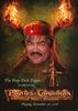
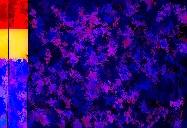
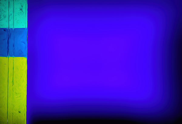
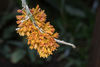
This is an exercise on "creating abstract, FROM abstract." The first image is a photo of a clolse up of "home made" door on an old RV trailer.
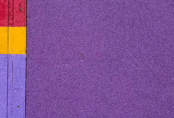
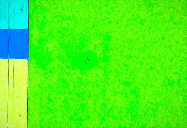
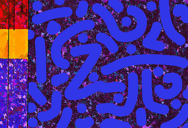
The next few are creations of abstract images FROM that image. Comments, suggestions, (or favorites) of any (or all) of the images are welcome... (The last one I titled "Ode 2 Rothko")
I realize that this is not every UHH member's "cup of tea" so I kindly ask if it's of no interest to you, please ignore, and try not to post objections to it's content.
This is an exercise on "creating abstract, FROM abstract." The first image is a photo of a clolse up of "home made" door on an old RV trailer.
The next few are creations of abstract images FROM that image. Comments, suggestions, (or favorites) of any (or all) of the images are welcome... (The last one I titled "Ode 2 Rothko")
Dec 26, 2018 08:59:37 #
The dimensionality on #3 is fantastic. I like them all.
Dec 26, 2018 09:09:13 #


Dec 26, 2018 09:25:17 #
I also like #3 and also 4 for their use of color-beautiful. I do pottery and use some of the same color combinations.
Dec 26, 2018 09:35:48 #
Dec 26, 2018 09:46:02 #
Whoops... (My bad...)
Would that be #3 from (and including) the original?
Would that be #3 from (and including) the original?
lesdmd wrote:
The dimensionality on #3 is fantastic. I like them all.
Dec 26, 2018 10:22:28 #
#3 from the top. Looks very 3 dimensional. The blue literally appears to jump off the background.
Dec 26, 2018 11:15:43 #
buddah17 wrote:
Hello; br I realize that this is not every UHH mem... (show quote)
I like the first one as a photograph. I would consider the others to be 'graphics'.
I think you might enjoy and find insperation from the contemplative photos on http://seeingfresh.com/ It is a really great site for photographers.
Dec 26, 2018 12:11:22 #

I appreciate the color harmony of #2, the rich surface of #4, and the beautiful serenity of #5. #3 seems a little thin, just contrasty without unity. Fine work!
Dec 26, 2018 19:45:42 #
Thanks Bob..
artBob wrote:
I appreciate the color harmony of #2, the rich surface of #4, and the beautiful serenity of #5. #3 seems a little thin, just contrasty without unity. Fine work!
Dec 26, 2018 19:46:36 #
Thanks will check it out..
repleo wrote:
I like the first one as a photograph. I would consider the others to be 'graphics'.
I think you might enjoy and find insperation from the contemplative photos on http://seeingfresh.com/ It is a really great site for photographers.
I think you might enjoy and find insperation from the contemplative photos on http://seeingfresh.com/ It is a really great site for photographers.
Dec 26, 2018 19:51:16 #
Thanks for your thoughtful response..
artBob wrote:
I appreciate the color harmony of #2, the rich surface of #4, and the beautiful serenity of #5. #3 seems a little thin, just contrasty without unity. Fine work!
Dec 26, 2018 19:53:13 #
WOW... Just took a "gander" at the site you recommended.. GREAT suggestion, thanks SO much.. Will be looking at it in depth some more...
repleo wrote:
I like the first one as a photograph. I would consider the others to be 'graphics'.
I think you might enjoy and find insperation from the contemplative photos on http://seeingfresh.com/ It is a really great site for photographers.
I think you might enjoy and find insperation from the contemplative photos on http://seeingfresh.com/ It is a really great site for photographers.
Dec 26, 2018 19:54:46 #
Thanks... Interesting insight.
lesdmd wrote:
#3 from the top. Looks very 3 dimensional. The blue literally appears to jump off the background.
Dec 26, 2018 19:55:25 #
Thanks..
issa2006. wrote:
I also like #3 and also 4 for their use of color-beautiful. I do pottery and use some of the same color combinations.
If you want to reply, then register here. Registration is free and your account is created instantly, so you can post right away.