Diesel Dancing!
Dec 18, 2018 08:47:32 #

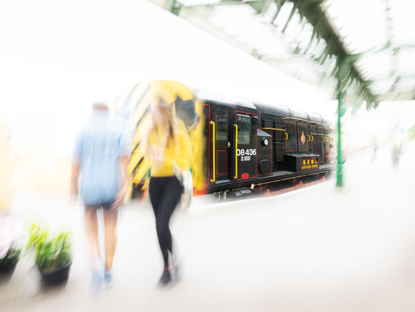
I'd hoped to get a shot of this girl by the diesel loco at our local station. Unfortunately the cameraman wasn't ready when he spotted the opportunity and fluffed the whole thing. It was the colour coordination that attracted me. Still, I think something is salvaged with this mild composite? I have to admit I thought I'd already posted the shot but cannot find it in my list, so maybe not. If you've seen it before, forgive an old man's memory.
Dec 18, 2018 09:01:58 #

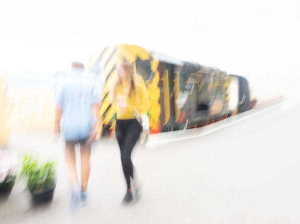
Very interesting and beautiful. For my taste, since it is abstract, I'd remove the references to the station, and leave it a beautiful mystery.
Dec 18, 2018 09:02:03 #
Very interesting and beautiful. For my taste, since it is abstract, I'd remove the references to the station, and leave it a beautiful mystery.
Dec 18, 2018 09:21:09 #
artBob wrote:
Very interesting and beautiful. For my taste, since it is abstract, I'd remove the references to the station, and leave it a beautiful mystery.
Good idea Bob - more like this?
Dec 18, 2018 09:54:16 #
Dave, its about taste and desire !!! Personally, I prefer the first over the second. My reasoning is: I love the mystery in the first one which was created with the blur of the young lady, which was probably a very attractive individual. The blur left the viewer to imagine just how beautiful she was/is. The person in blue going in the opposite direction is an added feature that I kinda wish was not there, but still the presence adds to the composition if not anything but added color. The references to the station is important because of the title and while too much mystery is just that, but leaves nothing for the viewer to imagine other than a blob of blur. An exampled scenario would be take nude fine art, too much exposure to the body leaves nothing to the imagination which is what the second version does. Too much blur does exactly that. IMO, we have to have some sort of hint to what is being displayed. This is just my opinion and is the way I would have presented the image, so you were right on track with the first. Nice work, I love it. I've been playing around with motion blur, diffusion and softness lately so this sort of image currently appeals to me.
Dave
Dave
Dec 18, 2018 10:17:52 #
Dave Chinn wrote:
Dave, its about taste and desire !!! Personally, I... (show quote)
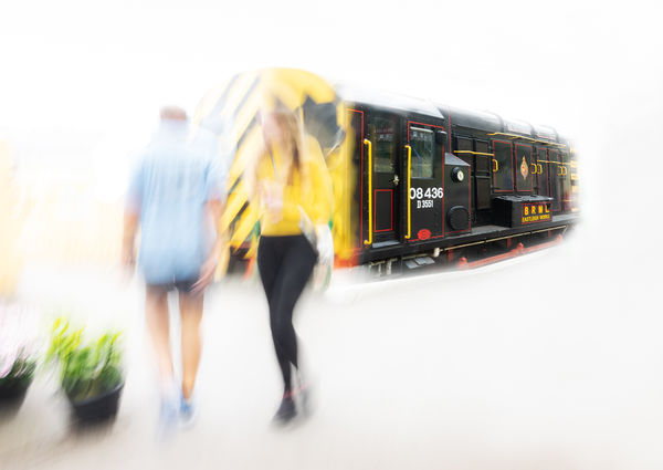
Thanks for your in depth thoughts on this one Dave. I think I’d prefer a combination - where the loco is partially crisp, but without station paraphernalia. You didn’t think I wouldn’t notice your subtle pun did you?
Dec 18, 2018 11:07:57 #

The first posted is a little jarring for me with the extreme contrast between blurred and sharp. If you do one per your reply to Dave Chinn, please share. I like the station structure, though 
Dec 18, 2018 11:35:43 #
Linda From Maine wrote:
The first posted is a little jarring for me with the extreme contrast between blurred and sharp. If you do one per your reply to Dave Chinn, please share. I like the station structure, though
Here you go Linda...
Dec 18, 2018 11:37:37 #
magnetoman wrote:
Thanks, Dave! Now I know for sure I prefer with the station structure Here you go Linda...

Dec 18, 2018 12:06:57 #
magnetoman wrote:
Good idea Bob - more like this?
I like it. Very mysterious.
Dec 18, 2018 12:21:01 #

Dec 18, 2018 13:52:55 #
Linda From Maine wrote:
Thanks, Dave! Now I know for sure I prefer with the station structure
Dammit, all that work too!
Dec 18, 2018 13:53:38 #
Dec 18, 2018 15:45:34 #
magnetoman wrote:
Dammit, all that work too!
Many critiques simply give personal preferences. I prefer judgments and critiques accompanies by the BASIS for the judgment. Objectively, all we can agree on is that the station give a more definite sense of place and may affect the composition, no? You did a smart exploration. Both versions are acceptable, but each "says" something different. That is where your expression makes the final veto.
Dec 18, 2018 17:10:50 #
artBob wrote:
Many critiques simply give personal preferences. I prefer judgments and critiques accompanies by the BASIS for the judgment. Objectively, all we can agree on is that the station give a more definite sense of place and may affect the composition, no? You did a smart exploration. Both versions are acceptable, but each "says" something different. That is where your expression makes the final veto.
It is a common problem with critique but surely perfectly natural to let personal preference bias the critique Bob? You must have fought this all the time you were critiquing student work - or do you feel you’ve trained yourself out of it? Certainly here in FYC, I often predict to myself who will point out what before I post a shot.
If you want to reply, then register here. Registration is free and your account is created instantly, so you can post right away.