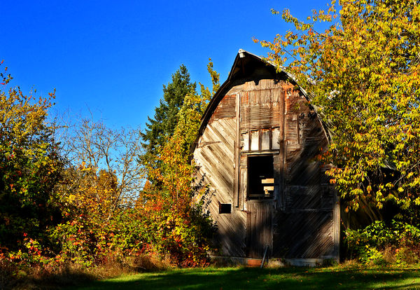
East Kent Barn
Dec 13, 2018 19:33:41 #

Until I recently installed the Nik Plugins to compliment the Affinity Editing software, I struggled with both the color and black & white versions of this old barn. However, I'm truly a satisfied cowboy now. I wish I could find a way to get around the banding of the sky in the b&w as it's just beginning to make itself evident. Oh well, this too shall be overcome in time. A brief comment on your thoughts would be welcome. (Notice the kitty in the opening of the loft  Ken
Ken
Ken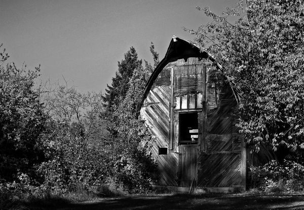
Dec 13, 2018 19:44:52 #
Dec 13, 2018 20:29:04 #

Dec 13, 2018 20:35:05 #

Dec 13, 2018 20:54:40 #
kenievans
Loc: Dallas
What a cool barn! I've never soon one like that before. Really sharp capture on the barn texture.
Dec 13, 2018 20:57:29 #
The colors of the trees, the sky, the barn--it is all lost in the b&w. It is just too beautiful to be missed. I am partial to the color photo.
Dec 13, 2018 21:11:05 #
kenievans wrote:
What a cool barn! I've never soon one like that before. Really sharp capture on the barn texture.
Thank you!
Dec 13, 2018 21:14:24 #
Katydid wrote:
The colors of the trees, the sky, the barn--it is all lost in the b&w. It is just too beautiful to be missed. I am partial to the color photo.
Yep. That's the problem when a person is partial to b&w, but color is so prominent. What to do, what to do ~sigh~~
Dec 13, 2018 21:16:21 #

Excellent play of light and shadow! Tough to choose but to me the patterns and textures are more prominate in the black and white. Love the kitty!
Dec 13, 2018 21:36:38 #
Dec 13, 2018 21:47:11 #


Dec 13, 2018 22:27:19 #
Cany143
Loc: SE Utah
The image works as well in b&w as it does in color; beyond that, its simply a viewer's preference between the two as to which will be seen as being preferred.
Not sure what you mean about banding, though. At least I don't see banding in either the thumb or the download versions of either shot. Unless, that is, what you're calling banding is what I'd call haloing, and that I do see in each of the versions. Though it is fairly subtle, its there nonetheless, and its slightly more noticeable in the color version. Specifically, I see this halo effect around the darker background tree and around the gabled top of the barn, more or less in the center of the image where ever the sky value meets the darker values of tree and barn. What's odd, though, is that the haloing isn't evident on the right and left sides of the image(s) where trees and skies meet. There are any number of reasons why this haloing occurs, but more often than not, its an unwanted result of post-processing. The thing is, there ARE ways to avoid having it happen while still processing as you choose. I've never used Affinity, so I couldn't offer any suggestions with regard to that software, but if you were using LR and/or PS, I could.
I hope you won't take what I've written as nit-picking, but if we don't pick our nits.... Its apparent to me you take your images seriously, and I can't imagine you wouldn't want them to be as good as they can possibly be.
Dec 13, 2018 23:04:18 #

They are both very nice. I like the color better, but if the contrast was pumped up a bit in the B&W, it might inch ahead.
--
--
Dec 13, 2018 23:58:23 #
Cany143 wrote:
The image works as well in b&w as it does in c... (show quote)
I've no issues with nit-picking at all. Thanks for the input.
Yes, the halo is evident, and the problem is in my pp. I started with Photoshop Elements and now using Affinity, which is the equivalent of the full house of Photoshop.
The banding is in the grey sky and is noticed as bands of grey as it transitions from dark to light.
As with all things, this too will pass with time and an increase in software skills.
Dec 14, 2018 05:48:14 #

Photobum wrote:
I've no issues with nit-picking at all. Thanks for the input.
Yes, the halo is evident, and the problem is in my pp. I started with Photoshop Elements and now using Affinity, which is the equivalent of the full house of Photoshop.
The banding is in the grey sky and is noticed as bands of grey as it transitions from dark to light.
As with all things, this too will pass with time and an increase in software skills.
Very nice color pic. That halo is probably a bit too much sharpening. All editing apps can do it. I use PhotoPlus - Serif's fore-runner to Affinity - certainly it will do it.
If you want to reply, then register here. Registration is free and your account is created instantly, so you can post right away.