Check out Close Up Photography section of our forum.
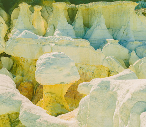
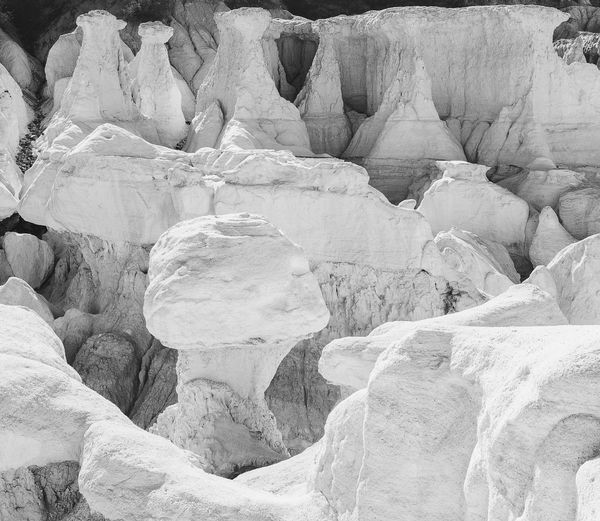
Help me decide: is B/W or color better for this image
Dec 8, 2018 09:41:46 #
rmalarz wrote:
Peter, I'd lean towards the black and white. However, processing is needed to reveal the beautiful textures that are hinted in these presented.
--Bob
--Bob
THX. I am working on it.
Dec 8, 2018 09:43:58 #
AndyH wrote:
I agree completely. The b/w is Adamsesque with a few tweaks, mostly in the direction of increasing contrast and deepening low zones, at least IMHO...
Andy
Andy
thx
Dec 8, 2018 09:45:47 #
magnetoman wrote:
I prefer the b&w and others are already pointing you at the processing possibilities. The pointed rocks at the top I find particularly interesting, looking like caped figures. Think I'd like to see them brought out.
thx
Dec 8, 2018 09:46:16 #
Dec 8, 2018 09:46:45 #
fergmark wrote:
There is a lot to like in both the color, and the black and white, once some corrections are applied. The B/W is very nice so I would choose it without much hesitation.
thx
Dec 8, 2018 09:49:15 #
jaymatt wrote:
I prefer the second one if the exposure/brightness were dealt with.
thx. As I stated, the exposure issues are due to viewing the images on a very overbright monitor; on a calibrated monitor the exposures are the way I wanted.
Dec 8, 2018 11:11:19 #
Herewith my latest edits. Many thanks to all who made constructive suggestions.
Check out Film Photography section of our forum.
Dec 8, 2018 15:12:27 #
I counted the preferences, color v. B/W: So far, there are 6 votes for the B/W version and 3 votes for the color version (I have only counted votes that showed a clear preference for one version or the other).
If you want to reply, then register here. Registration is free and your account is created instantly, so you can post right away.
Check out Video for DSLR and Point and Shoot Cameras section of our forum.