Black & white photography in a color world...
Nov 28, 2018 12:02:38 #

It think that Henri Cartier Bresson's work is more powerful in black and white. I have attached an image of mine that I think works better in Black and White. I shoot everything raw, but if I am planning to print in black and white I frequently show the image in black and white on my camera's screen.
Nov 28, 2018 12:05:05 #
Strodav
Loc: Houston, Tx
Stephan G wrote:
Let's not forget that in B&W days, we also used different papers for desired effect in final print. I still have my paper sampler in one of my cartons in the garage. 
Good point
Nov 28, 2018 12:27:51 #
Anhanga Brasil
Loc: Cabo Frio - Brazil
I was born and raised with B&W photography. Even when color films were everywhere
my father kept shooting in B&W.
In some occasions (birthdays, some trips with us) he used once or twice color for
slides.
I set my camera to B&W (I know... it is a conversion from what the sensor "saw")
and go out and shoot. I used many rolls of B&W film even on a point-and-shoot
Kodak camera I bought in Canada. Unfortunately I can not afford to get a darkroom
and materials, including films and developers, etc.
I use physical filters (not the camera's) like Cokin and Hoya for B&W photo.
It is a pleasure for me to see the same I could have if it was film...
Many examples are being mentioned here, as Linda's "colorized" movies (ugh...
never liked any "colorization", although I did some in Photofinish 3.0 under
Windows 3.11 to XP) and two of Adams works that would never be good in color.
It would be like any landscapes we see everywhere.
IMHO, a few color photographs would figure on such an exposition.
BTW, loved the mom and baby photo. That is a wall hanger, for me.
Cheers.
Nov 28, 2018 12:31:08 #
Retina
Loc: Near Charleston,SC
Given that both b/w and color photography are exposure and print latitude constrained 2D representations of 3D objects, we should also ask: how many of the greatest color photographs would have been better in black and white? Only statistically valid surveys could answer this type of question within a predefined definition of "better". However it does not explain why some people feel compelled to pick sides or run numbers on such subjective topics. At the same time, your question does bring out a lot of educational responses, unlike mine which only questions the premise. It's not a criticism as I am glad you posed the question. The website of rare historical photographs is especially interesting.
Nov 28, 2018 12:32:07 #

Black and white film making in the 30s 40s and into the 50s was more an art form than many people would admit. Lighting, contrast, shading, vignetting, and so many other aspects of black and white film making are highly diminished or lost in many cases in color films. If you look at the movie Casablanca and then watch it in it's colorized version you can see exactly what I mean - much of the dramatic impact and nuance of lighting and shadow is lost completely. The same is true for many of the early Hitchcock films. I think many of these considerations translate well to the concept of black and white photography today.
Nov 28, 2018 12:39:39 #
Anhanga Brasil
Loc: Cabo Frio - Brazil
tommystrat wrote:
Black and white film making in the 30s 40s and int... (show quote)
There is an easy comparative test NOT linked to "colorized" versions.
Check "12 angry men" by Sidney Lumet and William Friedkin's color version.
Lumet's (1957) is unbeatable.
Nov 28, 2018 12:44:02 #

An interesting and timely topic. As it happens I'm doing a short presentation for my photography class next week on why B&W images are relevant for todays photographers. But first, lets acknowledge that we don't know what choices our mentors of the past would have made, had really good color technology systems been available to them. Ansel Adams did shoot color from time to time, but he choose to do B&W because it gave him way more control over the development process. Hardly anyone was able to process color in their own darkroom back then. And, always the best choice, his B&W prints delivered on the emotional impact he was looking for.
Second, having a fair amount of experience scanning older family photographs, and having lived through the 'which is better, film or digital?' debate (circa 2005), I can attest to the fact that most of those color film prints are technical crap. They looked great or at least adequate because there was nothing else to compare them to, until now. Color shot by pro photographers were of course technically much better than the ones taken by the average photog.
Third, B&W film prints appear and usually are sharper than their color equivalent. B&W film consists of a single layer emulsion made up of very fine crystals of silver chloride. Color film emulsions are composed of at least three layers. All other things being equal, an image residing in a single layer will appear sharper than one composed of multiple layers. Sort of like stacking or not stacking filters on your lens.
But, that doesn't answer the question, why would we want to shoot B&W in todays digital environment, why do these images still appeal to us? The answer lies with the evolution of our biology. The optic nerve is actually brain tissue, it's the only part of our brain that is directly exposed to the outside world. For the larger period of human existence we spent a lot of our waking day in twilight or darkness. As the sun sets, our color receptors begin to fail and our, way more light sensitive, monochrome receptors take over. To stay alive, to recognize a threat, to distinguish friend from foe in the dark was an important evolutionary adaptation. A large area of our visual cortex is devoted to monochrome recognition. Needless to say, because of that, we evolved a whole host of emotional responses to what we see in the dark. That emotional connection has not diminished in the brief time that our species has experienced artificial illumination. That's why, even today, B&W images can have such a profound affect on us. And that's why B&W photography will always be relevant to us carbon units.
Nov 28, 2018 12:52:16 #
srt101fan wrote:
Periodically we see comments here re the value of ... (show quote)
None, they were shot, the way the photographer intended them, end of story! Or would you tell a painter, his painting would sure look a lot better if he had used a different number brush?!!
Nov 28, 2018 12:54:29 #
Linda From Maine wrote:
When shooting for a black and white result (whethe... (show quote)
 Thanks!
Always love your posts.
Coincidentally, just checked out a book on great black and whites of Baltimore. (Photos) Awhile back, there was a guy in town named Bodine. Never saw any of his color shots.
Still waiting for cold, snowy, depressing days for my BALTIMORE shoot. B W
Adore Maine.
Nov 28, 2018 12:58:05 #

Strodav wrote:
First time I saw Ansel Adams work I knew I had to try Tri-X developed with HC-110. Even got a medium format film camera, but have not been able to achieve the emotion, use of contrast and textures he was able to achieve in B&W. Which of the two images do you like better?
When shooting film we had a collection of colored filters to use which altered the tones of the negative. For your shot if a green filter was used the foliage would print lighter causing that wonderful tree to present darker against them. Red would darken the foliage and brighten parts of the tree. When we convert a digital color image to black and white using Photoshop the program allows is to apply filters to the raw file and because this is done with sliders there are infinity more filters available now than what we could have afforded back in "the days of olde". One thing I have done is import my files into ACR/HSL and adjust the saturation and/or lightness of colors that require change to move the image toward my ultimate goal before converting to B&W. More often than not I try converting first, can't get what I want and then start over. That will however give you a good idea of which colors need a level change.
All that being said, it never seems to come up to the look of film images.
PS: My avatar image is converted from color.
Nov 28, 2018 13:02:58 #

rmalarz wrote:
Bill, you make a point. However, if one looks at t... (show quote)
A few things to consider:
Viet Nam was the first war to be covered with much color film. The impact it had on the American public via nightly news shows was substantial.
Color film processing was much more difficult back in the 1960s and 1970s. It required expensive machinery and precise temperature control, and extra time and patience. Quality varied a lot from batch to batch. Film stocks were much slower back then. ISO 100 was fast!
Networks spent small fortunes getting just a few minutes of 16mm film each day, processing it, editing it, converting it to color video, and bouncing it off satellites to NYC. By the time it was broadcast, a day or two later, it was a fuzzy, low resolution mess!
The motivation to use color stills was lower, because four-color printing processes were much more expensive and time consuming than black-and-white. Only periodicals with huge circulations and weekly deadline cycles could afford to use it with any frequency.
The ability to transmit color still photos electronically was very limited to non-existent. With Viet Nam half way around the world, that was a barrier to use of color. (B&W darkrooms can be set up in tents and closets).
Contrast that with 2018 — we can send a sharp, high resolution photo or video anywhere in the world in seconds, as long as we have cellular or WiFi service.
I'm not discounting the value or aesthetic appearance of B&W; I love it. But if I were an *editor* covering Syria, I'd want to see sharp, colorful images of the damage to people and property, cities and cultures. I'd want to make the decision of whether to reproduce them in color or B&W. A chief consideration would be, "What is the competition doing with their coverage? Can we do it better in B&W or color?" The answer to that can be a case by case editorial decision. 50 years ago, that was seldom the case. Another consideration would be, "How far can we push the boundaries of good taste without disturbing too many readers?"
Nov 28, 2018 13:03:28 #

Linda From Maine wrote:
As usual, Linda is dead on! Any argument about Ansel Adams and his use of B&W completely misses the point that he used B&W because his subject called for B&W. I teach a course in B&W, and the first point I drive home is that deciding between B&W and color has to be based on the subject and the colors being captured. I never shoot in B&W mode, because I always want the option of changing my mind after I've captured the image.When shooting for a black and white result (whethe... (show quote)
Some images fizzle when color is eliminated. Some images can be either B&W or color. It all depends on the scene being captured. Oh, by the way, some images are good or bad in either B&W or color. Linda delineated various factors that make for a good B&W image. If those elements are present, the image will be a success. If they--we're talking tonal range, texture, and patterns--are absent, the image will be a flop.
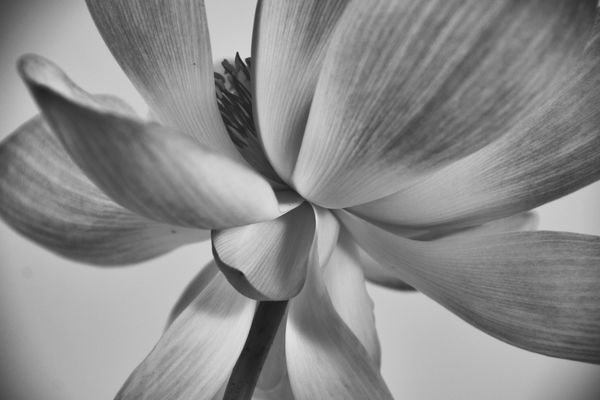
I have a six page handout I use in conjunction with my course. I'm not sure how to post a pdf in this forum, but if you PM me, I'd be happy to share it with you. For now, I'll post two images that show how the same image can work in either color or B&W. Note, however, that while they're both successful, they tell a very different story. And, after all, the story is what we're trying to convey.
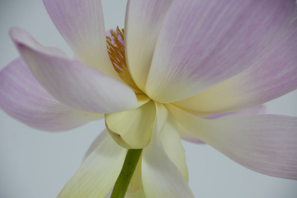
Nov 28, 2018 13:18:44 #
rdgreenwood wrote:
As usual, Linda is dead on! Any argument about An... (show quote)
Nice work! I agree completely — I like both images, in different ways.
Nov 28, 2018 13:19:49 #
burkphoto wrote:
Nice work! I agree completely — I like both images, in different ways.
Ditto!
Nov 28, 2018 13:47:47 #
burkphoto wrote:
Yep, I completely agree. To me, the color image is serene and warming; the B&W is much more serious and explicit. The poiint that one image can tell several stories is an idea we don't explore very often. I have to admit, after 50+ years of shooting, I'm just coming to the realization that color locks into to intellectual which locks into emotional which reacts to color which...Nice work! I agree completely — I like both images, in different ways.
Ain't we got fun!
If you want to reply, then register here. Registration is free and your account is created instantly, so you can post right away.