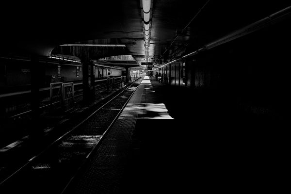
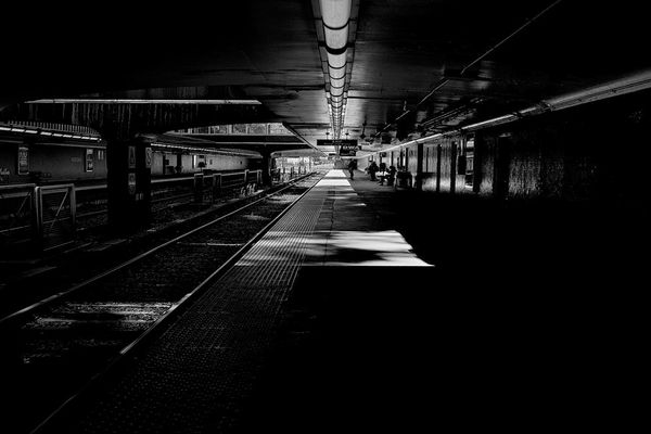
Subway Platform
Nov 24, 2018 11:02:36 #

Nov 24, 2018 11:13:46 #
RickH wrote:
thinking about printing this one, suggestions for editing?

Nov 24, 2018 11:13:58 #
Old Timer
Loc: Greenfield, In.
A great project for a B&W with some dodge and burn and tonal adjustments.
Nov 24, 2018 11:29:19 #
ricardo7
Loc: Washington, DC - Santiago, Chile
Old Timer wrote:
A great project for a B&W with some dodge and burn and tonal adjustments.
Agree. Experiment with variations tonal values and please show some of the results
Nov 24, 2018 13:11:57 #

The large dark area in the right hand foreground creates imbalance. You could cure that by cropping in a bit, still keeping the vanishing point in the centre.
Nov 25, 2018 06:01:58 #
RickH wrote:
thinking about printing this one, suggestions for editing?
Open up the shadows on the right where possible then stretch the canvas. More can be done but but just a quick edit to show what I mean
Nov 25, 2018 15:36:27 #
Even on my big, bright monitor I find it way to dark. I would like to see the shadows opened enough to have a hint of detail and the midtowns brought up enough to make the subject interesting. Highlights look good. This is just the kind of photo that can be brought to life with some love and time.
...Cam
...Cam
RickH wrote:
thinking about printing this one, suggestions for editing?
Nov 25, 2018 20:40:11 #

It's wonderfully sharp and very inviting. It IS very dark. I think if there were a bit more detail in some of that darkness there would be more to look at. As it is, my eyes go to the few light spots and dismiss the rest.
Nov 26, 2018 01:07:51 #
Most post processing software has a slider that will selectively lighten only the dark tones. Your photo could IMHO be made more interesting by showing more detail in the dark areas. The light areas are a light shade of gray. Those light gray areas could be selectively lighted up to near white but still retaining a bit of detail.
Canadaboy had the right approach but stopped a bit short on both adjustments. I love your concept and the composition, but it's just too dark for my taste. (Of course that depends on the message that you were trying to convey. If you were trying for a feeling of unknown peril, then by all means ignore my opinion.)
Canadaboy had the right approach but stopped a bit short on both adjustments. I love your concept and the composition, but it's just too dark for my taste. (Of course that depends on the message that you were trying to convey. If you were trying for a feeling of unknown peril, then by all means ignore my opinion.)
Nov 27, 2018 07:29:53 #

I like your photo as is. I would not bring out more shadows of the station. I like the darkness of the tunnel and train that frame the leading line.
If the photo were mine, I would try to very slightly lighten the background behind the center figure to show it more in silhouette.
I would also play with cutting some of the bottom and right side just to see if the resulting image gave the viewer a better sense of the train and waiting passengers. But, I have a feeling that the image, as is, is quite effective.
A very pleasing image!
If you want to reply, then register here. Registration is free and your account is created instantly, so you can post right away.