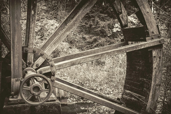
Old mill: color or sepia?
Nov 10, 2018 11:03:36 #
Nov 10, 2018 11:14:46 #

Nov 10, 2018 12:24:07 #

Nov 10, 2018 12:28:54 #
JFCoupe
Loc: Kent, Washington
At first glance, I think the color is the better image. I would suggest lightening the Sepia toned image and see if that appeals to you more than the current version.
Nov 10, 2018 12:31:54 #
Nov 10, 2018 12:32:04 #

Like the sepia. That being said: try shooting again with shallow depth of field, f16 or better (Maybe use tripod). You may get better contrast. Nice work/history on this subject.
Nov 10, 2018 12:58:09 #

Composition seems stronger in sepia. Fewer elements to distract. Color patches makes my eye dart around. That said, I would enhance contrast and bring out more tonal range. A strong geometric composition.
Nov 10, 2018 13:02:08 #

hiker60 wrote:
Like the sepia. That being said: try shooting again with shallow depth of field, f16 or better (Maybe use tripod). You may get better contrast. Nice work/history on this subject.
"f/16 or better"? f/4 would give you a much shallower depth of field than f/16. Remember depth of field is shallower when the F-Stop is a smaller number, the distance to the subject shorter and the focal length is longer.
If you don't have a depth of field calculator, try www.dofmaster.com/dofjs.html
Bud
Nov 10, 2018 13:06:05 #

The color image caught my eye first, but I think it depends on the story you want to tell. The way I saw it, the color gives the viewer a story about the mill wheel on a fall day. But if your story is the interesting graphics of just the wheel, I might suggest the sepia option with post processing emphasizing the wonderful textures and design of the spokes and hub of the wheel, lessening the importance of the background. Regardless, I'm betting it was fun being at the mill and photographing all the options. Nicely done. Bev
Nov 10, 2018 13:26:38 #

I love sepia tones, and really like the subject you have chosen. If you add a touch of exposure compensation and contrast adjustment, I think you might have a more interesting rendition of the subject. I took the liberty of doing a quick adjustment on the attached, and I hope you don't mind.
Nov 10, 2018 14:08:15 #
Color unless you can adjust the sepia to bring out more detail
Fran
Fran
Nov 10, 2018 14:08:16 #
Color unless you can adjust the sepia to bring out more detail
Fran
Fran
Nov 10, 2018 14:33:08 #
19photo30
Loc: Olympia, WA
The color one. The sepia is for the pretentious ones only. If B&W was so good, color would never have been invented.
Nov 10, 2018 14:48:43 #

Color. The sameness of tonality in the monochrome makes it a flat image to my taste.
Nov 10, 2018 14:56:32 #

If you want to reply, then register here. Registration is free and your account is created instantly, so you can post right away.