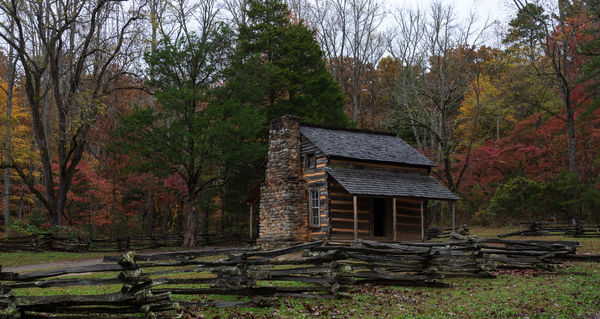
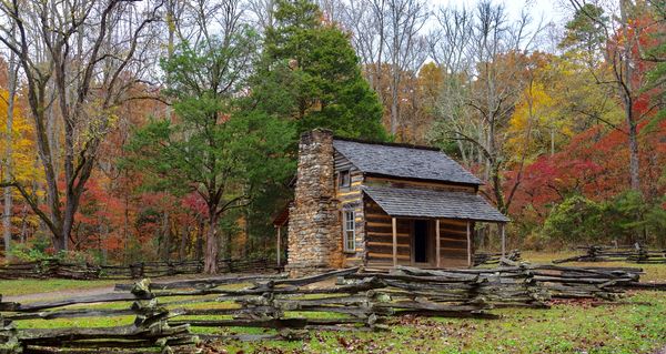
Too dark?
Nov 4, 2018 09:30:02 #
Nov 4, 2018 09:32:38 #

Nov 4, 2018 09:36:47 #

I like it, but I also vote to lighten it a bit. Why not lighten it, and compare and see which you prefer, which is what matters most.
Nov 4, 2018 09:39:46 #
Nov 4, 2018 09:41:57 #

Just for fun I imported the Download into Lightroom and hit Auto Tone in the Develop module. It gave +0.5 stop of additional exposure along with a few other changes. I like it better, as it brought out the fall colors and made the whole image less gloomy. But it is your image and you only need to please yourself. Best wishes.
Nov 4, 2018 10:02:24 #

I've been accused of getting things too dark. I really like the first one, as it somehow seems more natural. But likely a lighter version would appeal to most.
Nov 4, 2018 10:24:23 #
Nov 4, 2018 10:27:41 #

IMO this one is a good candidate for selective lightening: perhaps of just the red trees, and a little of the building - including that great chimney - and grass.
As for overall (global) brightening, so much depends on how an image is viewed, on what devices - or how brightly lit a room is for your print on the wall.
As for overall (global) brightening, so much depends on how an image is viewed, on what devices - or how brightly lit a room is for your print on the wall.
Nov 4, 2018 13:00:28 #
TBerwick
Loc: Houston, Texas
I agree with Linda. I like the definition brought out in the fireplace in the lighter version but also think everything else would benefit being a little darker. In the end, whatever you like should be your guide. No two people are going to agree 100% on any specific presentation.
Nov 5, 2018 05:48:08 #
Nov 5, 2018 06:58:08 #

Nov 5, 2018 06:59:13 #

Nov 5, 2018 07:16:28 #

Initially, I thought it may be a tad too dark, but after going back and forth a few times between it and your lightened photo, I prefer the original, darker version. But that's just me. Overall, I really like this photo.
Nov 5, 2018 07:28:23 #

Nov 5, 2018 07:29:41 #
md91 wrote:
I like the colors, but is it too dark?
For me, I like the first one. You have to look at it. The second one you glance at it and move on.
If you want to reply, then register here. Registration is free and your account is created instantly, so you can post right away.