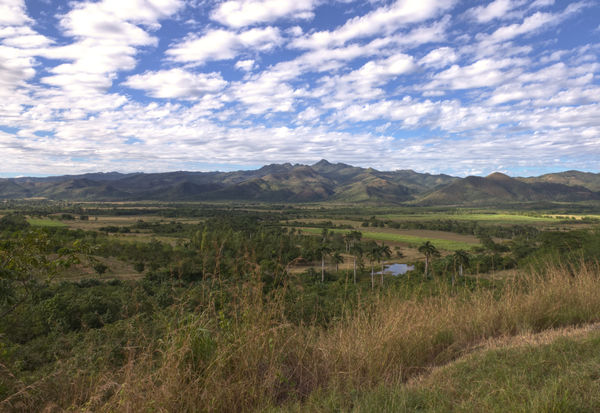
Trinidad, Cuba landscape
Nov 4, 2018 07:08:15 #

Nov 4, 2018 07:16:12 #

Nov 4, 2018 07:39:12 #

The sky looks wonderful, very natural. I think you should coax more out of the land itself with some selective edits of brightness, saturation, levels/curves. Can I post a tweak of your pic?
Nov 4, 2018 08:19:01 #
GeorgeK
Loc: NNJ
Linda From Maine wrote:
The sky looks wonderful, very natural. I think you should coax more out of the land itself with some selective edits of brightness, saturation, levels/curves. Can I post a tweak of your pic?
Certainly, Linda. I would like to see your take.
Nov 4, 2018 08:26:03 #
GeorgeK wrote:
I used an online app to make the changes I mentioned. Now that it's uploaded, I would do even more, especially to the light/shadows and color saturation of the center of the mountain range and to the grassy/greenest areas of the valley. It's a beautiful scene that holds up to viewing large and in detail - and you have the opportunity to help direct viewers' eyes around the scene with color, tones and light.Certainly, Linda. I would like to see your take.
Thanks George!
(edit: I guess my crop moved the horizon line to the middle, but I remedied that with a pano crop in next posting
 )
)
Nov 4, 2018 08:38:03 #
I'm quite in love with those clouds (I feel I can touch them!) and the dappled light on the mountains. So, for a story that's all about the two stars of the show:

Nov 4, 2018 09:53:21 #
GeorgeK
Loc: NNJ
Linda, I like what you did with the saturation and shadows. I'm not sure I like the last crop as much, though. I like the small pond(?) and some of the golden grasses just below and to right of center in the original.
Thank you for the suggestions. I will enjoy doing more work on this.
Thank you for the suggestions. I will enjoy doing more work on this.
Nov 4, 2018 10:19:38 #
GeorgeK wrote:
Absolutely, it was your vision and I appreciate being able to play....I'm not sure I like the last crop as much, though. I like the small pond(?) and some of the golden grasses...
Nov 4, 2018 11:16:46 #

Since you okayed showing what we mean, here is my suggestion. First, your shot is absolutely great in composition. Next, I thin you got a great moment, as cloud shadows pattern the land.
To bring out those features, I increased the contrast on the land, then lightened and saturated the brighter value lands in the shadows to emphasize the composition while not destroying the cloud shadows.
To bring out those features, I increased the contrast on the land, then lightened and saturated the brighter value lands in the shadows to emphasize the composition while not destroying the cloud shadows.

Nov 4, 2018 13:21:13 #
Nov 5, 2018 08:10:10 #

I think like many landscapes images many have their own vision. For me that is what makes the subject interesting. As seen in this thread many have a different take on your image. In this particular shot i think I am in your camp in how you presented your image to FYC. Nicely done.
Nov 5, 2018 08:50:13 #
GeorgeK
Loc: NNJ
NJFrank wrote:
I think like many landscapes images many have their own vision. For me that is what makes the subject interesting. As seen in this thread many have a different take on your image. In this particular shot i think I am in your camp in how you presented your image to FYC. Nicely done.
Thanks for looking and the comment, Frank.
Nov 5, 2018 11:54:04 #

GeorgeK wrote:
Too much post processing?
Hi, George,
First, I am one of those with antipathy for a horizon right across the middle of a landscape. I think it works better with horizon raised or lowered.
Also, I am unimpressed with the compositional effect of the “cloud shadows” in this image, but AM impressed with the opposed arcs of the clouds and the arcs of the terrain greens; they are in almost perfect opposition and are an effective compositional counterposition.
See examples.
Dave


Nov 5, 2018 15:21:23 #

Not sure I’d go as far as some of the offerings but a bit more saturation as per Linda’s first shot at it is about right for me. I too do not love central horizons but I’d be very loath to give up any of that beautiful sky - I think you can leave the crop as you chose . It’s a lovely landscape image.
Nov 5, 2018 15:56:31 #
GeorgeK
Loc: NNJ
Uuglypher wrote:
Hi, George,
First, I am one of those with antipathy for a horizon right across the middle of a landscape. I think it works better with horizon raised or lowered.
Also, I am unimpressed with the compositional effect of the “cloud shadows” in this image, but AM impressed with the opposed arcs of the clouds and the arcs of the terrain greens; they are in almost perfect opposition and are an effective compositional counterposition.
See examples.
Dave
Dave, thanks for taking the time to view and comment. I typically don't like a horizon in the middle either but it didn't bother me here maybe because both the sky and terrain are so strong texturally.
If you want to reply, then register here. Registration is free and your account is created instantly, so you can post right away.