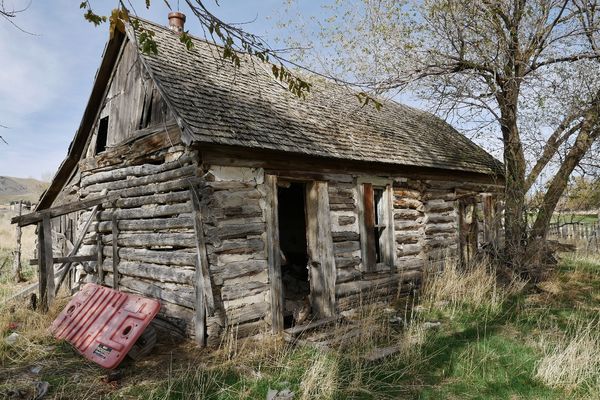
Old Log Cabin...which do you prefer?
Nov 1, 2018 09:14:46 #

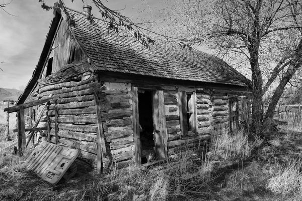
I've gotten some responses on my images of old structures to try them in B&W. Really enjoy B&W photos but I'm lousy at processing them so have always hesitated to try my hand at them. Anyhow, here are a couple more shots of the log cabin I posted a couple of days ago. The color image just grabs me, not so the B&W...what do you think, does it need more processing? BTW, I started with an orange filter on the B&W image to keep the image as bright as I liked.
Nov 1, 2018 09:16:25 #
Nov 1, 2018 09:16:43 #

Nov 1, 2018 09:17:05 #
Nov 1, 2018 09:18:08 #
Nov 1, 2018 09:21:47 #
The B&W does it for me. The orange plastic leaning on the cabin is very disconcerting in the color shot as it takes away from the aged look of the cabin, while in the B&W version it is much less obvious.
Just my opinion
Just my opinion
Nov 1, 2018 09:27:05 #

I usually like color, but the B&W really works on this subject. It's a great shot!
Nov 1, 2018 09:27:42 #

I think the b&w could use more tonal range: brighter whites, blacker blacks. If the one I pm'd you is not of interest, you might just try adjusting levels or curves with your posted shot. Another technique for editing b&w is use of dodge and burn tools. For example, you could selectively lighten the tallest grasses, the door frame and the area where the sun hits the front of the structure. When you don't have a naturally contrasty scene, use dodge and burn to help direct our eye around the composition. The edits can be subtle or in-your-face, depending on what you want to convey.
Nov 1, 2018 09:34:20 #
Old Timer
Loc: Greenfield, In.
The B&W, I agree with Linda the tonal range or contrast could be brought up some. I have found that shooting in raw and over saturated the colors and contrast then convert monochrome usually works on b&w
Nov 1, 2018 09:36:55 #
Old Timer wrote:
Nik Silver Efex has colored filters to help with that also: for example, using a red filter makes a blue sky blacker. A good demonstration of how the pp filters work is to convert a red rose with green leaves. A green (or often yellow) filter whitens the leaves significantly. Or keep them darker, and apply a red filter to result in a white rose I have found that shooting in raw and over saturated the colors and contrast then convert monochrome usually works on b&w

Nov 1, 2018 10:10:40 #
Image-ing wrote:
Definately the black and white. I like the contrast and drama better.
Thanks for responding and I agree with the contrast and drama making stronger image!!

Nov 1, 2018 10:11:53 #
Longshadow wrote:
I also like the color better for this one.
Thanks Longshadow. To me the color is more cheery and the way I saw the scene when I photo'd it.
Nov 1, 2018 10:12:36 #
awis01 wrote:
I Like them both but I prefer the B & W
Hard to choose, I know...thanks for responding!!
Nov 1, 2018 10:13:30 #
Image-ing wrote:
Definitely the black and white. I like the contrast and drama better.
Thanks for taking the time to comment and, you are in the majority opinion!!
Nov 1, 2018 10:17:27 #
BWur wrote:
The B&W does it for me. The orange plastic leaning on the cabin is very disconcerting in the color shot as it takes away from the aged look of the cabin, while in the B&W version it is much less obvious.
Just my opinion
Just my opinion
Thank You NWur, I appreciate you responding. When composing this photo I thought about moving that object but decided not to disturb anything on the property. You are correct that this object looks better in B&W and it kinda ruins the color photo.
If you want to reply, then register here. Registration is free and your account is created instantly, so you can post right away.