Florida Sunset
Oct 28, 2018 13:08:24 #

Oct 28, 2018 13:42:36 #

Oct 28, 2018 13:43:48 #

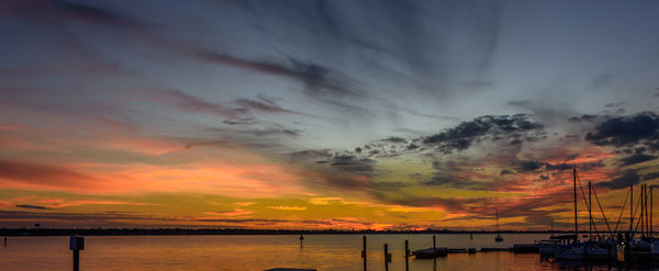
For me, the left side is mostly empty space and all the interest is in the right side of the frame. So I'd cut it down the middle  My only other observation is about the close-in elements touching the bottom of frame. You may not have had any options re composition with that area, but it feels a little tight, adding to the imbalance overall.
I want to feel the serenity and awe you must have felt when shooting, but the composition - including the number of small posts and other items - is holding me back.
My only other observation is about the close-in elements touching the bottom of frame. You may not have had any options re composition with that area, but it feels a little tight, adding to the imbalance overall.I want to feel the serenity and awe you must have felt when shooting, but the composition - including the number of small posts and other items - is holding me back.
Oct 29, 2018 09:16:44 #

I don't mind the empty space on the left. It's not really empty because it enables us to see more of the sunset sky, even though our eyes do concentrate on the right and that wonderful cloud formation.
I think that, if I had another chance to get a beautiful sunset at this location, I would include more of the dock that's seen on the left - it would add a leading line toward the right side and justify even more including the mostly empty space on the left.
A beautiful capture!!
I think that, if I had another chance to get a beautiful sunset at this location, I would include more of the dock that's seen on the left - it would add a leading line toward the right side and justify even more including the mostly empty space on the left.
A beautiful capture!!
Oct 29, 2018 14:03:38 #
wayne barnett
Loc: Grants Pass, Oregon
I do not know what the original uncropped shot looks like but would like some more on the bottom of the shot. Like the great expanse of the sky. The different colors help balance the various elements in the shot.
Oct 29, 2018 15:08:04 #

I would do something about the unattractive yellow/green colour in the sky. Plus the yellows look like they've been over-darkened and it looks like orange has been tint-shifted towards red - I would ease off with that a bit.
Oct 29, 2018 17:11:21 #
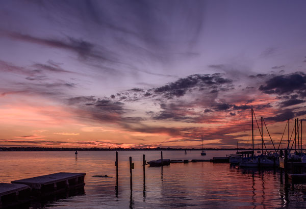
What say you to this version?
Rab-Eye --- Backed off saturation
Linda --- Cropped about 1/3 from left (did not want to do more and get a portrait looking version), added back some bottom of the original. Short of
being able to walk on water I was somewhat limited in ways that I could "work" the scene.
Edie --- Added back some of the abandon dock on the left side
Wayne --- Added back some of the bottom from the original.
R.G. --- Didn't notice the green tint in sky, removed. Eased off the orange/red tint some. The original scene had some "orange" in it.
Don
Oct 29, 2018 17:52:38 #
Now that you've done all these things to please us, is there anything left that you like, Don?  I personally find your reworked image to be hugely engaging.
I personally find your reworked image to be hugely engaging.Oct 29, 2018 20:24:53 #
PAR4DCR wrote:
Would you do anything different?
What?
Don
What?
Don
I'm glad the edit was in place when I opened this thread. I think the edit is an improvement over the original. Especially because of the colors. By cropping out the entire left side, I think you have maybe gone too far. I liked the panoramic aspect ratio. I might have cropped; but I probably would have cropped to the sign in the water. I think the final version should be what you are most comfortable with in terms of the crop. The colors in the edit are much more convincing than in the original. Very nice work.
Erich
Oct 30, 2018 13:35:43 #
Big improvement. The foreground is fine and does a good job of acting as a channel to lead the eye towards the sunset. Darkening the extreme right seems to have been a good move to help maintain the overall balance. Colour-wise it's hard to say what would be best without seeing the original. The pink still looks a little unusual - not impossible but not a typical sunset colour either. If you did tint-shift orange towards red it might have been better to tint-shift yellow towards orange and boost red on its own. Hard to say without knowing what the starting point was. I usually find that only slight shifts of orange towards red are needed, if at all. Yellow on the other hand usually needs a heavier hand, and you definitely don't want yellow to go too dark or heavy (i.e. saturated) because the sky ends up looking like luminous mustard. But I've seen big shifts towards orange working well with yellow. Split toning done with a light touch can also enhance sunsets/sunrises.
Oct 30, 2018 15:08:07 #
I quite like the result of the crop and the toning down of the saturation. I am very much satisfied with the reworking of the original image. Really did not want to get the horizon to much higher in the image but where it is works well for me.
Thanks all for your very good and constructive suggestions!
Don
Thanks all for your very good and constructive suggestions!
Don
Nov 2, 2018 01:32:27 #
Nov 2, 2018 15:40:39 #
If you want to reply, then register here. Registration is free and your account is created instantly, so you can post right away.