My conundrum
Oct 26, 2018 08:51:29 #
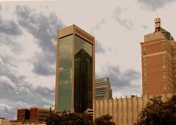
Picture #1:
I have tried in vain to do something at the top of this building to get rid of, or change the background with my 'limited' post processing software.
I like the building, but not the blown out sky and sunlight across the top of the structure. The left side is also a bit too bright. Even if I crop out the top, the sides (especially the buildings left side) don't look particularly pleasing.
Pictures #2 & 3:
I don't know whether the angled buildings [1] or the straightened edit [2] is more pleasing. Your opinions, please.
PS: I like the reflection off the glass of the building behind the building on the right.
Higher level PP programs are out of reach at this time. I use Faststone, Paint Shop Pro 9 and Paint, currently.
Obviously, comments, opinions and suggestions are welcome.
Larry
Blown out top and sides, egad!
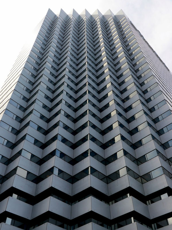
(Download)
Buildings at an angle
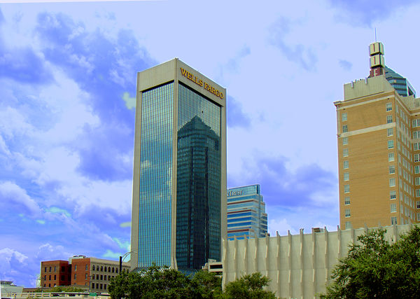
(Download)
Buildings straightened
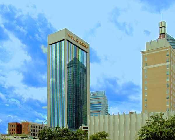
(Download)
Oct 26, 2018 09:43:12 #

Your straightening produced a kind of pinched look in the Wells Fargo bldg (smaller at the base). That's a tough one because there are several angles and perspectives to deal with. I don't have the expertise and my PS Elements software doesn't have the best tool.
What I wanted to do with that shot is show you your blue color cast. Note the difference in the wall especially, between my #1 and your #2. You may prefer your original, or perhaps something between yours and mine? But I just wanted to toss out the idea of color cast.
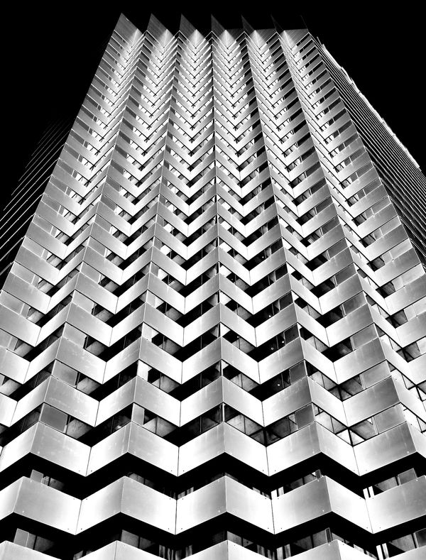
With the tall close-up, you mentioned you cropped, but not by how much. My edit is a higher contrast b&w - again just to help stimulate ideas.
These edits were done with an online app, https://www.befunky.com/
For $35/year there are a great many tools (with the paid version, there are no ads)
.
What I wanted to do with that shot is show you your blue color cast. Note the difference in the wall especially, between my #1 and your #2. You may prefer your original, or perhaps something between yours and mine? But I just wanted to toss out the idea of color cast.
With the tall close-up, you mentioned you cropped, but not by how much. My edit is a higher contrast b&w - again just to help stimulate ideas.
These edits were done with an online app, https://www.befunky.com/
For $35/year there are a great many tools (with the paid version, there are no ads)
.


Oct 26, 2018 09:50:40 #
Here is one possible way of displaying the skyscraper.

Oct 26, 2018 10:36:33 #

One way to deal with the bad sky is to let it go black. Black and white can be a very forgiving way to handle blown elements. I like Linda's crop suggestion also. The pattern itself is pretty interesting.
Oct 26, 2018 11:31:27 #
Linda From Maine wrote:
Your straightening produced a kind of pinched look... (show quote)
Linda, your #3 looks great..... best photo on the thread.
Just my opinion.
Mark
Oct 26, 2018 11:40:17 #
Naptown Gaijin wrote:
Thanks! I like Sony's and Fergmark's a lot. And the OP may hate all of them Linda, your #3 looks great..... best photo on the thread.
Just my opinion.
Mark
Just my opinion.
Mark
 But, for processing suggestions, IMO it's great to have this kind of variety of input.
Oct 27, 2018 06:52:45 #

fergmark wrote:
One way to deal with the bad sky is to let it go black. Black and white can be a very forgiving way to handle blown elements. I like Linda's crop suggestion also. The pattern itself is pretty interesting.
Nicely done, the black really works.
Oct 27, 2018 18:15:45 #

Glen, did you photograph the first one using RAW format?
--Bob
--Bob
GlenBose wrote:
Picture #1: br I have tried in vain to do somethi... (show quote)
Oct 27, 2018 19:32:04 #
Oct 28, 2018 05:01:37 #

Trying to correct perspective distortion can be tricky, especially when tilt is included. Sometimes the only reliable reference in the whole image is a vertical that's close to the centre line. In the case of #2 that would be the right hand edge of the Wells Fargo building. Get that properly vertical before you try any perspective corrections. My preference is to NOT get rid of convergence completely.
If you want to reply, then register here. Registration is free and your account is created instantly, so you can post right away.