Critique my Day of the Dead photo
Oct 8, 2018 13:02:25 #

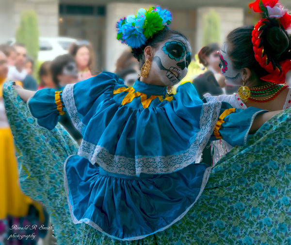
Please Critique
This was taken at the SF Opera House Event "Day of the Dead" with a point and shoot Leica 190
Edited in Photoshop and this is the end result.
thanks for looking
This was taken at the SF Opera House Event "Day of the Dead" with a point and shoot Leica 190
Edited in Photoshop and this is the end result.
thanks for looking
Oct 8, 2018 13:09:20 #

Can you store the original so we can see the details rather than just a thumbnail version?
It would seem the dead space of the upper left corner could be removed by cropping to a square, removing the woman's bright face in the background by the car and doors. Then, reprocessing the dancer subject so she is not in shadow, increasing the overall exposure of what remains and the brightness of the whites and blue.
It would seem the dead space of the upper left corner could be removed by cropping to a square, removing the woman's bright face in the background by the car and doors. Then, reprocessing the dancer subject so she is not in shadow, increasing the overall exposure of what remains and the brightness of the whites and blue.
Oct 8, 2018 13:23:37 #
ok thanks
i will store the edited version of it
yes i should remove the background thanks for pointing that out
i need to color calibrate my monitor so i see what you see
thanks
ron
i will store the edited version of it
yes i should remove the background thanks for pointing that out
i need to color calibrate my monitor so i see what you see
thanks
ron
Oct 8, 2018 13:30:45 #
Redron wrote:
ok thanks
i will store the edited version of it
yes i should remove the background thanks for pointing that out
i need to color calibrate my monitor so i see what you see
thanks
ron
i will store the edited version of it
yes i should remove the background thanks for pointing that out
i need to color calibrate my monitor so i see what you see
thanks
ron
Ron, was there more to the original image where cropping at the blue woman's shoulder could place her at / near the upper left 1/3 intersection rather than nearly centered? To my eyes the main weakness is the relative darkness of the subject and the awkward position within the frame. The eye is not drawn to the dancer's face, rather to the bright yellow of the collar and then to the bright face in the background. After changing the crop and removing the background distractions, reprocess the dancer subject so she is not in shadow, increasing the overall exposure of what remains and the brightness of the whites and blue. Her face should be the primary focus of the image, where more brightness and positioning will help accomplish. Maybe the crop is less important than correcting the exposure of the subject relative to the brighter background. Although going back in time and adding a fill-flash is not possible, more adjustments in post may accomplish the same, such as a layer that lowers the exposure of the background while working on a layer that adds brightness to the foreground.
Oct 9, 2018 00:00:47 #
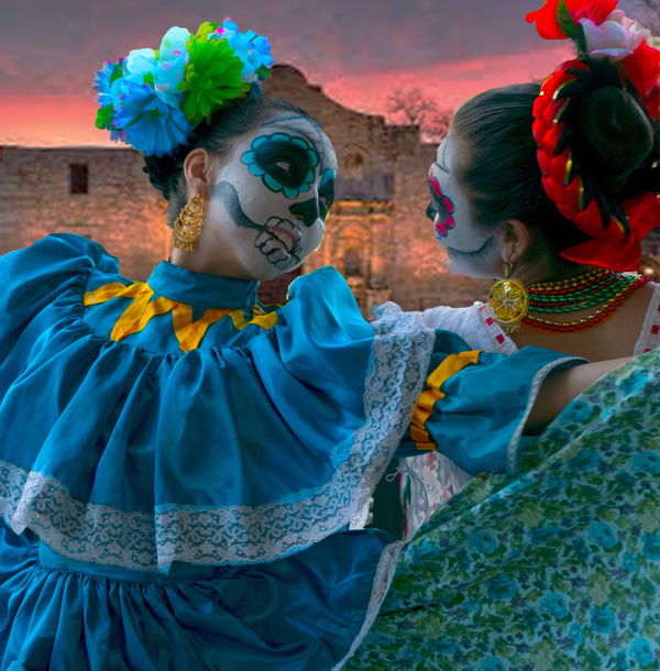
here is an update A little better thanks
not sure how to put this in the same frame as the first one to compare
not sure how to put this in the same frame as the first one to compare
Oct 9, 2018 08:28:48 #
Ron, much better to my eyes. Hopefully, you agree. I walked from my laptop over to my main computer to confirm my assessment the dancers are still too dark / seemingly in shadow. It might be harder for you to see if your work area or monitor is bright. The change isn't a need for more saturation, rather more exposure in the foreground and more white to the white. What I envision is subtle, but you haven't stored the original so I can't be more specific in the suggested changes.
Oct 9, 2018 10:30:33 #

In the original the background was really hindering focusing on the subject. Partly because she is in shadow and the background people aren't, and partly because it's so busy. In the rendition, changing the background to that single building is interesting and certainly isn't distracting. I did like the expanse of her dress in the first one, though. You can't have everything! I think mostly it's the lighting that affects this photo. The faces are not in the light, and I'm not sure any amount of brightening will help that.
Oct 9, 2018 11:21:50 #
Oct 9, 2018 11:50:35 #
Redron wrote:
Thank ill calibrate my monitor the color is rgb
As in you're posting an uncalibrated color image? Can't really tell when the attachment isn't stored, but that could be an area to investigate too. Using sRGB as the colorspace for JPEGs being posted online for critique would be a better choice, if that update is applicable.
Oct 9, 2018 13:23:56 #
I’ll have to calibrate and switch to SRGB and check stored from now on
Thanks
Thanks
Oct 9, 2018 14:13:24 #
Oct 9, 2018 14:53:44 #
Agree with prior critics. My first thought upon viewing the original was that the subjects are under exposed. There is such beautiful color and a nice pose, and you wouldn’t care if the background was less detailed...only that it wasn’t so bright as to distract from the main subjects. Thanks for sharing.
If you want to reply, then register here. Registration is free and your account is created instantly, so you can post right away.