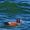
Tri-Colored Heron on Next original and Processed
Sep 18, 2018 20:42:50 #
Looking at the various versions posted in this chain, one thing not mentioned is trying a square crop. When I look at this image, it seems to me that a square crop would be really nice, removing a lot of distracting background while allowing the subject to dominate the frame. I think your original crop tried to leave open space to the left because that’s the direction the bird was facing. I don’t think that is really necessary in this image. Take a look at a square crop and see what you think. You can choose how tight you want to crop the subject. By the way, we’ve had tri-colors here in So Cal this year throughout the late spring and summer, which is pretty rare. Enjoy them when you can see them.
Sep 18, 2018 21:31:18 #
Strodav
Loc: Houston, Tx
Geegee wrote:
Why did you choose 350mm when you had 600 available? You will get sharper pictures if you crop less. And for exposure, you could dodge the bird to get the right amount of detail and burn the background so that it would be less distracting.
You are right. I should have pulled out the tripod and taken some longer shots at larger apertures and bracket. I tend to avoid full zoom handheld and at 20.1mp, I know I have some room to crop. I did have one at 400mm, but the head was slightly soft where the body feathers were sharp, so it probably moved its head and blurred the shot.
Sep 20, 2018 00:09:48 #
Pixelpixie88 wrote:
I think you did pretty good in getting the shot. My thoughts are that all it really needed was a better exposure. I raised up the shadows and blacks...color on the original is good. Also brightened it with the exposure slider and a slight radial filter. Do you "spot focus" for the eyes?
From now on, I’m bringing all my edit problems to you, Pixelpixie!
Sep 20, 2018 08:54:09 #
I enjoyed your post and obviously people have their opinions on exposure etc. to make it to their taste and this is where you have decisions to make. In my opinion the background is really disturbing and detracts from your subject. Certainly a crop shot posted earlier shows you can come in closer. I thought at first the background was noisy but it’s not at iso 160.
I would recommend that you select the subject in ps invert it and apply a Gaussian blur to the background of 14-15. This will certainly make a positive difference to your picture and separate the subject from the background. I would have done some work on your download but I’m just having a short break from packing ready for a trip to France in the morning.
I would recommend that you select the subject in ps invert it and apply a Gaussian blur to the background of 14-15. This will certainly make a positive difference to your picture and separate the subject from the background. I would have done some work on your download but I’m just having a short break from packing ready for a trip to France in the morning.
If you want to reply, then register here. Registration is free and your account is created instantly, so you can post right away.
