Re-Charged!
Aug 29, 2018 06:54:13 #

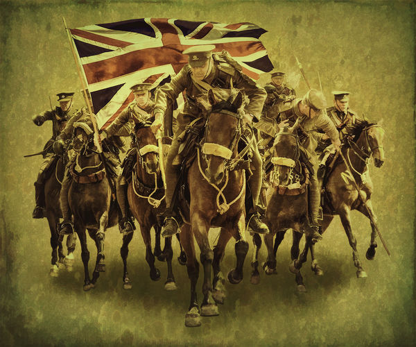
I posted a composite a little while ago using most of the elements seen here. It was intended as a trial piece and, following the various critique received, I've come up with this final version. Rather different feel to it perhaps. I wonder what you think of this version and appreciate any critique you have to offer. For those interested the first post is here: https://www.uglyhedgehog.com/t-547162-1.html
The thumbnail looks rather dark - please download to view as intended.
The thumbnail looks rather dark - please download to view as intended.
Aug 29, 2018 07:04:45 #

I'm feeling a lot more drama with the first you did. Or maybe danger and the horrors of war better describes. This one, in comparison, is more organized to my eye. I'm also more aware of the horses' hooves being in empty space, which isn't as appealing to me. I like the inclusion of the flag! The color, size and placement are eye-catching and tell us who these soldiers are.
In my exif viewer, color space shows as "uncalibrated." That's the reason for the flat looking thumbnail. I was curious if simply passing it through (with no edits) my online editor would remove the offending color space tag
In my exif viewer, color space shows as "uncalibrated." That's the reason for the flat looking thumbnail. I was curious if simply passing it through (with no edits) my online editor would remove the offending color space tag
Aug 29, 2018 08:14:45 #
Linda From Maine wrote:
I'm feeling a lot more drama with the first you di... (show quote)
Thanks Linda - I hadn't thought to check that, makes all the difference! Yes, that's my bug with it now - not as dramatic. Just off to do a railway evening, so out of touch for a while.
Aug 29, 2018 08:31:34 #

For me I like this image more than the original. I like the color tone more than the original. Adding the flag was a plus. In addition showing the "complete" horse particularly the lead horse, give a more of an action look. Having a boarder gives my eye room to move around and take in the whole image. The original was more like in your face.
Aug 29, 2018 09:53:00 #

It's a fine, powerful image, the perspective and composition reinforcing the idea. I do feel sorry for the rider behind the flag bearer on our left. His horse can't see where it's going!
Aug 29, 2018 10:29:32 #
magnetoman wrote:
I posted a composite a little while ago using most of the elements seen here. It was intended as a trial piece and, following the various critique received, I've come up with this final version. Rather different feel to it perhaps. I wonder what you think of this version and appreciate any critique you have to offer. For those interested the first post is here: https://www.uglyhedgehog.com/t-547162-1.html
The thumbnail looks rather dark - please download to view as intended.
The thumbnail looks rather dark - please download to view as intended.
Cool & outstanding concept Dave on both projects. I like both for different reasons. Overall, the second concept, with the flag wins over the other, IMO. However, I do prefer the color on the first vs the second. The fact that you included all of the front runner horse, rather than chopping off at the hooves is a must and a huge plus. It's an exciting piece to view with the action and feeling there must be a battle in their near future. The placement of all is near perfect as can be.
Dave
Aug 29, 2018 18:57:29 #
NJFrank wrote:
For me I like this image more than the original. I like the color tone more than the original. Adding the flag was a plus. In addition showing the "complete" horse particularly the lead horse, give a more of an action look. Having a boarder gives my eye room to move around and take in the whole image. The original was more like in your face.
Glad you like this version Frank. Not sure they would have run with a flag, but it does add something! I do get the need to include the whole rider and horse, but somehow this version just doesn’t seem to have the punch of the first.
Aug 29, 2018 19:01:06 #
artBob wrote:
It's a fine, powerful image, the perspective and composition reinforcing the idea. I do feel sorry for the rider behind the flag bearer on our left. His horse can't see where it's going!
Thanks Bob. Don’t worry to much about that horse, it’s all sort of ‘heat of the moment’ action, he’ll be able to see again in a moment! Some of the elements were taken four years apart - at commemoration events for both the beginning and the end of WW1.
Aug 29, 2018 19:02:46 #
Dave Chinn wrote:
Cool & outstanding concept Dave on both projec... (show quote)
Good to hear from you Dave, and thanks for the kind comments. Yes, I think I’ll be changing the colour to something nearer the first version.
Aug 29, 2018 19:40:48 #
magnetoman wrote:
I posted a composite a little while ago using most of the elements seen here. It was intended as a trial piece and, following the various critique received, I've come up with this final version. Rather different feel to it perhaps. I wonder what you think of this version and appreciate any critique you have to offer. For those interested the first post is here: https://www.uglyhedgehog.com/t-547162-1.html
The thumbnail looks rather dark - please download to view as intended.
The thumbnail looks rather dark - please download to view as intended.
I agree with Linda's assessment about the horses not being grounded. I could see one or two horses being completely in the air; but not the whole bunch. Now I need to qualify that criticism. If this had been done by almost anyone else, I would not have mentioned it because everything else is technically wonderful as far as I can tell. The fact that I mentioned it at all is that we are used to seeing such high quality work from you that nit picking does not seem to be overly picky. I know how hard it is to do a great composite. You succeed where many of us do not and that is why we are so picky when it comes to your work.
Erich
Aug 30, 2018 03:17:23 #
ebrunner wrote:
I agree with Linda's assessment about the horses n... (show quote)
Don’t apologise Erich, that’s what I post them for! It’s too easy to let things by when compositing and I like to be kept on my toes. In the first version I don’t feel it matters that they are ‘flying’, but this one needs sorting. Maybe I’ll like it more if I ground them.
I’ve have so much trouble with this compo - Ps has introduced maximum files sizes and this one is way above them. Consequence has been having to save as a psb (large document) and my four-year old computer can’t hack it. Simply grinds to halt all confused and frail - a bit like its owner! I think the answer is to adjust the file size of each element prior to compositing - or get a nice New mac with 128gig of ram! That will set me back around £10k in the U.K. Not sure the Treasurer will allow that.
Many thanks for your comments, they are always appreciated.
If you want to reply, then register here. Registration is free and your account is created instantly, so you can post right away.