Critics wanted
Aug 24, 2018 14:18:02 #

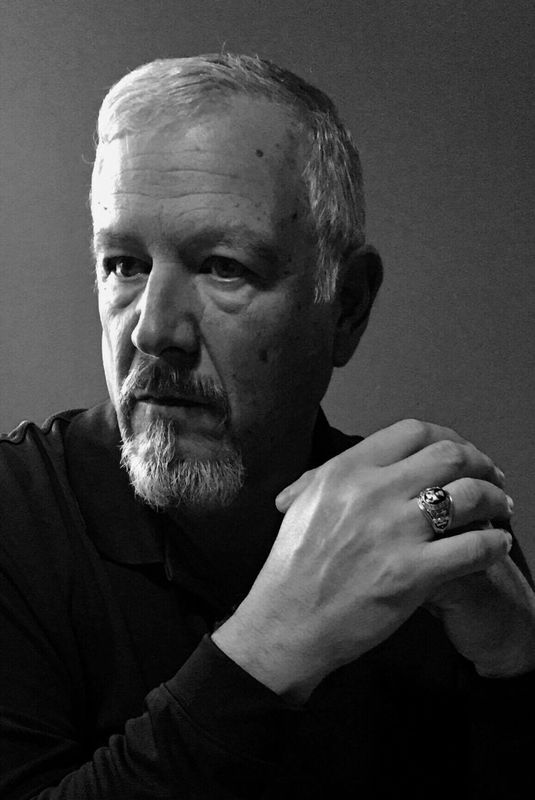
This is a snapshot in a pub with my iPhone. (I didnât bring my camera). I have some ideas how to make it different/more appealing but want some constructive opinions. What do you think?
Aug 24, 2018 14:28:36 #
Not knowing what PP options you have, all I would do is lighten up the facial shadows a little if you can. Good luck.
WJH
WJH
Aug 24, 2018 14:33:12 #
williejoha wrote:
Not knowing what PP options you have, all I would do is lighten up the facial shadows a little if you can. Good luck.
WJH
WJH
Thanx for your opinion!
Aug 24, 2018 15:00:36 #

Elmerviking - In order to be seriously helpful, it would have been best to click “Store Original” and then add your image as an attachment. What we see here is a representation colloqially referred to as a “Thumbnail” which does not reflect all the depths of shading and tone of your image. Also be aware that UHH has three photo posting sections. One is called “Photo Critique”, the second is called “For Your Consideration” and the third, primarily used to display images, is “Photo Gallery”. Those first two sections can give you serious evaluation and feedback on whatever you post. Welcome to UHH and best wishes, Ralph
Aug 24, 2018 15:58:03 #
ricardo7
Loc: Washington, DC - Santiago, Chile
Might try playing with the darkness and contrast.
Emphasize the chiariscuro.
Emphasize the chiariscuro.
Aug 24, 2018 16:09:34 #
Aug 24, 2018 16:30:27 #
rjaywallace wrote:
Elmerviking - In order to be seriously helpful, it... (show quote)
As I said, this is a iPhone6 snapshot, i.e. no exposure data. This photo was only edited on my iPad....just cropped and converted to black and white. In my opinion it would look much better if there was more room on the left side, where the guy was looking. I also miss reflexions on his eyes. I personally like the darkness.....we all have different opinions.
Do you think his hand is too dominant?
(I didn’t know UHH has a special forum for picture critics)
Aug 24, 2018 16:54:19 #

Elmerviking wrote:
Elmer, I would lighten the eyes so they have character and can make eye contact. I would use my Lightroom program.This is a snapshot in a pub with my iPhone. (I didnât bring my camera). I have some ideas how to make it different/more appealing but want some constructive opinions. What do you think?
Aug 24, 2018 17:04:25 #
I suspect with the lens of the cellphone being so close to the subject my eye tells me there is facial distortion and his hands look seemingly larger than his head. I agree his hands seem too dominant in the portrait. I'm fine with darker shadows on the face of men as I feel it enriches a dramatic look but I'd like to see more light in the eyes even with a faint catchlight on camera right.
Aug 24, 2018 17:18:43 #
Haydon wrote:
I suspect with the lens of the cellphone being so close to the subject my eye tells me there is facial distortion and his hands look seemingly larger than his head. I agree his hands seem too dominant in the portrait. I'm fine with darker shadows on the face of men as I feel it enriches a dramatic look but I'd like to see more light in the eyes even with a faint catchlight on camera right.
I agree with you. Thanx.
I was sitting 6 feet away and just zoomed in with the phone. Maybe I should have enabled flash, but this was just a quick snapshot. You are right, the hand seems a bit too big.
(I really appreciate all comments!]
Aug 24, 2018 17:33:21 #
Elmerviking wrote:
This is a snapshot in a pub with my iPhone. (I didn’t bring my camera). I have some ideas how to make it different/more appealing but want some constructive opinions. What do you think?
You did not understand what I was saying about clicking “Save Original”. Suggest you look at the posting instrctions for the Photo Gallery section. Regardless, here is my response in terms of improving on what you posted.

Aug 24, 2018 17:55:36 #

I would suggest going with the lighting rather than trying to fight it. It's contrasty, which gives a dramatic look, and you could add more contrast up to - but not beyond - the point where the subject's identity becomes difficult to discern.
Predictably, the small sensor has produced blown highlights, which seldom look good, even in a contrasty shot. Trying to go with that problem rather than fighting it probably won't produce good results. Cloning with reduced opacity is probably the best option.
Predictably, the small sensor has produced blown highlights, which seldom look good, even in a contrasty shot. Trying to go with that problem rather than fighting it probably won't produce good results. Cloning with reduced opacity is probably the best option.
Aug 24, 2018 18:11:22 #
Aug 24, 2018 18:17:24 #

Elmerviking wrote:
This is a snapshot in a pub with my iPhone. (I didnât bring my camera). I have some ideas how to make it different/more appealing but want some constructive opinions. What do you think?
Here are links to forum sections on UHH that deal specifically with criticism and critique:
Photo Analysis https://www.uglyhedgehog.com/s-20-1.html
Photo Critique https://www.uglyhedgehog.com/s-117-1.html
For Your Consideration https://www.uglyhedgehog.com/s-119-1.html
You may want to ask in one or all of them.
Aug 24, 2018 18:29:02 #
Mac wrote:
......Photo Analysis https://www.uglyhedgehog.com/s-20-1.html.....
Despite what the name suggests, the Photo Analysis section is not about general critique. It's for addressing specific issues in a shot.
If you want to reply, then register here. Registration is free and your account is created instantly, so you can post right away.