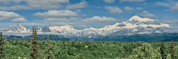
Stitched Panorama of Denali and Mt Hunter
Aug 17, 2018 16:51:52 #
This is my first attempt at stitching. Any critique is welcome. I can use all the help I can get. I used a D750 with a 24-120 lens. The clouds on Denali are relentless so I waited for an hour to get two frames and then stitched together in Affinity.
Aug 17, 2018 16:58:34 #


Aug 17, 2018 17:34:25 #
Bill Munny wrote:
This is my first attempt at stitching. Any critique is welcome. I can use all the help I can get. I used a D750 with a 24-120 lens. The clouds on Denali are relentless so I waited for an hour to get two frames and then stitched together in Affinity.
Great stitching of the images. Did you apply any saturation and/or clarity to the image? I ask because the colors of the trees are look artificial. Also, there's a fare amount of noise in the sky which is easy to correct.
Aug 18, 2018 08:29:16 #

You say you waited and hour to get to shots to stitch because of the clouds - as you have fit all so very nicely causes me to wonder if you superimposed any part of the image...
Aug 18, 2018 09:13:58 #

Good job with the panorama. However, the green is off. Also, if you bring down the shadows a little bit, it would look more natural at the base of the mountains. Would also help with the trees. I think I stood in this exact spot a couple years ago waiting for the clouds to move. (They did.)
Aug 18, 2018 09:48:37 #

Bill Munny wrote:
This is my first attempt at stitching. Any critique is welcome. I can use all the help I can get. I used a D750 with a 24-120 lens. The clouds on Denali are relentless so I waited for an hour to get two frames and then stitched together in Affinity.
From where I sit, you don't need any help at all.

Very well photographed!!
Aug 18, 2018 10:39:36 #
Thanks for the suggestions. Not sure what you mean by superimposed but they are overlapped by about 1/4 of the frames. I used two frames taken about 10 seconds apart. The greens in Alaska are very vivid. The first comment I made after getting off the plane was "it is so green". Maybe the photos are too green, but being from brown Colorado (35 years of drought and beetle killed trees everywhere) may have skewed my vision of "green". I will tone it down and work with the shadows to see how that looks.
Aug 18, 2018 10:58:00 #
Bill Munny wrote:
Thanks for the suggestions. Not sure what you mea... (show quote)
I could be wrong too but my first impression of the green was that there was a little too much blue in the green. I would love to see the photo again if you do any changes!
Aug 18, 2018 11:16:32 #
Pixelpixie88 wrote:
I could be wrong too but my first impression of the green was that there was a little too much blue in the green. I would love to see the photo again if you do any changes!
Maybe a bit of color balance correction needed because of the time of day (appears to be around noon from the cloud shadows) and, the altitude?
Aug 18, 2018 11:19:39 #
Bill Munny wrote:
Thanks for the suggestions. Not sure what you mean by superimposed but they are overlapped by about 1/4 of the frames. I used two frames taken about 10 seconds apart. .
I mis-interpreted your comment - my brain read it as waiting an hour to take the second image. Sorry
Going against the grain - I like the colors.
Aug 18, 2018 13:34:19 #

Excellent first effort! The colors do not disturb me, having been to Alaska in the spring.
Aug 18, 2018 14:07:02 #

Pixelpixie88 wrote:
That was my thought, too. Nice job on the stitching and photography. Not often one can actually see Denali.I could be wrong too but my first impression of the green was that there was a little too much blue in the green. I would love to see the photo again if you do any changes!
Aug 18, 2018 16:45:48 #
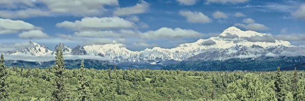
Okay, I tried your suggestions. Got rid of most of the noise in the sky. Lightened up the greens and worked with the shadows. It seems to be more vivid and lively. Please let me know if I am on the right track or I need to do something different. Thanks to all, I am on the learning path with some excellent mentors.
Aug 19, 2018 14:38:16 #
Actually, I think the original is the more vivid and lively image; like it much better than the 2nd image
Aug 19, 2018 15:15:28 #
Thanks, BboH, and I still like the first one better also. I need more practice with PP.
If you want to reply, then register here. Registration is free and your account is created instantly, so you can post right away.