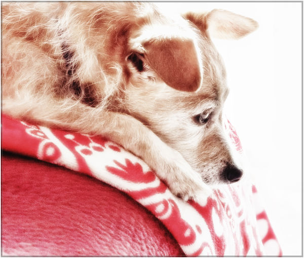
Pensive Trixie
Jul 28, 2018 13:44:31 #

Your impressions, please. Suggestions and edits are welcomed. Many thanks!
Jul 28, 2018 13:46:21 #

Edits are all well and good, but my crew wants to know if Trixie is pensive because you have forgotten feeding time?
Jul 28, 2018 13:49:45 #
UTMike wrote:
Mike, you can assure your crew that failure to produce meals on time is a federal offense in Trixie-world Edits are all well and good, but my crew wants to know if Trixie is pensive because you have forgotten feeding time?

Jul 28, 2018 13:53:28 #
Having been assured about Trixie, I would say that the lighter exposure puts this photo into "art" rather than "capture." The light background adds to this. Instead of thinking about Trixie, this presentation causes me to reflect on what Trixie is thinking about.
Jul 28, 2018 14:12:28 #
UTMike wrote:
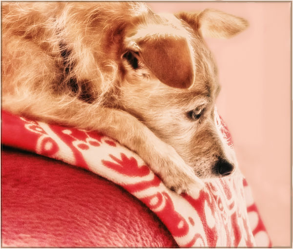
Thank you, Mike! I started with a backlit shot, and then did several things in pp to help achieve this somewhat high key look. (it's probably not light/white enough - too much midtone red - to be true high key, though, so don't quote me Having been assured about Trixie, I would say that the lighter exposure puts this photo into "art" rather than "capture." The light background adds to this. Instead of thinking about Trixie, this presentation causes me to reflect on what Trixie is thinking about.
 )
)Jul 28, 2018 14:29:33 #
kenievans
Loc: Dallas
I love the light in this. It has a celestial quality. The only thing that bothers me is the fading of the red in the left hand corner. It almost looks like you missed a couple of spots in pp. I would rather see it either stay the same red or fade in a more linear way. Very cool shot!
Jul 28, 2018 14:29:57 #

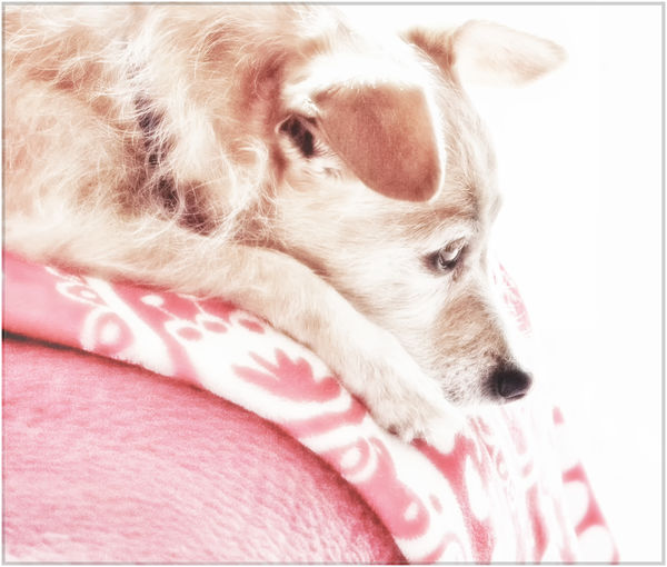
I like everything except the dazzling white. Any alternatives are basically turning it into another shot altogether, but here's one of them for your consideration.
-
-
Jul 28, 2018 14:36:31 #
kenievans wrote:
Thanks so much, Keni. Excellent catch. While you and R.G. were typing your comments, I did one more I love the light in this. The only thing that bothers me is the fading of the red in the left hand corner. It almost looks like you missed a couple of spots in pp. I would rather see it either stay the same red or fade in a more linear way. Very cool shot!
In talking to UTMike and in a pm to another user, I realized if I was going for high key, I needed to go further. So here is another idea, though seeing it now on UHH yellow, it looks anemic - ha. There are many reasons to download a photo!
Also, don't know if it's a feature you have to activate in "my profile" at top of page, but you can just click on the center of the image itself to see on a black background (at the smaller size). Many photos look infinitely better that way.
Jul 28, 2018 14:38:21 #
R.G. wrote:
Thank you, R.G. You'll see from the newest I just posted that I'm heading the other direction I like everything except the dazzling white. Any alternatives are basically turning it into another shot altogether, but here's one of them for your consideration.
 But I'm going to see what I can do to undazzle the white. Your time is much appreciated!
Jul 28, 2018 14:40:08 #

Linda From Maine wrote:
Your impressions, please. Suggestions and edits are welcomed. Many thanks!
Very nicely done, Linda. Can't think of a thing to improve an already perfect image, lol. As they say, 'If it ain't broke, don't fix it!'
Jul 28, 2018 14:42:46 #
Treepusher wrote:
Thanks very much, Randy! I've already tweaked and reposted, lol. Now it's too light, but I'm interested in R.G.'s description of the white being too "dazzling." I don't see that on my Chromebook, no doubt because of the 13" screen and medium-quality optics, but I want to see what I can do.Very nicely done, Linda. Can't think of a thing to improve an already perfect image, lol. As they say, 'If it ain't broke, don't fix it!'
Jul 28, 2018 16:21:48 #
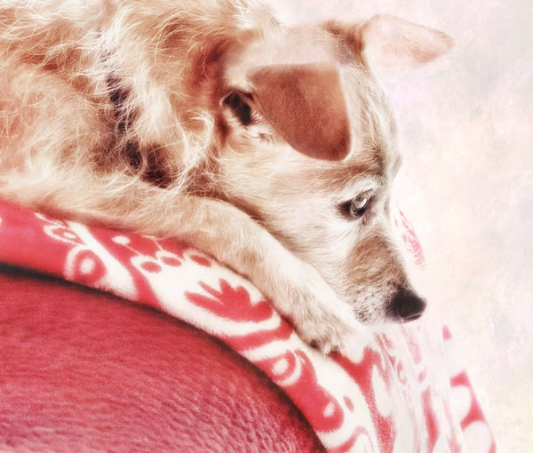
One more version for today. First, I smoothed out the exposure on the blanket per Keni's mention. Then a 10-second application of soft pink texture overlay, which made a nice addition to the right side and blanket (mostly masked from Trixie). But the blown area above her closest ear challenged me for an hour, and this is the best I could get, so far.
I suspect that the texture acted differently in that spot because there was no detail in the original, whereas there actually was on the right side. I can confirm by going back to the beginning, or someone can tell me here
Many thanks to all!
I suspect that the texture acted differently in that spot because there was no detail in the original, whereas there actually was on the right side. I can confirm by going back to the beginning, or someone can tell me here
Many thanks to all!
Jul 28, 2018 16:26:05 #
Jul 28, 2018 16:29:02 #
UTMike wrote:
Thanks Mike! My attention span is limited, so it's possible this really is the finish A great finish, Linda!
Not to say I like the pink better; it's just different, and definitely a softer mood.Jul 28, 2018 16:33:40 #
Maybe since you used the texture overlay you might have got away with some less-than-perfect cloning for the blown patch. Cloning is usually the best answer for totally blown areas. Failing that, selecting that area in what you have just now and dropping the Highlights (and perhaps Brightness as well) you may be able to mitigate the unwanted effect in that area.
If you want to reply, then register here. Registration is free and your account is created instantly, so you can post right away.