Mother and Child in a Doorway
Jul 25, 2018 17:19:05 #

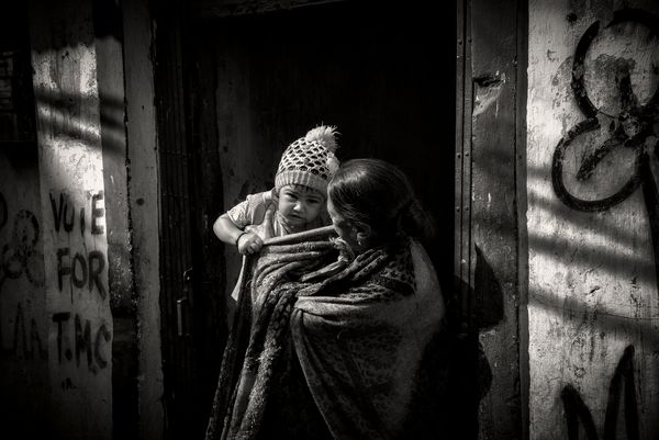
In the doorway to their slum home near Entally Market, Kolkata.
Jul 25, 2018 20:16:17 #
Graham Smith wrote:
In the doorway to their slum home near Entally Market, Kolkata.
Great image. Strong story.

Jul 25, 2018 23:10:11 #
Graham Smith wrote:
In the doorway to their slum home near Entally Market, Kolkata.
I noticed that you have the subject pretty much centered. That seems to fly in the face of the "rule of thirds". I think, in this case, it is very effective. The information on the left and right of the main subject is important to the composition. Having the subject in the middle works really well in this instance. Black and white tones are stunning. Really nice image.
Erich
Jul 26, 2018 08:31:22 #

Excellent, especially for street photography. Personally, I wouldn’t have centered the subjects, but who am I to question your work, that I see as always first-class.
Jul 26, 2018 08:58:37 #
To John and Erich, you both mentioned the centring of the subject. The rule of thirds works but in some instances ignoring will work better. I think this image works better with the subject centred. The shadow stripes act as leading lines and the political graffiti on either side of the door give a real sense of the place and insight into the people that live there. Indians, particularly those that live in the cities, are very politically minded.
Jul 26, 2018 09:05:51 #

Graham Smith wrote:
In the doorway to their slum home near Entally Market, Kolkata.
Very nice Graham I haven't seen many posts lately I have always admired you work
Thanks
Joe
Jul 26, 2018 09:22:05 #
Graham Smith wrote:
In the doorway to their slum home near Entally Market, Kolkata.
The walls and dark space work together to make the frame around the image of the mother and child.
Rules of thirds is a rule of thumb. Reality does not follow any rules of thumb, though. But this shot does fit into several "thumbs".
Jul 26, 2018 09:30:07 #

This is lovely. It has great detail and beautiful toning. I like that you shot from the perspective of seeing the child's face. And that the mom is looking at the kid instead of at you.
Jul 26, 2018 10:21:32 #
Graham Smith wrote:
To John and Erich, you both mentioned the centring of the subject. The rule of thirds works but in some instances ignoring will work better. I think this image works better with the subject centred. The shadow stripes act as leading lines and the political graffiti on either side of the door give a real sense of the place and insight into the people that live there. Indians, particularly those that live in the cities, are very politically minded.
I agree that there are times when the "rules" should be taken as only "suggestions". The trick is knowing when it is advantageous to break the rules. I don't think that can be taught. I think it is something that you either get or don't get. Thanks for the explanation.
Erich
Jul 26, 2018 10:31:20 #

Many good comments on this good shot, especially about "rules." As with most, I agree you first must learn to work intuitively within the principles ("rules") to know when to break them. It clearly has to be intentional and not accidental.
Jul 26, 2018 11:59:25 #

Jul 26, 2018 18:03:13 #

Graham Smith wrote:
I agree with the others about the rule of thirds, however I would have cropped out the wall on the right. The section on the left makes a statement, the one on the right doesn't really say anything.In the doorway to their slum home near Entally Market, Kolkata.
And at least for me - and it is only my opionion - the brightness on both sides distracts from the dark subjects. Not because they are centered but because they are flanked by brightness. But I do really like the concept and your lighting. Well captured.
Jul 26, 2018 18:10:52 #

Graham Smith wrote:
In the doorway to their slum home near Entally Market, Kolkata.
Fantastic image!!!!!!! Graham
Jul 26, 2018 22:09:42 #

Nice framing of the two of them. The dark background makes the two of them pop. Very nicely done
Jul 27, 2018 15:10:52 #
rplain1 wrote:
I agree with the others about the rule of thirds, however I would have cropped out the wall on the right. The section on the left makes a statement, the one on the right doesn't really say anything.
And at least for me - and it is only my opionion - the brightness on both sides distracts from the dark subjects. Not because they are centered but because they are flanked by brightness. But I do really like the concept and your lighting. Well captured.
And at least for me - and it is only my opionion - the brightness on both sides distracts from the dark subjects. Not because they are centered but because they are flanked by brightness. But I do really like the concept and your lighting. Well captured.
Thanks for your thoughtful comments,
Bob. With a lot of my work I tend to take a more expansive view to give the viewer the feeling that they are standing back and observing the subject rather than being up close and involved intimately. As to the brightness of the sides, I feel they frame the subjects and that the subjects, because they are people and people are always what we naturally pick out in an image, overcome any distraction.
Graham
If you want to reply, then register here. Registration is free and your account is created instantly, so you can post right away.