Help ! I can't decide
Jul 22, 2018 19:11:24 #


Jul 22, 2018 19:14:06 #
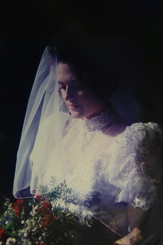
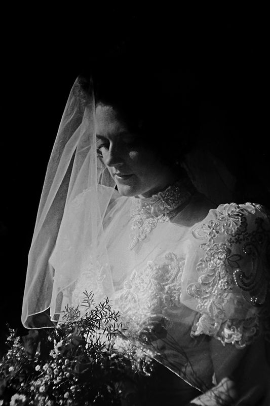
I’m for the color one. To me, the dress in the mono and sepia looks a little blown out. Nice tho!
Jul 22, 2018 19:16:49 #

Jul 22, 2018 19:19:47 #

47greyfox wrote:
I’m for the color one. To me, the dress in the mono and sepia looks a little blown out. Nice tho!
Iwould agree with that. If you don’t mind a couple suggestions, here are my 2 cents to start.
1. I would go into the original and try to retrieve any additional information that has been lost in the front of the dress. There is some great detail that is being lost.
2. I would work with your levels or curves and contrast a bit.
Right now, all 3 have varying vintage feels. If that is what you are going for they could work, if not I would see where you have information that can be brought back.
Basically see what you can bring back on the front. And then maybe repost to see where it stands.
Thank you for posting
Jul 22, 2018 19:34:47 #

Well kinda one and two I think I would burn in the upper part or the dress , and open up the shadows in the face create your black and white , then with the Nik viveza 2 I would put a control point in the center
and move warm slider to create a warm glow . As if by candle light .with the black and white layer over the color one I would take a soft eraser at 10 percent and erase over the flower area . If you also have Nik color effects I would use "Glamour Glow to soften the entire image creating a soft , warm black and white with the only color from the roses ...thats what I would do....P. s. I DO love the lighting its called 3/4 or by a better name Rembrant lighting....good job of that capture ...
and move warm slider to create a warm glow . As if by candle light .with the black and white layer over the color one I would take a soft eraser at 10 percent and erase over the flower area . If you also have Nik color effects I would use "Glamour Glow to soften the entire image creating a soft , warm black and white with the only color from the roses ...thats what I would do....P. s. I DO love the lighting its called 3/4 or by a better name Rembrant lighting....good job of that capture ...
Jul 22, 2018 19:36:26 #
tripsy76 wrote:
Iwould agree with that. If you don’t mind a couple... (show quote)
Yes to this advice. You do need to pull out some additional detail, but this is a great shot.
Andy
Jul 22, 2018 19:40:41 #
Paul Moshay
Loc: Los Angeles, CA
Personally, as an old wedding photog, I feel they are all too morose, dark and not very joyful. There is too much detail missing in the gown, the shadow side of the figure and flowers. I downloaded the color image to see if their was any more detail, but nothing there. This lighting scheme is for an old man with a beard and wrinkled face, not for a bride.
Just my opinion.
Just my opinion.
Jul 22, 2018 22:42:01 #

Jul 23, 2018 01:16:38 #
Jul 23, 2018 11:42:48 #
Jul 23, 2018 12:12:37 #
The first one because of the red color in the flowers. I would tend to put a little more light on her face to see more of her face but yours and her call. Don Z.
If you want to reply, then register here. Registration is free and your account is created instantly, so you can post right away.