Working with Black and White
Jul 16, 2018 14:42:42 #
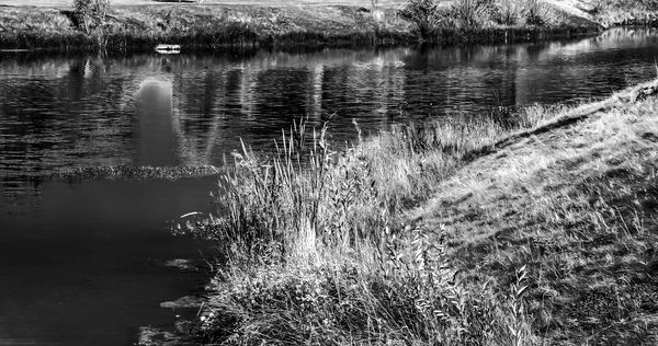
Hopefully, this picture will be a little more appealing than recent pictures. There are so many presets available for black and white, and even those can be manipulated so that you can create your own. I liked the color version of this, but I kind of like the contrast in the black and white as well. Comments or criticisms welcome.
Jul 16, 2018 15:34:59 #

gener202002 wrote:
Great tonal range in the image Gene.Hopefully, this picture will be a little more appealing than recent pictures. There are so many presets available for black and white, and even those can be manipulated so that you can create your own. I liked the color version of this, but I kind of like the contrast in the black and white as well. Comments or criticisms welcome.

Jul 16, 2018 16:06:51 #
Jul 16, 2018 19:28:14 #
Jul 16, 2018 20:02:44 #
alolewis wrote:
Little too much contrast for my tastes and I would include more of the background.
You're right about the background. I had to crop it due to the fact there was extensive smoke from forest fires when I took this shot. All of my shots taken in Boise last year had this problem. Also, there are so many good b&w presets it is hard to make a choice. This might have been contrasted even more after that however. When one option is taken it often gives some good as well as some bad at the same time.
Anyway, thanks for commenting.
Jul 16, 2018 22:59:07 #
gener202002 wrote:
Hopefully, this picture will be a little more appealing than recent pictures. There are so many presets available for black and white, and even those can be manipulated so that you can create your own. I liked the color version of this, but I kind of like the contrast in the black and white as well. Comments or criticisms welcome.
The foreground vegetation is too contrasty, and looks over sharpened or had too much clarity applied. For a successful grayscale conversion the tones have to achieve balance.
Jul 16, 2018 23:40:43 #
rgrenaderphoto wrote:
The foreground vegetation is too contrasty, and looks over sharpened or had too much clarity applied. For a successful grayscale conversion the tones have to achieve balance.
Thanks
If you want to reply, then register here. Registration is free and your account is created instantly, so you can post right away.