Playing with color in B&W
Jul 11, 2018 20:06:09 #

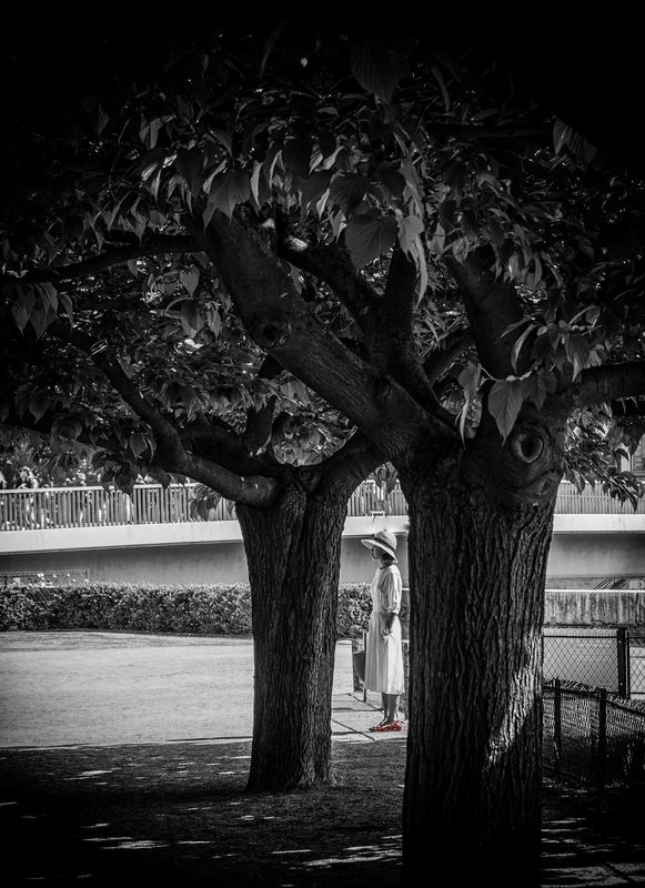
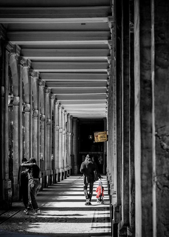
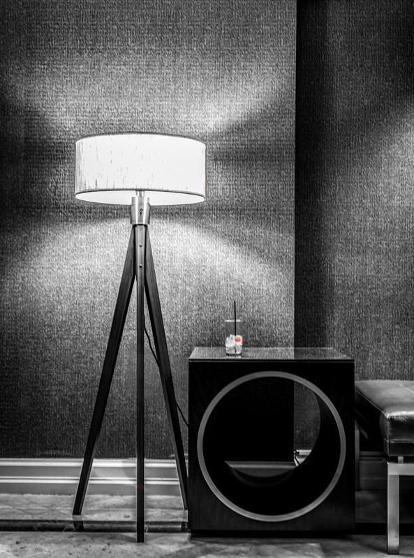
Learning to process. Usually just do straight B&W
Jul 11, 2018 20:17:21 #
Jul 11, 2018 21:16:08 #
Jul 11, 2018 21:23:52 #
Jul 11, 2018 23:08:55 #
In #1 I would have colored her hat before the shoes.
If you want to add color, make the color noticeable. Give it meaning. A red cherry in a drink has meaning; until it is drowned out with the rest of the photo.
Just my opinion. That and a $1.19 gets you a 24 oz coffee.
If you want to add color, make the color noticeable. Give it meaning. A red cherry in a drink has meaning; until it is drowned out with the rest of the photo.
Just my opinion. That and a $1.19 gets you a 24 oz coffee.
Jul 12, 2018 08:00:13 #

AlexS wrote:
Alex, second image has great tonality. My favorite.Learning to process. Usually just do straight B&W
Jul 12, 2018 08:27:33 #

Interesting--I’ve been intending to learn to do that process, at the prodding by my more artsy wife.
Jul 12, 2018 09:11:11 #

Jul 12, 2018 09:35:07 #

I really like these. Actually, I really like #'s 1 ans 2. #3 doesn't float my boat, but it's because I simply don't appreciate the scene as I do in the other two.
Jul 12, 2018 16:15:50 #

Alex, #2 is fantastic, but I really love them all with your little pops of color!!! 
Jul 12, 2018 18:24:08 #

Jul 12, 2018 20:00:55 #

If you want to reply, then register here. Registration is free and your account is created instantly, so you can post right away.