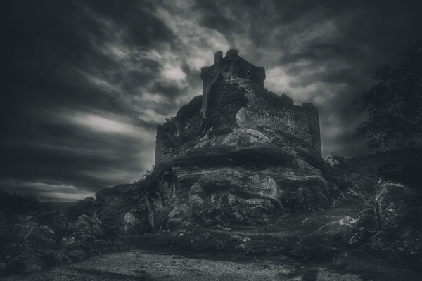
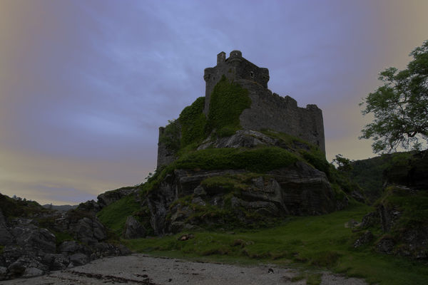
Tioram Castle.
Jun 30, 2018 06:22:51 #
fergmark wrote:
Thanks for the DNG. Its a good challenge. I like it dark as well, and I think it looks good the way you rendered it. I was surprised that burning in the sky would affect the color as much as it did, when I did this one earlier. The sky got a little bluer, and I thought it was a good look. Then for good measure I did slight dodging in some of the stone work. I will save the DNG for another time.
It's nice to see people enjoying working with one of my images. I gave mine significant amounts of desaturation after I darkened it. I found that it enhanced the glow in the sky round the castle. But I didn't want to lose the colour completely. It's funny how much more moderate the colour and contrast seem when viewed at full screen.
Jun 30, 2018 06:34:56 #
JGW30033 wrote:
Wow! the DNG is more spectacular than I thought it... (show quote)
Thank you Gilbert. Glad you enjoyed your edit. I think with the brightness being either left as SOOC or darkened in PP the need for bracketing is largely negated. In fact the single dark exposure may well be sharper than the merge (not that it'd be very noticeable at that level of brightness). Funnily enough, there have been previous times when I shot in daylight with the specific intention of creating a nighttime look, and for that I had the exp. comp. set to -1.7.
Jun 30, 2018 09:19:29 #
R.G. wrote:
I think it would be awesome to be there as nighttime approached, and that's what I was hoping to convey. Castles have their own drama, and for me, that's amplified by the approaching night.
Absolutely R.G. Castles do have their own drama, but it is so much more fun to add more drama to what is already there. I really like you image and love to have been there to capture one for myself. Since you are allowing us to edit and play with your image, I could not resist. Thank you for allowing us to pursue the matter and edit your wonderful image.
Dave
Jun 30, 2018 10:52:42 #
R.G. wrote:
It's nice to see people enjoying working with one of my images. I gave mine significant amounts of desaturation after I darkened it. I found that it enhanced the glow in the sky round the castle. But I didn't want to lose the colour completely. It's funny how much more moderate the colour and contrast seem when viewed at full screen.
An approach that I have experimented with, with pleasing results, is to blend a color version, with a black and white version. Gives the opportunity to refine both components, as it facilitates the desired effect in the end, with the % slider. The black and white can also serve as a sharpness layer, not unlike sharpening the lightness channel in lab color.
Jun 30, 2018 12:17:04 #
Dave Chinn wrote:
Absolutely R.G. Castles do have their own drama, but it is so much more fun to add more drama to what is already there. I really like you image and love to have been there to capture one for myself. Since you are allowing us to edit and play with your image, I could not resist. Thank you for allowing us to pursue the matter and edit your wonderful image.
Dave
Dave
I should have known that this was a scene that'd suit your style down to the ground. I suspected that the sky had potential that I wasn't bringing out. Your edit shows that the castle is back-lit, which is something you don't see till you darken the sky quite a bit. And there's a vignette thrown in for free.
Jun 30, 2018 12:23:27 #
fergmark wrote:
An approach that I have experimented with, with pleasing results, is to blend a color version, with a black and white version. Gives the opportunity to refine both components, as it facilitates the desired effect in the end, with the % slider. The black and white can also serve as a sharpness layer, not unlike sharpening the lightness channel in lab color.
Blending colour and B&W has been discussed in UHH before. Maybe I should familiarise myself with layers more. I can see that one of its strengths is that complex adjustments can be localised to specific problem areas and applied in degrees. If only LR's Adjustments brush wasn't limited in what you can apply with it.
Jun 30, 2018 13:42:49 #
R.G. wrote:
Blending colour and B&W has been discussed in UHH before. Maybe I should familiarise myself with layers more. I can see that one of its strengths is that complex adjustments can be localised to specific problem areas and applied in degrees. If only LR's Adjustments brush wasn't limited in what you can apply with it.
Its not so involving as you might think. With two images open in photoshop you drag one onto the other, and in doing that, you inadvertently created a layer. With the layers box active, the fill % slider is the blending. Then be sure to flatten in layers drop down before you save as. I don't activate layers except in certain instances. The only way to access transform is by making a duplicate layer. An article about sharpening orly the lightness layer from lab color intrigued me to try that. I admit that I have been stubbornly resisting working in layers ever since I started using photoshop.
Jun 30, 2018 14:21:23 #
fergmark wrote:
Its not so involving as you might think. With two... (show quote)
Thanks for the info. The only thing I have to do layers is PS Elements 12. I rarely use PSE because I don't like the drop to 8 bit processing that the interesting stuff has to get. I should probably try to get beyond that and do some learning. I may make a move over to On1 which has layers built in.
Jun 30, 2018 14:45:37 #
It is always fun for me to play with another ones submission. I have no emotional attachment to it that I would have with my own photo. Thanks RG for the DNG download
Jun 30, 2018 15:03:56 #
NJFrank wrote:
It is always fun for me to play with another ones submission. I have no emotional attachment to it that I would have with my own photo. Thanks RG for the DNG download
Glad you enjoyed, NJ. The sky is nothing short of beautiful, and I'm very familiar with that type of sky. And it's another vote for staying with the twilight look.
Jul 8, 2018 08:51:34 #
Yep, that last shot is the winner RG. I would start with the dark version and, with some d&b (no RG, dodging and burning!), try for somewhere between the two.
Jul 8, 2018 09:08:55 #
magnetoman wrote:
Yep, that last shot is the winner RG. I would start with the dark version and, with some d&b (no RG, dodging and burning!), try for somewhere between the two.
Yes yes, I know what d&b stands for - bodging and durning
 . I agree that NJFrank's edit is the best so far, and I'm not sure I could replicate it. Radical colour changes can be difficult to pull off convincingly. I've edited it two ways already, so I think I'll just leave it at that and enjoy what others have posted.
If you want to reply, then register here. Registration is free and your account is created instantly, so you can post right away.


