Give Music Life
Jun 23, 2018 09:42:37 #
Hi critique folks,
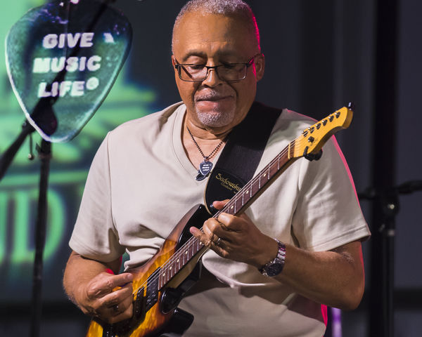
I took several concert pics last weekend and liked this one of the guitar player. When I zoomed in and saw the inscribed guitar pic around his neck I was even more loving the story it tells. Your typical viewer will not zoom in however so I selected it, enlarged it, put on another layer, and blended into the background. Does this work? I am unsure of my creative a abilities.
I took several concert pics last weekend and liked this one of the guitar player. When I zoomed in and saw the inscribed guitar pic around his neck I was even more loving the story it tells. Your typical viewer will not zoom in however so I selected it, enlarged it, put on another layer, and blended into the background. Does this work? I am unsure of my creative a abilities.
Jun 23, 2018 14:25:32 #

It works for me. It's a good capture and your addition enhances the story without being intrusive.
Jun 24, 2018 09:58:41 #

Hummm. I've thought about this. Your original shot is an excellent one. It has great detail and lighting, and I really like the player's attention to his playing. The colours in the background to the left (his right) are slightly distracting. I'm afraid that the addition of the overlay is even more distracting. I understand you want to get the point across. Maybe if you made it smaller? But it just sort of hangs there with no reasonable explanation for being there (such as hanging on a nail).
Jun 24, 2018 14:09:44 #
I really like your photo, but until I read your text, I didn't understand the connection between what you describe as the pick, and the musician. For me anyway, I think the original photo is sufficiently strong that it doesn't need the overlay. I do think the color beneath his forearm is distracting, and I can't tell about the imagery beneath the overlay, but suspect it also distract's from the power of the player.
Jun 24, 2018 17:15:24 #

Jun 24, 2018 19:19:38 #
Thanks all! I appreciate the feedback. I totally understand looking at this as a portrait and applying the general rules of distraction. However, what I was going for here is more of a feeling that the "Give Music Life" effect is coming through. Think album cover. Your classic album covers have many 'distractive items and text that relay the appeal of the musician. This was all stage lights with me about 40 ft. back with a 70-200. I think the red and green lighting is worth preserving. I'll let you know the reaction from the musician. I sent the images to the leader of the band (an old friend of mine) but not received much feedback yet.
Jun 25, 2018 01:22:49 #
Photos like this are not just about the subject. There's context as well, and in this case the context is a stage. The simple fact is stages usually do have what some might describe as distractions (props, backgrounds, instruments, sound equipment etc), and they usually have funny lighting as well. The way you've done it, the inserted pick looks like a stage prop, and that's what I thought it was until I read your description.
Jun 27, 2018 16:37:36 #

RG is right unless you really think about it. I think I would put it on the wall behind and give it the proper perspective with the warp/blend in Photoshop.
Jun 27, 2018 19:18:01 #
Nightski wrote:
RG is right unless you really think about it. I think I would put it on the wall behind and give it the proper perspective with the warp/blend in Photoshop.
Tried that, but the light stand is an issue and very tough to remove the light stand from the scene.
If you want to reply, then register here. Registration is free and your account is created instantly, so you can post right away.