Picture Transformations- You're thoughts?
Jun 16, 2018 11:48:36 #
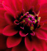
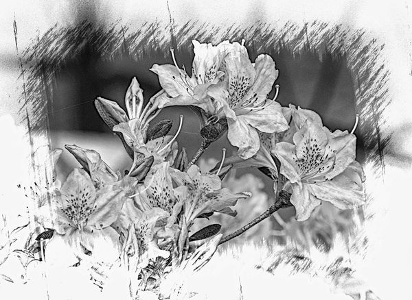
I had a nice picture of some azaleas. I wanted to do something different, more monochrome. It's a gift to be put in a grey room. .So, this is what I acme up with. Do you think I should adjust the shadows/highlights for greater contrast between the two. Thanks for looking
Fran
Fran

Jun 16, 2018 12:03:47 #

Both shots are very nice. But my eye is distracted and drawn away from the flowers by the artistic borders. If it were me, I'd let the actual shot bleed to the edges of the paper or frame it with a simple matte.
Jun 16, 2018 12:06:13 #

Jun 16, 2018 12:26:05 #

I'm not a big fan - Probably would have preferred the original --
But just the same -- good work on your part !! --
But just the same -- good work on your part !! --
Jun 16, 2018 12:40:23 #

I think the background is way too busy for these flowers. Maybe you could put them against a more solid background?
Jun 16, 2018 20:16:43 #
How about a light blue or green or even pink tint? Just because a room is grey doesnt mean no colors are allowed.
As is, just looks too fussy and washed out, but thats just my opinion. I do like the composition.
As is, just looks too fussy and washed out, but thats just my opinion. I do like the composition.
Jun 17, 2018 06:09:09 #
Burtzy wrote:
Both shots are very nice. But my eye is distracted and drawn away from the flowers by the artistic borders. If it were me, I'd let the actual shot bleed to the edges of the paper or frame it with a simple matte.
Thanks for your input Burtzy
Fran
Jun 17, 2018 06:10:00 #
Jun 17, 2018 06:24:09 #

Ben's nana wrote:
I had a nice picture of some azaleas. I wanted to do something different, more monochrome. It's a gift to be put in a grey room. .So, this is what I acme up with. Do you think I should adjust the shadows/highlights for greater contrast between the two. Thanks for looking
Fran
Fran
Fran, I love them as they are and since you are putting them on a wall you realize what I am also thinking.

Greg
Jun 17, 2018 06:27:44 #
ken_stern wrote:
I'm not a big fan - Probably would have preferred the original --
But just the same -- good work on your part !! --
But just the same -- good work on your part !! --
Thanks for your input. The person receiving this really liked the composition, however, she wanted monochrome... the original is bright pink and green.
Fran
Jun 17, 2018 06:28:19 #
NMGal wrote:
I think the background is way too busy for these flowers. Maybe you could put them against a more solid background?
Thanks for the suggestion.
Fran
Jun 17, 2018 06:29:30 #
krashdragon wrote:
How about a light blue or green or even pink tint? Just because a room is grey doesnt mean no colors are allowed.
As is, just looks too fussy and washed out, but thats just my opinion. I do like the composition.
As is, just looks too fussy and washed out, but thats just my opinion. I do like the composition.
Krashdrgon,
Thanks fr the suggestion.
Fran
Jun 17, 2018 07:47:45 #

Jun 17, 2018 10:18:47 #

FWIW, I think #2 is the better image. I would consider deepening the sepia tone a bit.
Jun 17, 2018 10:38:31 #

Nicely processed. I like the first one although the shade of the room's wall would determine my final choice.
If you want to reply, then register here. Registration is free and your account is created instantly, so you can post right away.