Is there improvement?
Jun 13, 2018 21:44:21 #
gator81
Loc: Jeffersonville Indiana
Hello again, well I have been trying some different things and keeping in mind what has been suggested to work on and I wanted to know if this would show that I have improved or that I need to keep working on a few things?
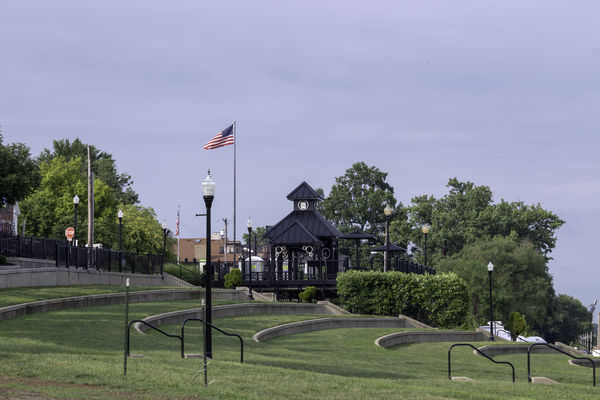
My wife also took a photo and asked me to post to see what you may think. The couple picture is me and the flag is hers.
I look forward to any comments :)
My photo camera settings:
f8 / 1/250s / ISO 100 / 55-250@100mm
Hers:
f9 / 1/250s / ISO 100 / 55-250@100mm
thank you.
P.S.
I have noticed that the photos a lot of times seem to be darker, is there a specific setting I should save the photos in that would show better when I upload them? I usually use ProPhoto for my settings and save jpg with largest and highest settings after editing the raw images in photoshop.

Jun 13, 2018 22:00:15 #
Regarding the shot of the couple, I would turn the camera vertical, so that you show more of them and the bridge in the background. It is an interesting backdrop, and you should use it to your advantage. Here, it is cut off and when I look at it, I want to see more. The lighting is good and I like the pose as well. Regarding the 2nd shot, I like the repeating lines and their shape is pleasing to me as well. The shot is a bit busy though. When I teach basic photography to my students, I tell them to show ONE thought in the image. Keep it simple and if there's several "things", make several shots. I also tell them that if I can't look at a photo and tell you exactly what the photo is about in 2 seconds, there's generally too much in the frame. Simplify.
Jun 13, 2018 22:11:33 #

I think Pixeldawg is right, vertical is a good idea. But I like the photo. Good contrast, dead on focus. and two happy people. #2 I love this photo also. I like the way you split it diagonally, and when I look at it I half expect the flag to wave.
Jun 14, 2018 04:50:32 #
gator81
Loc: Jeffersonville Indiana
Pixeldawg wrote:
Regarding the shot of the couple, I would turn the... (show quote)
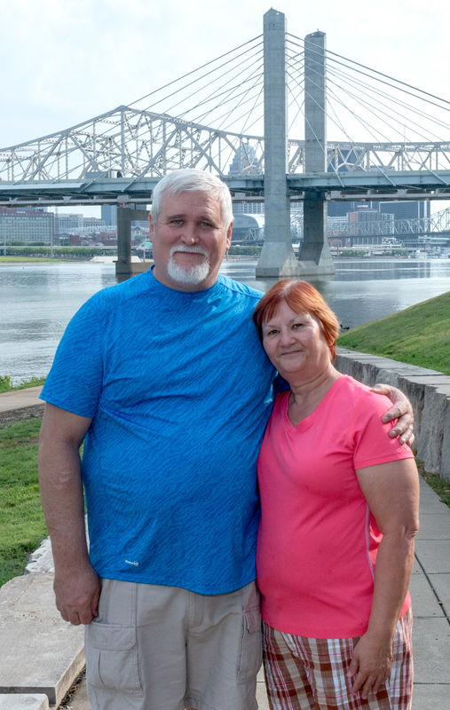
I had done another photo that has more of the backdrop sadly I have a hard time showing photos with scars from the Army but to show that I had the vision you were speaking about I will show you the photo and that my wife keeps encouraging me not to worry about them. I did go with a higher f stop and I made a simple diffuser for the speedflash to help with some of the shadows.
canon 70d f11 / 1/250s / ISO 100 / 18-55 @20mm with assisted diffused flash
The second picture my wife had taken, we had been trying to catch the flag just right when there was a breeze. She just had the touch :) I also agree that there is a lot to look at in the one photo and to us it was one we couldn't just look at for a couple seconds, we looked at for awhile to take in all of the story. We also know that simple is good :)
Jun 14, 2018 04:51:40 #
gator81
Loc: Jeffersonville Indiana
thanks SeamusMac for your thoughts, I will let the wife know. I will get use to this forum one of these days :)
Jun 14, 2018 06:45:30 #

The poor colors / presentation of your JPEGs can be traced to not using sRGB when creating your JPEGs for posting. Using AdobeRGB or ProPhotoRGB is fine for editing images. However, you have to change to sRGB when creating files for sharing. A dump of the EXIF data of the couple from the initial post:
Color Mode : RGB
Color Noise Reduction : 25
Color Noise Reduction Detail : 50
Color Noise Reduction Smoothness: 50
Color Space : Uncalibrated
Color Space Data : RGB
This discussion provides a lot of detail, examples, and links to still more discussion: http://www.uglyhedgehog.com/t-364870-1.html
As you develop a standard process for creating your JPEG images for posting, consider this additional discussion of how to resize the images specifically for online sharing, http://www.uglyhedgehog.com/t-512745-1.html
Jun 14, 2018 09:00:37 #
OK, and apologies if that came off wrong about simple. I like the background in the new shot, but would still crop vertical. Just above the bottom of the shorts and to the top of the bridge super structure and the width just outside the arms of the couple.
Jun 14, 2018 09:10:52 #

Jun 14, 2018 11:00:38 #
gator81
Loc: Jeffersonville Indiana
Pixeldawg wrote:
OK, and apologies if that came off wrong about simple. I like the background in the new shot, but would still crop vertical. Just above the bottom of the shorts and to the top of the bridge super structure and the width just outside the arms of the couple.
ok, I have be reworking this some and was able to get it like you suggested and I really like the shot now and wanted to see what you thought.
Jun 14, 2018 11:04:00 #
gator81
Loc: Jeffersonville Indiana
CHG_CANON wrote:
The poor colors / presentation of your JPEGs can b... (show quote)
you may see the new photo I just uploaded and I was able to change to SRGB and I lowered to 70% I will do some more testing on getting the sizes down better so I will be more on par for what I am uploading :) thank you so much for the assistance as it will only help me do better :)
Jun 14, 2018 11:15:41 #
Gator81 - glad to help on the technical stuff. This latest edit is much better composed as well. Good job.
Jun 14, 2018 11:17:00 #
gator81
Loc: Jeffersonville Indiana
CHG_CANON wrote:
Gator81 - glad to help on the technical stuff. This latest edit is much better composed as well. Good job.
thank you and I will be getting better :)
If you want to reply, then register here. Registration is free and your account is created instantly, so you can post right away.