June Title shot for Photo Club
Jun 12, 2018 06:07:10 #
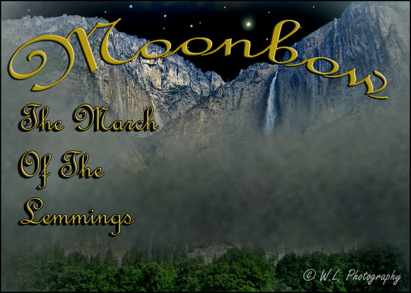
Topic was Moonbow in Yosemite
Comments Welcomed!
Comments Welcomed!
Jun 12, 2018 06:53:05 #
Georgews
Loc: Wellington, New Zealand
What is the title? Can't decipher the fancy text. Simplest is best.
Jun 12, 2018 07:33:04 #
Jun 12, 2018 07:40:27 #
Snap Shot wrote:
Topic was Moonbow in Yosemite
Comments Welcomed!
Comments Welcomed!
Sub-sub-title "Jump!"?

The font does make it hard to comprehend the title quickly. Also the placement of it makes it difficult to read. I would drop shadow the lettering to make it stand out. I would shrink the font and place "Moonbow" on the mist. Shrink the sub title font and run it across below in block letters, perhaps using the present font to emphasize "Lemings".
Like any book cover, it should be a brief, enticing glimpse of what is to come.
Jun 12, 2018 08:14:03 #
Georgews wrote:
What is the title? Can't decipher the fancy text. Simplest is best.
Thanks for stopping by Georgews! The Title is Moonbow! It's always nice to see a new visitor!

Jun 12, 2018 08:15:52 #
Stephan G wrote:
Sub-sub-title "Jump!"? img src="https:... (show quote)
Thanks for the critique Stephan G! It's always nice to see a new visitor!
Jun 12, 2018 08:16:37 #
Jun 12, 2018 09:16:38 #

Bill, the only thing this needs is to be downloaded. Your lettering becomes sharp and clearly defined! Unfortunately, the thumbnail versions don’t always shine through as they should.
Jun 12, 2018 10:55:33 #
Cwilson341 wrote:
Bill, the only thing this needs is to be downloaded. Your lettering becomes sharp and clearly defined! Unfortunately, the thumbnail versions don’t always shine through as they should.
Thanks for the heads up Carol! I should have suggested that when posting!
Jun 12, 2018 11:57:36 #
Snap Shot wrote:
Thanks for the heads up Carol! I should have suggested that when posting!
Thanks for your nods. Just wanted to mention that my suggestions were made after seeing the download. I looked at it from the idea of it being a cover for a presentation.
Jun 12, 2018 12:01:00 #
Stephan G wrote:
Thanks for your nods. Just wanted to mention that my suggestions were made after seeing the download. I looked at it from the idea of it being a cover for a presentation.
Jun 12, 2018 17:17:50 #

Jun 12, 2018 17:21:29 #
Jun 12, 2018 17:25:52 #
Jun 12, 2018 17:33:04 #
Sylvias wrote:
Excellent download and work Bill.
Thank you so much Sylvia! I could have done a better job on the text!
If you want to reply, then register here. Registration is free and your account is created instantly, so you can post right away.